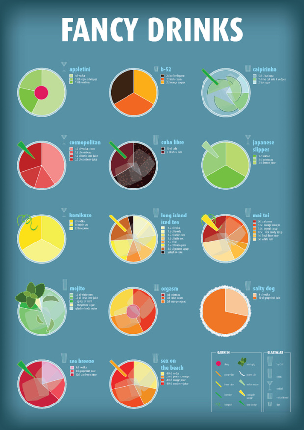
I’m partial to all things food and drink related, so naturally my eyes light up when they’re combined with charts. Fabio Rex illustrates what makes the perfect drink in a set of pie charts and annotated glasses. Below, Rex describes the perfect Mojito and above are breakdowns via pie chart of various other drinks.
Read More
-
-
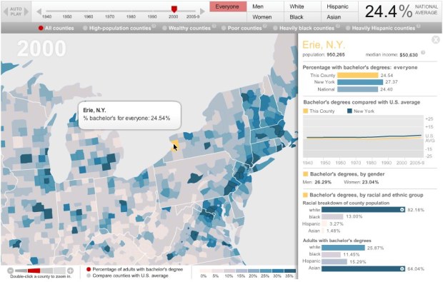
The Chronicle of Higher Education lets you explore the percentage of adults with college degrees from 1940 up to present, by county. Press play and watch the national average go up from 4.6 percent to 27.5, or select a county for breakdowns and a time series.
Read More -
 Add another online destination to find the data that you need. DataMarket launched back in May with Icelandic data, but just a few days ago relaunched with data of the international variety. They tout 100 million time series datasets and 600 million facts. I’m not totally sure what that means (100 million lines, sets of lines?), but I take it that means a lot.
Just over 2 years and countless cups of coffee after we started coding, DataMarket.com launches with international data. You can now find, visualize and download data from many of the world’s most important data providers on our site.
At first glance DataMarket feels a lot like now defunct Swivel. Search for the data you want and you get back a list of datasets. The focus on only time series though is actually a plus in that they can provide more specific tools to visualize and explore. The current toolset isn’t going to blow you away, but it’s not bad.
Read More -
My many thanks to the FlowingData sponsors. They help me keep the servers running and the posts coming. Check ’em out. They help you understand your data.
InstantAtlas – Enables information analysts and researchers to create highly-interactive online reporting solutions that combine statistics and map data to improve data visualization, enhance communication, and engage people in more informed decision making.
Tableau Software — Combines data exploration and visual analytics in an easy-to-use data analysis tool you can quickly master. It makes data analysis easy and fun. Customers are working 5 to 20 times faster using Tableau.
Want to sponsor FlowingData? Contact me at [email protected] for more details.
-
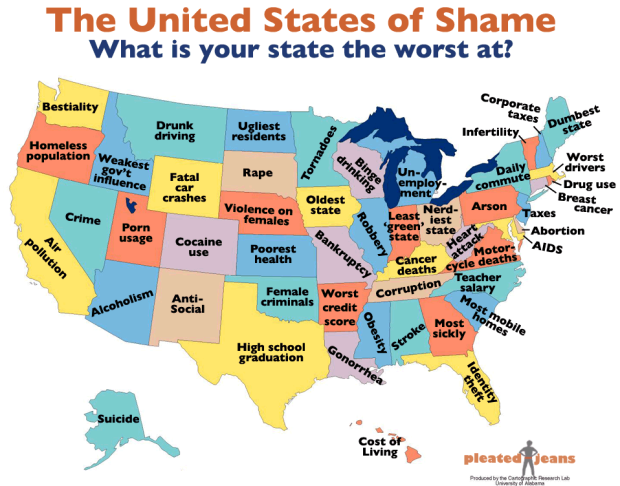
In a survey of rankings from a variety of sources, Pleated Jeans maps the United States of Shame. Because all states must be bad at something. Go, California. If we’re the worst at air pollution, does that mean we actually have really clean air? Must be.
Read More -
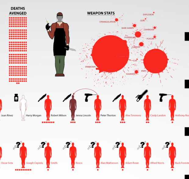
DeviantArt user dehahs, who seems to enjoy making graphics based on fiction (see here and here), classifies kills by main character Dexter of the popular Showtime series of the same name. Each kill is color-coded by type and weapon used is provided. Estimated number of deaths caused by killee is also provided on bottom by red dots. It’s kind of gruesome, but any Dexter fan will appreciate this.
[DeviantArt via datavis]
-
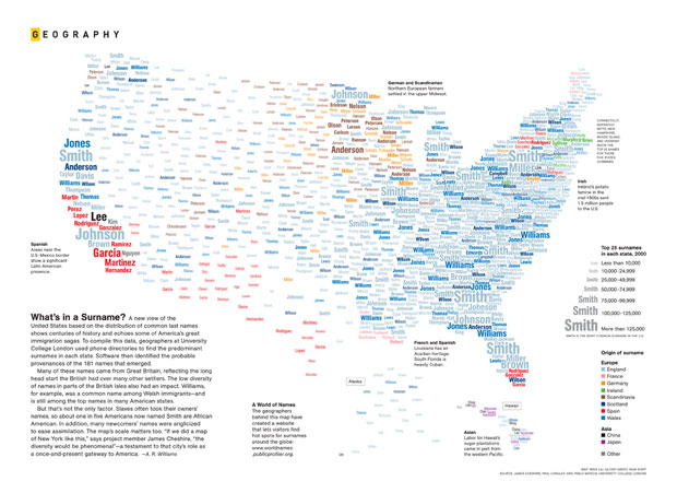
Mina Liu and Oliver Uberti for National Geographic examine the most common surnames across the country:
What’s in a Surname? A new view of the United States based on the distribution of common last names shows centuries of history and echoes some of America’s great immigration sagas. To compile this data, geographers at University College London used phone directories to find the predominant surnames in each state. Software then identified the probable provenances of the 181 names that emerged.
The most common surnames are then placed geographically and colored by origin. Browse the full-sized map here. Is your name in there?
-
 Okay, I sort of dropped the ball on this one. I have a free pass up for grabs to the O’Reilly Strata Conference next week, February 1 to 3. Here’s the short description:
Unprecedented computing power and connectivity are bringing new layers of experience to our lives in how we manage and present data sets of all sizes.
Throughout three days of training, breakout sessions, and plenary discussions, O’Reilly Strata connects the decision-makers, practitioners, and leading vendors from enterprise and the web who are at the leading edge of this space. Topics include data science, acquisition, organization, machine learning, visualization, and more.
Want to win the free pass? Leave a comment below by Friday, January 28, 2011 at 7pm PST. Tell us what super power you’d want if you could only pick one. I’ll pick a comment randomly and email you the discount code. Please only enter if you know you can attend February 1-3 in Santa Clara, California. I’d hate the pass to go to waste.
If you don’t want to leave it up to the randomized gods and just want to register now, it’s not too late to do that either. You can register here and get a 25% discount. The program looks like it’ll be a good one.
Update: Congrats to Tyson! “I’d like to fly”
-
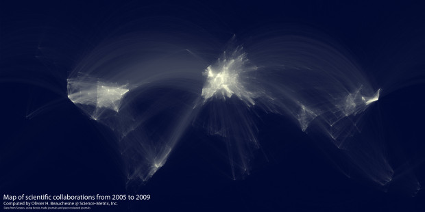
In the spirit of the well-circulated Facebook friendship map by Paul Butler, research analyst Olivier Beauchesne at Science-Metrix examines scientific collaboration around the world from 2005 to 2009:
I was very impressed by the friendship map made by Facebook intern, Paul Buffer [sp] and I realized that I had access to a similar dataset. Instead of a database of friendship data, I had access to a database of scientific collaboration.
From an extensive database of academic citations:
I extracted and aggregated scientific collaboration between cities all over the world. For example, if a UCLA researcher published a paper with a colleague at the University of Tokyo, this would create an instance of collaboration between Los Angeles and Tokyo.
After that, Beauchesne used a similar mapping scheme that Butler used, and behold the results above. The brighter the lines, the more collaborations between a pair of universities.
Read More -
President Barack Obama delivered his State of the Union address yesterday, and this year it was “enhanced” by charts and graphs. Basically, as Obama spoke, graphics that you could equate to Powerpoint slides showed up on the side. What’d you think of the enhancement? Did it add or detract from the message? Were the graphics used honestly and effectively?
One thing’s for sure: there’s something wrong with that bubble chart. Uh oh.
Read More -
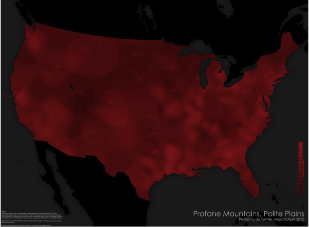
Cartographer Daniel Huffman has a look at swearing in the United States, according to geocoded tweets:
Isolines are based upon an interpolated surface generated from approximately 1.5 million geocoded public posts on Twitter between March 9th and April 12th, 2010. These data represent only a sample of all posts made during that period. Isolines are based upon the average number of profanities found in the 500 nearest data points, in order to compensate for low population areas.
The brighter the red, the more profanities used in the area, and the more black, the less swearing. Words looked for were (pardon my language): fuck, shit, bitch, hell, damn, and ass, and variants such as damnit. Honestly, I never swear like this. Unless some idiot pickup truck tailgates me going 80 on the highway in the middle of the night. That doesn’t count though.
Read More -
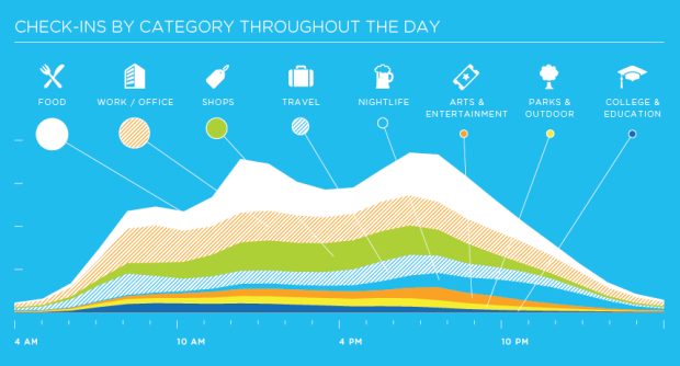
Foursquare has a look at their usage in 2010. I bet you were sitting there wondering how many peopled named Wendy checked in at Wendy’s during the year. It was 224, but there was only one mayor of Wendy’s named Wendy. What I really want to know though is if people named Wendy are more drawn to Wendy’s than non-Wendy’s. Or number of Nathans who eat too many hot dogs. Either-or.
[foursquare via Waxy]
-
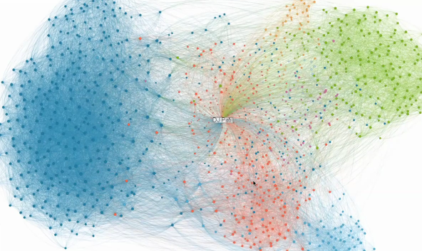
LinkedIn has been having some fun with their data lately. They opened up the career tree a couple of months ago, and today they announced InMap to visualize your links as a network diagram. They call it InMap:
InMaps is an interactive visual representation of your professional universe that answers all of the above questions. It’s a great way to understand the relationships between you and your entire set of LinkedIn connections. With it you can better leverage your professional network to help pass along job opportunities, seek professional advice, gather insights, and more.
Below is LinkedIn’s chief scientist DJ Patil with a brief description of how it works.
Read More -
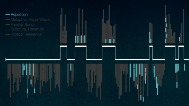
Nancy Duarte of Duarte Design has a look at Martin Luther King, Jr.’s “I Have a Dream Speech” and why it was so good:
MLK’s “I Have a Dream” speech is not only literarily brilliant, its structure follows the presentation form perfectly, by traversing back and forth between what is and what could be, and ending by describing what the new bliss of equality looks like. In addition, MLK carefully chooses phrases and metaphors that resonate deeply with his audience.
The transcript is placed on a timeline that follows the “presentation form” and color coded by use of metaphor, repetition, and political and scripture references.
[Video Link via Waxy]
-
It’s Friday. You might need this vintage-looking guide on how to play beer pong by Mel Marcelo. Remember not to use a lawnmower, a skull, or a toaster, and you should be okay. Safety first.
-
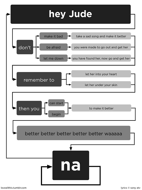
What day is it? Flowchart Friday of course. Old but new to me. Based on the Total Eclipse of the Heart flowchart, this one takes on Hey Jude. Don’t get stuck on an infinite loop of na na na na na na na na na…
[Love All This via Laughing Squid | Thanks, John]
-
Lockheed Martin’s Space Fence, expected to be in initial operation in 2015, will track the junk floating in space:
Space Fence is envisioned as a network of ground-based S-band radars that will detect, track, measure and catalog thousands of objects in low-Earth orbit. Expected to begin initial operation in 2015, the system will replace the existing Air Force Space Surveillance System, or VHF Fence, which has been in service since the early 1960s. A leader in S-band radar development, Lockheed Martin’s high-powered radar systems will find and follow the course of thousands of pieces of space debris to an accuracy of just meters.
They provide this video (below) to explain the concept, of which I’m pretty sure most of is fake, but let’s pretend it’s real. It’s more exciting that way.
Read More -
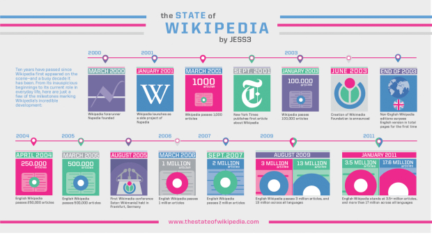
In their most recent video (below) to their “State of…” series, JESS3 takes a look at the State of Wikipedia:
The State of Wikipedia not only explores the rich history and inner-workings of the web-based encyclopedia, but it’s also a celebration of its 10th anniversary. With more than 17 million articles in over 270 languages, Wikipedia has undoubtedly become one of the most visited and relied upon sites on the web today.
It’s really light on the data and kind of fluffy, but Jimmy Wales narrates, so it’s worth it to watch just for that. For some reason I expected him to have a grittier voice. It must be the beard.
Read More -
According to 2009 numbers reported by the Federal Bureau of Investigation, DC, Louisiana,…
-
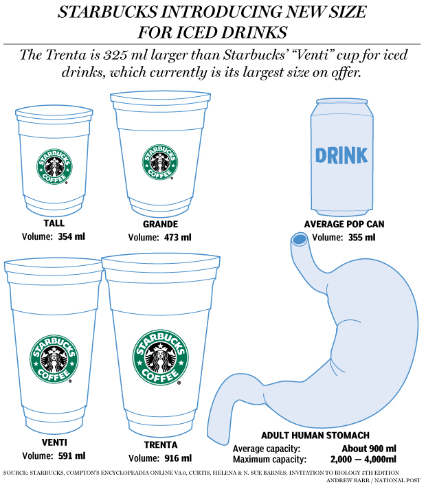
Starbucks recently announced their next size up from 591-milliliter Venti: the Trenta. It’s 916 milliliters, which happens to be slightly more than the average capacity of the human stomach, as illustrated by Andrew Barr for The National Post.
I don’t know why everyone’s getting their panties in a bundle though. If it’s too big for you, then don’t buy it. Besides, 7-Eleven has Starbucks beat with their line of Big Gulp drinks ranging from 0.59 to 1.9 liters.
I’m thirsty.





 Visualize This: The FlowingData Guide to Design, Visualization, and Statistics (2nd Edition)


