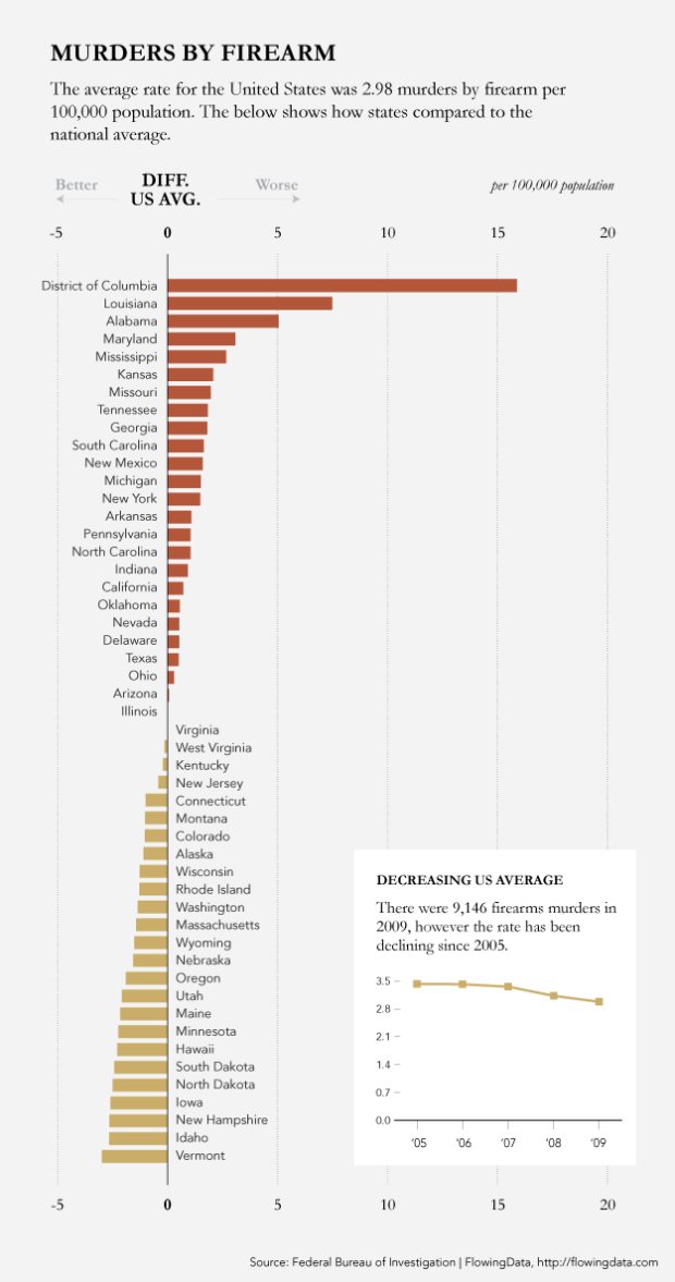
According to 2009 numbers reported by the Federal Bureau of Investigation, DC, Louisiana, Alabama, Maryland, and MIssissippi had the highest rates of firearms murders. On the opposite side of the spectrum, Vermont, Idaho, New Hampshire, Iowa, and North Dakota had the lowest. Time to move into a bed and breakfast.
Update: Made some small changes to the copy, so that everyone and their mom isn’t confused.
 Visualize This: The FlowingData Guide to Design, Visualization, and Statistics (2nd Edition)
It would be good to do some more with this data:
– Plot as a ‘heat map’ over the states, to show at a glance the ‘best’ and ‘worst’ areas (as the other examples do below)
– Correlate with some form of scoring for gun control (points for ability to purchase, open carry etc)
– Correlate with other political data (NRA activity/funding, Democrat / Republican vote preference?)
This is the subject of a couple of Masters’ theses right now, unfortunately, I don’t think we’ll hear anything about them because all of the ones I know of are slaving away at smaller state schools.
For example, I knew a master’s student in econ who was using the brady campaigns’ scores and finding a strong correlation between more favorable gun control scores and gun violence. Then the brady campaign must have realized what was going on with their scoring system and the fbi datasets and took the site down. It took him nearly 2 months to find a cache of it, and it almost ruined his thesis.
I personally would would be very interested in seeing some serious statistical analysis.
Another thing to do with the plot is to find some way of indicating variability. It would be interesting to know, for example, how likely it is that Idaho is among the best two states. Or even the best 5.
I think the chart is fine, but the horizontal axis is very unclear to me. US average is zero? Plus and minus seem to indicate percentage differences – or is it occurrences per 100’000? Also, wouldn’t be the quotient with the average, and a log axis be more appropriate?
Btw the trend chart needs labeling on y axis as well.
This comment corresponds to my own feelings while looking at the Horizontal Bar Chart.
It is not so much the horizontal bars that bothered me, but the unclear title, labels and scales as well as the Zero average for the USA didn’t make sense to me.
One has to infer from the negative rates that that chart presents percentage differences against the USA rate, but this is nothing but an inference. A chart must be clear and not subject to too much personal interpretation, although some personal interpretation is unavoidable since we all have different backgrounds that make some data “ring a bell” in our minds while it may not for another person.
Ah, forgot: thanks for not making a map :)
I must admit I am a bit perplexed. The title says Murders by Firearm per 100,000 population but then the chart indicates the average across all 50 states is zero. I find that hard to believe, but not as confusing as the representation of negative numbers. If I base my interpretation on the title, murders by firearm per 100,000 population, it appears to me that firearms are responsible for around 3 conceptions in Vermont. I realize a lot can happen during those long cold winters, but conception by firearm is a bit of a stretch for me.
agree… what is the value of the horizontal axis? is it average or is it murders per 100,000? are there negative murders in some states?
Vermont is interesting in terms of it’s lack of gun laws. Wikipedia:
Vermont has very few gun control laws. Gun dealers are required to keep a record of all handgun sales. It is illegal to carry a gun on school property or in a courthouse. State law preempts local governments from regulating the possession, ownership, transfer, carrying, registration or licensing of firearms.[292]
The term “Vermont Carry” is used by gun rights advocates to refer to allowing citizens to carry a firearm concealed or openly without any sort of permit requirement. Vermont law does not distinguish between residents and non-residents of the state; both have the same right to carry while in Vermont.
The Vermont constitution of 1793, based partly on the U.S. Constitution and Bill of Rights, guarantees certain freedoms and rights to the citizens: “That the people have a right to bear arms for the defence of themselves and the State — and as standing armies in time of peace are dangerous to liberty, they ought not to be kept up; and that the military should be kept under strict subordination to and governed by the civil power.”[293]
Note: The Federal Gun Free School Zone Act of 1995 severely limits where an unlicensed person may carry.
No data for Florida?
This makes perfect sense to me as an overall picture.
These data are good candidates for linked micromaps. See the book by Carr and Pickle. http://amzn.to/eHmwOB
I second the comments of Moritz and Jack. Both charts need clearer labels.
Are we supposed to read the number off the small timeline and apply it to the larger bar chart? This makes us have to work too hard. The value axis on the bar chart should show the numbers, not deviation from average. Add a vertical line to indicate average.
As Trevor points out, these numbers could use more context. Guns per X residents, for example. Total murders per 100k.
Love the idea, but it seems the US average of 0 on the map does not match the actual US average (around 2.8 according to this graph).
Agree with the above commenters about the X-axis, and just adding that I[‘m not sure how one can have -2 murders per 100,000. Like Bunny Colvin in the third season of The Wire said, “How do you hide a body?”
Where’s Florida?
I was wondering the same thing.
Numbers were not reported for two states, one of them being Florida.
The guy who was supposed to do the reporting was ironically murdered by firearm.
I hate to say this, but that ranking looks like a close fit with percentage black in the population.
It’s fine to say that, but be verrrrrrry careful about the conclusions you draw from that. It seems likely to me that the correlation between race and poverty in the US could have something to do with these results.
I think a more valid correlation is with education and poverty rates. Race is a confounding factor between the two and gun violence.
“Firewarm” almost sounds cuddly (typo in white box at bottom right of the infographic)
I need a copy editor.
a good one, and inexpensive too: http://grenadineink.com
:)
Yeah, and it’s probably worth pointing out that you should use the word “fewest” rather than “least” to describe countable nouns: “States with the most and fewest firearm murders”.
:)
According to Wikipedia, “Less has always been used in English with counting nouns. Indeed, the application of the distinction between less and fewer as a rule is a recent phenomenon in linguistic terms.”
The article has good citations of Merriam-Webster and a couple other sources.
@JFielder – Don’t you hate grammar prescriptivists and their incorrections?
Well, I can’t say that I hate prescriptivists. I will just say that I disagree with that rule, and historical usage is on my side.
Well, I think it’s a bit harsh to say that you hate somebody you’ve met, but I guess the internet does that to people.
Regardless, I wasn’t trying to be a “prescriptivist” (although it’s worth noting that the Wikipedia article suggests that the preference for “fewer” over “less” became normative in the late 1700s). It may be a stylistic choice, but to me it just sounds more correct. If I were comparing the number of firearm murders in two states I would say that one had fewer than the other, and the superlative form of fewer is fewest.
And just so you know where I’m coming from, I work alongside two former journalists and produce work for lots of fields in which “proper” (actual or perceived) grammar is actually really important. Using “less” where “fewer” is preferred wouldn’t fly if I were packaging up a visualization like this for a news organization. It may seem like nit-picking to you, but my experience has been that people who often have to answer for graphics like this—journalists, analysts, designers, etc.—have higher grammatical standards than most. That’s the reality of our field, and it’s worth acknowledging rather than writing me off as a “prescriptivist” just for suggesting it.
Hi Shawn –
This isn’t the place for such a debate, and I didn’t mean to cause offense. I’m just aware of many so-called rules of grammar which are not consistent with historical usage. Many of these “rules” emerged as personal preferences, which perhaps well-intentioned folks started prescribing as proper usage.
“Less” has been used for countable items at least since the time of King Alfred the Great, ca 888 AD (Merriam-Webster’s Concise Dictionary of English Usage via Language Log, http://itre.cis.upenn.edu/~myl/languagelog/archives/003775.html).
Hi, Shawn.
This has become more contentious than I originally intended. I don’t know if your last comment was directed at me, but I will respond as if it were.
I do not disagree with anyone using “fewer”, if that’s what they prefer, nor am I unaware that journalistic venues have rules of style, and may prescribe the use of “fewer” for discrete quantities. Nor am I unaware that many people will think that “less” is wrong in this situation. I made a graphic for fun a few days ago, and I put a lot of thought into whether I could use “less” in place of “fewer”. I preferred “less”, but I knew many people would think it was wrong (hypothetically! — I don’t get much traffic).
Let me say something about my original intentions. As a comment within the context of this post (and with no other context given), I assumed that your comment was prescribing a general rule of grammar (“you should use the word ‘fewest’ rather than ‘least’ to describe countable nouns”).
However, I was aware that I was making assumptions, and I wanted my comment to be as assumption-free as possible, so I intentionally did not include any explicit argument. I just wanted to plop down some evidence that, as a general rule of grammar, this rule is artificial, and leave it at that. If this directly speaks to your comment, fine, if not, fine.
I am glad to hear that journalists, analysts, and designers have higher grammatical standards than most. I, too, have higher grammatical standards than most, and I agree that the superlative form of “fewer” is “fewest”.
Also, I do not think you were nit-picking. This is nit-picking:
1. The Wikipedia article does not say the rule became normative in the late 1700s, it says the rule originated in the late 1700s (as far as Merriam-Webster could discover).
2. Notice that you were literally prescribing a rule (“you should use …”), so, even if you were not trying to be a “prescriptivist” (why the quotes?), you were engaging in prescriptivism.
(I apologize for the condescending tone of the last part of this, but I think you were being condescending as well. That’s fair, right? Also, if Nathan wants us to quit arguing this here, I’m fine with that.)
I think we’re set :)
Not sure that this comparison is actually all that useful. DC is a city-state, for example, and so one would expect to see a higher rate due to the higher population density. Perhaps DC should not be included in here, just in a comparison of metropolitan areas… or the data should be scaled based on population density… or the data should be plotted with population density in another axis,
Higher rate due to population density – does that imply people randomly fire their guns in all states? ;)
yeah, still a bit of a disconnect with any sort of causality, but I don’t think causality is the point of looking at it by state in the first place… I think it is more of an indirect connection; a possible link to policy framework perhaps? But if that is the intention, state isn’t a good way to go, you should link it to police department jurisdictions.
I agree that comparing DC to larger states is problematic (but I don’t know if it’s just a density thing since the rate is per 100k). it would be interesting to see DC vs. New Orleans and/or Virginia (incl. DC) vs. Louisiana. I think that would put it in context.
I agree that it would be interesting to see comparisons of large metropolitan areas, but using state and local firearms policies as a comparison metric. For instance, I’ve read some interesting articles on D.C.’s gun-related violent crimes skyrocketing directly following their handgun ban and staying inflated. I’ve also seen information indicating a similar outcome after Chicago’s handgun ban. So, comparing FBI crime report information from those cities to large cities states where concealed carry is allowed to varying degrees would be interesting.
Would like to see some other information here, including:
– state-wide population density
– some indicator of large urban areas, or # of population that lives in an urban area, or post-industrial, or something like that…
Things to be careful about including:
– racial breakdown (as mentioned above, you need to be really careful that this isn’t a proxy for some other variable like race, urban status, etc).
– gun control laws. Because this is not a time-series map, you’d lose the whole before/after effect of changes in gun control legislation. E.g., a state may not implement any laws unless they have a surge in gun violence, then you would have to look a year or two down the road to see the effect.
I’d like to see how this correlates with sales of country music records.
Amazed at the people that can’t read the axis labels – seems pretty clear to me. However, no insight. I would like to see these data plotted against something – state share of GDP/capita, % population rural vs urban, ethnic, age, educational breakdown. What explains the variation? (I’m guessing a lot of these things autocorrelate and would link to drug-related crime…)
Also, how do murders compare with shootings? Are people in some states better shots? Or are healthcare services better? The chart just raises questions…
It would be interesting to see how this compares to other countries in the world, particularly those with strict bans on carrying or owning guns.
What’s a “murde”? :)
Darn i’ll have to fix that later
Interesting fact that more deaths are attributed to drunk drivers that are repeat
offenders than homicide by weapons. Along these same lines are the number of
accidental deaths brought on by bad medical decisions. The media lives on sensationalism
and because of their liberal spin will take every opportunity to blow out of proportion events
that have to do with the use of weapons. In reference to the number of other deaths as
mentioned above, seldom does the media expound even bother to cover these events?
Go figure.
Patrick
Total car accident deaths in the US are 12.3 per 100,000, which is more than twice as high as your 5 per 100,000 murder rate.
(Source – World Health Organisation, cited in
http://en.wikipedia.org/wiki/List_of_countries_by_traffic-related_death_rate)
So you have a point there, far more people are killed by cars in the US than are murdered by guns.
It’s a dodgy comparison of course, because you’re looking at *all* car deaths, but not all gun deaths.
A few accidental shootings and a whole lot of suicides, and the CDC makes it 10.4 for firearms, still not as bad as cars but pretty close.
(source: CDC – http://www.cdc.gov/nchs/data/nvsr/nvsr59/nvsr59_02.pdf)
Deaths by “legal intervention” are 0.1 per 100,000 by the way, so you can take that number down to 10.3 if you like. Or even 10.2 if you “age-adjust”.
Incidentally the CDC puts homicide by firearm at 4/100K, not the 3 that the above graph attributes to the FBI.
40% of those deaths involve alcohol, which = 4.92. So your total drunk driving deaths are nearly equivalent to your homicide deaths.
(source: National Highway Traffic Safety Administration, cited in http://en.wikipedia.org/wiki/Drunk_driving_in_the_United_States)
Your claim that “more deaths are attributed to drunk drivers that are repeat offenders” could not therefore be true, even if every single motor accident death that involved alcohol was caused by a repeat offender. It’s not so much an “interesting fact” as it is bullshit.
Oh, and “complications of medical and surgical care” – that’s all of them, which includes the “bad medical decisions” you’re worried about as well as bad luck: less than 1/100K.
Incidentally the CDC puts homicide by firearm at 4/100K, not the 3 that the above graph attributes to the FBI, and motor vehicle accidents at 13.1 rather than the 12.3 from the WHO. The ratios are around the same though, I suppose.
CONCLUSION:
1. About as many people in the US are killed by cars and guns.
2. About half the gun deaths are murder, the other half are mostly suicides. Very few people, relatively speaking, are killed accidentally with guns.
3. Nearly half of the car deaths involve alcohol. Most car deaths are considered to be accidents; negligence rather than malice.
4. A vanishingly small number of people are killed as a result of medical negligence or accidental drowning. The only reason these causes of death come up in debates is because they are larger than the tiny number killed accidentally with guns. That’s not because guns are safe; it’s because when someone is killed with a gun it is almost never an accident.
Oh – another cross-cultural comparison to go with the one I posted below: in Australia the death rate from motor vehicle accidents in 2008 (same year as the stats above) was 6.9/100,000.
Source: Australian Bureau of Statistics: http://www.abs.gov.au/AUSSTATS/[email protected]/Lookup/D18CA4EA930FF0D2CA25773700169CE5
So our Australian car death rate is about half the US rate, just as our non-gun murder rate is half yours, but not as significant as our one-quarter total murder rate.
Maybe life is cheap in the US? On the other hand our death rate from being eaten or poisoned by various nasty non-human animals is surely higher.
What I find fascinating is that the governmental district (DC) with the strictest gun control laws in the nation has the highest murder by firearm rate. And there were only 9,146 firearm murders in US in 2009? That’s it? A nation of +300 million and only +9000 died by firearm? That’s a .00003 chance of being murdered with a gun. There is a greater risk of being killed by a drunk driver than a gun.
its not a fair to compare d.c. to states. if you took any major u.s. city and compared it to states the city would certainly stick out.
@byl046 higher murder rates probably cause cities to enact laws to bring down the murder rate – reverse casuality.
i’m not saying that gun murders in dc aren’t a problem, but this exaggerates it compared to other cities (which is more fair of a comparison).
By the way, lest us not forget that DC has taxation without representation! No one in Congress to vote on behalf of DC.
Hmm. Perhaps DC has more gun control laws BECAUSE it has more murders? Can’t say which is cause, and which is effect. I was also very surprised by the “9000 in 2009” stat; I figured it was much (much much) higher because of all the gun control issues cropping up.
@Bryan, that’s an important point, and why we should caution against using this particular map to compare to gun control policy. That’s like the classical example of a mistake in interpreting correlation: “There are always more police officers where crime is the highest, so the police must cause crime.”
“The below shows how states compared to the country” would be clearer if it said “The graphic below shows how each state compares to the national average”
I would like to echo the comment about excluding DC. There are other factors, but cities tend to have higher higher firearm murder rates than rural/suburban areas. Thus, state averages are pulled down by rural counties. By virtue of not having a rural hinterland, DC’s murder stats seem abnormally high.
A more useful comparison would be by city (in which case the analyst would have to make a decision on what the geographical limits of a city are) or county (in which case a heat map may be more appropriate…)
You know Florida has got to be close to the top. (And I’m writing from Jacksonville, the murder capital of Florida… Some things we’d rather NOT be known for.)
A breakout by legal and illegal gun possession would be illuminating. Now back to my NRA Rifleman mag to read the Armed Citizen column which recounts thwarted crimes by legal gun owners.
to me the most astonishing issue here is just how few firearm murders there are in the US. It would be interesting to map the murders and see where they concentrate. Also It would be most interesting to see what percentage of the murders were committed during a criminal act vs random killings or murder/suicide type stuff. I would wager a significant amount of the murders were committed during some sort of drug related activity. Which would mean that to be murdered by random chance in the US, the supposed most violent society in the history of civilization (Spike Lee) is so absurdly small as to be statistically insignificant.
United Kingdom: The number of homicides per year committed with firearms has remained between a range of 49 and 97 in the 8 years to 2006. Population: 70m
From this side of the pond the US numbers are “astonishing” all right, but not in the way that you mean.
Here in Australia guns are illegal, except for law enforcement and sporting shooters. I’ve never seen an unholstered gun outside of a shooting range or a farm. We certainly don’t allow concealed carry or automatic weapons.
We have 260 murders a year, and falling. Of course, we have only one fourteenth your population, so let’s look at it per 100,000 of population. Australia is 1.2, the US is 5.0. So, you have over 4 times our murder rate. Is that due to guns?
Well, guns are used in around 20% of Australian homicides, so we have around 1 murder/100k without guns and .2 murders with guns. In the US guns are used in around 3 of your 5/100k, which leaves 2/100k for knives and fists and baseball bats (cricket bats in Australia of course). So, you have double our murder rate if guns were out of the equation, and four times our rate when you put them back in.
Since this is flowingdata, here’s a little graph of that for you: http://dl.dropbox.com/u/19242622/homicides.png
I visit the US regularly. I notice that US and Australian media are very similar, except that there’s no equivalent of Fox News here and our version of the PBS appears vastly better funded. We have the same fiction, though; Australia gets all the US movies and hit TV shows and we consume them just the way you do, depictions of fantasy violence intact.
It’s very noticeable that Australia has less extreme wealth and less extreme poverty. We have universal health care and an income safety net, so nobody starves or is bankrupted by medical emergencies. Poverty really stares out of the US graph above, it seems to me; the high homicide areas have reputations for poverty, the low-homicide areas are reputed to be wealthy. That would be interesting to graph against, instead of the bare ranking we have there.
I think trying to rank countries by gun laws would be a bit broken; those laws are complex and inherently qualitative. To quantify them by making up a ranking of laws would hide a lot of information and judgement calls. Instead, why not go for a raw number, like the number of guns in circulation, or guns sold per year, or ammunition sales?
It’s a thought-provoking graph. Nathan, could you please elucidate as to why you didn’t label the axis from 3, the current US average, instead of zero?
A few points that leap out of the numbers…
79 people are murdered with guns every day in the US.
source: http://www.wrongdiagnosis.com/f/firearm_injury/deaths.htm
If you had the same rate of murders by firearm as Australia, that would be 5 a day instead.
Another 50 or so are killed without guns every day in the US. If you had the same overall murder rate as Australia, there would be 25 of those.
Unfortunately, if your suicide rate was the same Australia’s… nothing much would change. A few less (1 per 100,000) might kill themselves, but the half of your suicides who currently use guns would just find another way.
My thought when I first saw this was that it appears that there is a corrleation between temperature and the firearm murder rate. Most of the states with above average firearm murder rates have a reputation for being hot & humid, while the states below average seem to be cold.
“”Did you know that more murders are committed at 92 degrees Fahrenheit than at any other temperature? I read an article once. At lower temperatures, people are easy going. Above 92 it’s too hot to move. But just 92, people get irritable!”
The above quote is ultimately from Ray Bradbury, used in the 1950s film “It Came from Outer Space”, an episode of Alfred Hitchcock Presents (“Shopping for Death”), and the classic Siouxsie and the Banshees song “92 Degrees”. I couldn’t help but include it after reading your observation about hot states…
Where is Florida on this chart ??
Here is a link to an analysis of murders in England and Wales: http://understandinguncertainty.org/node/1198
Occurrences per day are Poisson distributed The average is 1.78 murders per day.
In addition to “firewarms”, you need copyediting on “murdes”.
I found a similar study for France showing and analysing a strong decrease un murders between 2000 and 2009. The map with statistics shows that the corelation with large urban concentration is high in France too, although the rate in France is much lower than in the USA:
France 60 million people : 682 homicides in 2009 vs 1051 in 2000 (all homicides included)
USA: 300 million and only +9000 died by firearm
One analysis that is missing in the US study is is “domestic crimes” vs street crime. In france Domestic crimes(family hatred and other passion related crimes represent the majority of homicides.
I
The interpretations for the significant drop in murders vary betwenn right wing and left wing news papers
Rightwing News paper
http://www.lefigaro.fr/actualite-france/2010/08/01/01016-20100801ARTFIG00207-meurtres-et-assassinats-en-net-recul-en-france.php
Left wing News paper
http://www.liberation.fr/societe/0101650184-baisse-des-homicides-en-france-pour-quelles-raisons
Better crime investigation success is pointed out as a reason for this progress with more of less emphasis depending on the newspaper.
Even though there was an update (description sais so, I didn’t see it before), the meaning of the x-axis still isn’t sufficiently clear on the first glimpse. As I understand it should be labelled “percentage deviation from US average of murders by firearm per 100’00 people”.
Admittedly, this is quite long which is why I also would go with depicting the average as a line and not depicting everything with respect to the average (which in my opinion also doesn’t do any good anyway). The way it is now, there is also too much empty space due to DC which could be avoided by depicting the real numbers and e.g. putting the deviation from the mean in brackets (+16 %) inside the bar or so.
I would like to see the definition of “murder” explained a little better.
I’ve seen where the anti-gun groups will talk about guns deaths, but not point out that most of the gun deaths in America are actually the deaths of criminals being killed by police, potential victims or armed bystanders.
Another big part of the gun death statistics is people committing suicide.
Is this chart just showing 1st degree murders or is it including the above mentioned categories.
And even 1st degree murder isn’t always such a bad thing.
I’ve read that some studies claim that half of all the 1st degree murders in America are by criminals killing other criminals. If the criminals hunted themselves to near extinction that would be just fine with me.