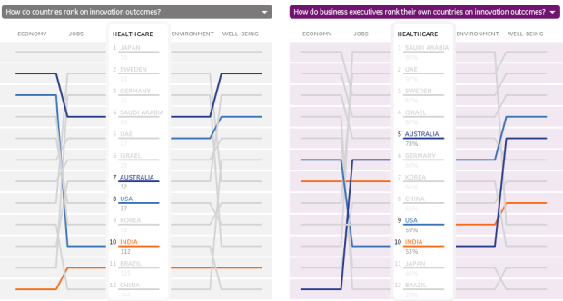
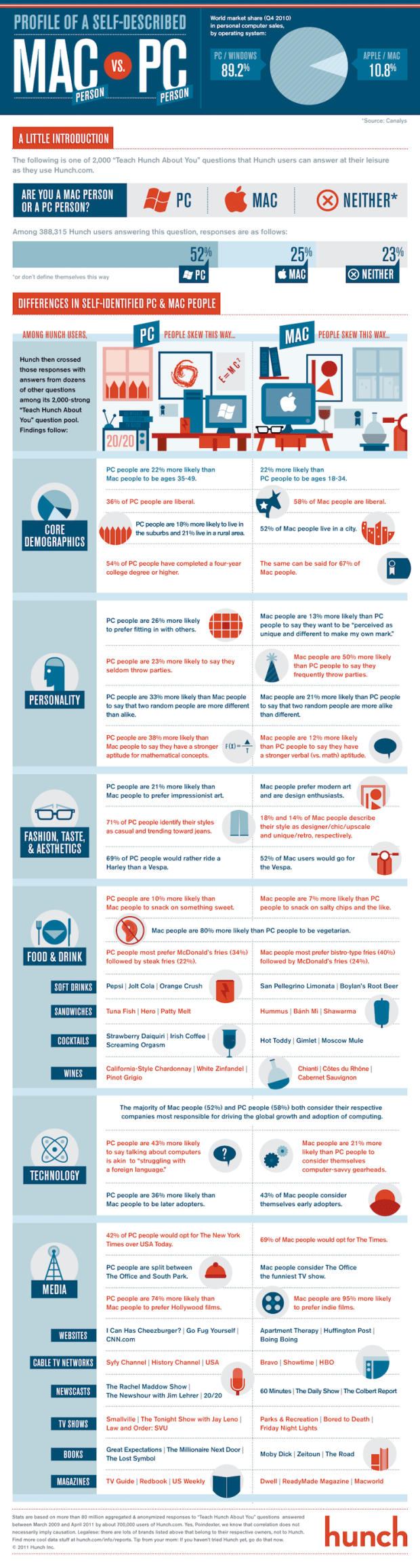
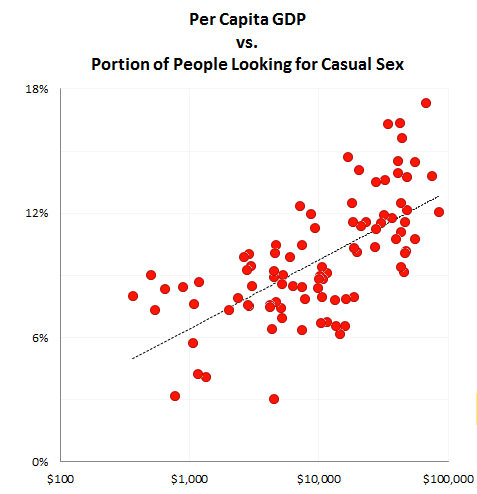
• Buffalo Snowfall Map Without LegendI saw this map of the average snow levels in Buffalo. I think I just glanced at it and that was about it. When you first look at the map, what do you make of the colors? When I see green for snow levels, I think no snow. Am I crazy? What do you think?

    So the image was kind of in my head all this summer while I was in NYC. When I told people that I was going back to Buffalo after my internship, they always gave this look that said, “Ha, have fun during the winter,” and then they would actually say it and then go into how they measure the snow level by comparing it against a giant pole.
    Read More

  • Mint LogoMint was released last week. It’s an online application that brings financial data from all of your credit card and bank accounts into one place. Think Quicken online and free.

    It’s super easy (only takes a few seconds) to add your financial accounts, and you only have to do it once. After you’ve added your accounts, Mint will update your data every night and compile them into useful reports. You’ll get an overview of spending trends, transactions, and even ways you can save money based on your current credit cards’ interest rates.

    So far I’ve found it useful simply because all of my data is one place. As I’ve made my way into adulthood, I’ve slowly accumulated more and more credit cards to the point where it’s kind of annoying to login to every account to see how much debt I have.

    One Small Annoyance

    My one gripe about Mint is that the spending trends and savings features haven’t been that informative, but I imagine will get better once more data comes in and Mint continues to tweak the system. My highest hope is that they do something about the dreaded 3-d pie chart…

    Mint Pie Chart

    Overall though, I’m looking forward to seeing Mint grow and develop into an extremely useful tool that brings all of your data into one place and represents it in a way that’s understandable and interesting.

  • Michael Mukasey Compared to His Peers

    Friday was my last day at The Times, and this past Sunday, my last graphic ran in the paper. The story discussed Judge Michael Mukasey’s past rulings and experience. Who’s Michael Mukasey? He’s up for the spot of the new attorney general of course.

    Anyways, I got to look through a lot of cool data on past rulings and busted out R for some statistical fun. This brought me to my last graphic. It compared Mukasey to his New York Southern District peers. You can see he’s been more strict overall but less strict in immigration cases. Unfortunately some spacing between each bar was lost in the web version; it looks much better in the actual paper.

    That’s not the most exciting part though.

    Read More

  • When I think airplanes and data visualization, I think of Aaron Koblin’s Flight Patterns. Aaron uses data from the Federal Aviation Administration to show flights all across the United States, including Hawaii and Alaska. Even without the presence of an actual map, you can see a basic geography and where lots of flights are going and coming from. Flight Patterns is an oldie, but still a goodie. Here’s a video:

    Speaking of flights, I’m currently waiting for my twice-delayed flight back to Buffalo. Thank goodness for free WiFi. Although it still doesn’t make up for the delays. I hereby shake my mental fist of rage at you, Jet Blue.

  • John Maeda, a professor in the MIT Media Lab, gives his talk on simplicity and how it plays a role in his position between technology and art. I read John’s book, The Laws of Simplicity, a few months ago, and yes, as many will tell you, it’s a pretty simple book. There are ten laws of simplicity that boil down to the main point — get rid of everything that’s unnecessary and nothing more. Although nothing earth-shattering, John’s book makes some good points and has some interesting anecdotes from his many trips to Japan and family life; it’s a nice read for some lazy Sunday. He’s also a pretty entertaining speaker, so sit back, relax, and enjoy yet another TED talk.

  • Today is my last day at The New York Times. Ten weeks and twenty something graphics later, I’m leaving NYC much more knowledgeable about data visualization and journalism and how they can make a powerful pair. It’s a bittersweet ending today.

    On the one hand, it’s been amazing working for such a prominent newspaper, but on the other, I’m also looking forward to taking a few days off doing nothing and then moving forward towards finishing, err, starting my dissertation. Do I know my topic? No, not really, but one thing’s for sure. Data visualization is what I want to do and I’ve been extremely fortunate to have learned from some of the best this summer.

    Onward ho.

  • Fortune CookiesMy roommate pointed out a couple of weeks ago that I always get Chinese takeout for dinner; however, we never get home at the same time, and most days, she’s not even in the apartment when I arrive. How could she, a very bright and educated individual, come to such a conclusion after seeing so little data?

    In fact, by my count, she only saw me bring home Chinese takeout twice before she decided that yes, I do in fact eat Chinese every single day of the week. In reality I rotate through four choices — sandwiches, Japanese, pizza, or Chinese with a few ventures out every now and then. This week I’ve had Japanese, hot dogs, Mediterranean twice, sandwich, burger, and Chinese.

    This is one of the reasons we need Statistics. What we perceive isn’t always the truth. I might have had Chinese takeout on Monday and Friday, but do you know what I had on the days in between? If no, can you make an educated guess?

  • USB PedometerI’m thinking it might be time to revive my step count data collection with a nifty USB pedometer from Brando.

    This Pedometer can store 3 days of step data and upload the data to your PC via USB! Through your data, the software can chart your outcome, view the calories burned and details on your daily activies. You can get easily to control your weight by this Pedometer and no over weight anymore!

    If I had this, it wouldn’t be such a big deal if I forgot to record a couple of days. As I noted in a previous post, one of the difficulties of getting good step data was simply getting it into the spreadsheet. This bad boy records 3 days worth of data. Plus the USB and software, I imagine, could make record-keeping a lot smoother. Plus no over weight anymore!

    Worth investigating, I think? The release date is somewhere November 2007. I’m about 1 percent positive that this could very well be as popular as the iPhone.

    [via Gizmodo]

  • Stata LogoFor those interested in or who already use Stata, the first Stata users group on the west coast is coming up on October 25-26. It’s $150 for both days and of course students get a good discount at only $50. I’m an R user myself, but to each his own.

    Stata Users Group meetings started in Britain in 1995 and have spread to Italy, Sweden, Germany, The Netherlands, Spain, Australia, and the East Coast. Talks are intended to be accessible to a general audience with mixed levels of expertise in Stata and statistics. Stata developers will also attend, both to present new Stata features and to take notes during the popular “Wishes and grumbles” session. We hope you will consider joining the meeting as a presenter or an attendee.

  • When I tell people that I’m a graduate student in Statistics, there are two responses that I get more than any others. The most popular of the two usually goes something like this.

    Oh man, I hated statistics in college. The professor totally sucked and I never knew what was going on. All I remember is mean and some… curve thing? I don’t know. What’s standard deviation anyways?

    I threw that standard deviation bit in for effect. No one actually asks about it, and I’m pretty sure most people don’t even remember ever hearing about it. It’s that whole selective memory thing — blocking out the bad and remembering only the happies.

    So anyways, every time someone tells me they absolutely hated statistics in college, I die a little inside and start bawling like a two-year-old whose lost her bottle. No, no, I’m kidding, but the first thing I think is, “Gee, thanks for letting me know that! Like I really wanted to know that you hate what I study. You know what? I think I hate you a little bit now.” I’m exaggerating a tad, but it’s slightly frustrating after hearing it so many times.

    But why do so many people hate statistics?
    Read More

  • Border-Crossing DeathsWith a stricter border patrol, more Mexican illegal immigrants are taking dangerous routes to get into the United States. As a result, treks through the dehydrating Arizona desert have caused a significant number of deaths. Most likely there are more deaths than this graph indicates because the data was only for deaths reported by the Border Patrol. There could very well be cases the Border Patrol did not handle or knew about.

    This graph was straightforward, mainly a waiting game for data from first, the Government Accountability Office and then the Border Safety Initiative. Take a look at the GAO report done last year, reporting a double in border-crossing deaths from 1995 to 2005. It’s a little odd though that they use numbers from two different sources, so take it with a grain of salt.

  • I actually did this graphic some time last month for the Week in Review. Slipped through the cracks somehow. It was a slightly different experience doing a graphic for this desk, because, well, I guess they don’t request graphics very often.

    As an aside, I just realized that old Times links are behind that silly TimesSelect thing, which kind of sucks. I hear TimesSelect is going to be free sometime in the near future though. Good.

  • In a previous life, I thought anything published in an academic journal was legit, but as a stat student, the story is quite the opposite. Whenever I hear results or see data from some study, I become an instant skeptic.

    Were there really that many deaths from 1998 to 2007? Did housing prices really increase that much over the past decade? Do that many people really support that presidential candidate?
    Read More

  • The greatest value of a picture is when it forces us to notice what we never expected to see.

    — John W. Tukey. Exploratory Data Analysis. 1977.

    Love it. Great words from the father of exploratory data analysis. Have an excellent weekend.

  • Housing BurdenArcGIS can do a lot for you in terms of speeding up the mapping process, which is great, but here’s my dilemma: do I really want to put in all the time to figure out how to use the software?

    I think the basics is good enough for me and any further than that, I’ll let a mapping expert take over. However, I know that spatial analysis is something I’m going to pursue, so… I’m really back and forth.

    On the one hand, ArcGIS has a lot of functions, but on the other hand, it’s not especially easy to use all those functions. For example, I was doing a join between two data tables, but it wasn’t working at first because the column on one table didn’t have leading zeros (e.g. 1 instead of 01). By “not working” I don’t mean that columns weren’t joining. I mean that I couldn’t select this column and that column to join by, so I couldn’t even get to the step where I knew I had to change something. It’s little things like that that bug me and make me think that ArcGIS is inflexible.

    Plus, it sure does like to crash.

    I don’t know.

    I probably just need more experience. How about this. I’ll just learn what I have to, but I’m not going to go out of my way to become an ArcMap expert. Yeah, that sounds OK to me.

    And on that note, here’s the map I made. Color scale was the main thing I had to fuss with. Too many shades of gray lead to a muddled graphic in the paper even if it looks fine on screen. The map shows the percentage of people who spend 30% or more of their household income on housing. Of course, California leads the way.

  • John Snow Cholera MapIf you’ve read any books on visualization, without a doubt, you’ve seen John Snow’s now famous cholera map. In 1854, people were dying in large numbers and high frequency, but nobody knew what was going on. John Snow solved the mystery with his map.

    It’s crazy to imagine a time when people didn’t think to map data, especially now as mapping data has become second nature for some. Steven Johnson, author of Ghost Map, goes into depth on the Cholera outbreak in London in his book and TED talk earlier this year.

    I’d embed it, but I can’t find the link anywhere on the TED page. They probably had to make it less obvious after Hans Rosling’s talk spread at the speed of Cholera in London in 1854. London hasn’t had another outbreak since Snow’s simple (for this day and age) but effective visualization.

    UPDATE: Here’s Steven Johnson’s TED talk

  • The above picture isn’t totally related, but I just had to put it up. It’s so amusing. A family of five plus groceries on one motorcycle! I think there’s room for one more on the handle bars.

    So in efforts to make the above picture relevant…

    If I’ve learned anything during my internship, it’s how to display as much information as possible in a small amount of space. Two things have helped me in trying to achieve New York Times graphics department worthiness:

    • Decide what data / information is important
    • K.I.S.S. — Keep it simple, stupid. (The Office, Thursdays on NBC)

    Decide What Data is Important

    When you get a large data set, your first impulse might be to show all of it. For some cases, like exploratory data analysis (EDA), this is what you want. However, when you’re trying to show off results or display some kind of idea, then you might not need to point to all 100,000 values in your data set. Instead, evaluate all the data you have and then ask yourself what interesting thing in the data you’re trying to show.

    Keep it Simple

    Once you’ve established what the point is, make sure your graphic draws attention to that point. Don’t clutter with giant labels or overly bright colors that overpower your graphic’s main idea. For example, if you look at a bar graph, I don’t think the labels should be the first thing you notice. Rather, you should notice the bars, the real meat of the graphic, first and then recognize the labels second.

    Oh, and don’t forget about white space.

    Super busy graphics are just plain hard to read. Let the data breathe.

    I guess my main point is that you can try to display as much information as possible in a small amount of space, but if you’re not careful and put too much, your motorcycle will tip over. See what I did there the whole motorcycle idea? You know, full circle. Circle of life. Hakuna matata. Oh forget it.

  • Two more graphics — one ran on Sunday with a story investigating lifeguard competence and the other went yesterday with a story on religious books (or lack thereof) in prison libraries. Probably the most challenging part of both graphics was figuring out what to show; there wasn’t exactly a ton of data to choose from.

    Less than Satisfactory Lifeguarding

    I knew this was running on Sunday, but when I checked online, I didn’t see it. I was a little disappointed, because it kind of sucks to make a graphic and then find out it was grilled. Luckily, that hasn’t happened to me yet. Knock on wood. My lifeguard graphic wasn’t on the Web, but it was in the paper.

    Lifeguards and Drownings at Beaches and Pools

    The graphic started as just small squares, but the results looked like they were missing something. It just looked like 32 tiny, shaded squares. They needed more context, so I highlighted incidents in which there were some serious lifeguard screw-ups. I think the excerpts make the graph a lot more human. What do you think?

    Read More

  • Chris Jordan’s series, Running the Numbers: An American Portrait, just opened this weekend in Los Angeles at the Paul Kepeikin Gallery. Chris depicts large numbers in a way that we can see, because oftentimes, big numbers are hard to imagine. For example, he recreates Georges Seurat’s famous painting, A Sunday Afternoon on the Island of La Grande Jatte, in the form of 106,000 aluminum cans — the number used in the US every thirty seconds. There are others like the number of plastic bags used every three seconds (60,000) and the number of brown paper supermarket bags used every hour (1.14 million).

    If you’re in the area, it should definitely be worth going. I wish I could. As Chris notes, it’s one of those series that you have to see in person to get the full effect. The shear size of each piece allows you to feel the largeness of it all.

  • Wall Street Journal put up a nice little graphic showing the evolution of the iPod along with Apple’s stock price. Semi-informative, I guess. Probably more of a fun graphic than anything else. I think it’s slightly misleading, suggesting the iPod was the only reason Apple’s stock changed. Let’s not forget about the iBook, iMac, Macbook, etc releases. Nevertheless, it’s cool to see Apple’s sexy design over the years.

    [link via Core77]