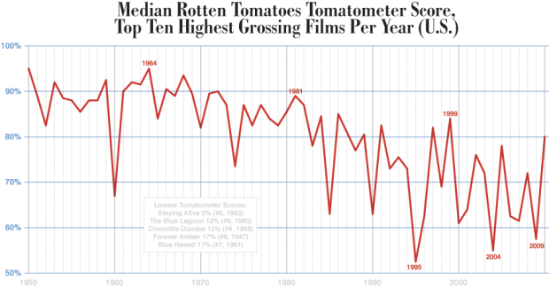
• Iraq Senate VotingFor what seems like forever, Democrats have been trying to get Republicans to agree to some kind of timeline to pull troops out of Iraq.

    On the surface, the graphic seems pretty straightforward, but the research took me forever. I had to look through past Times articles to find suitable lead ups to the actual bill being proposed. We were looking for something specific like another version of the proposed bill. In retrospect, I’m not quite sure why it took so long. Maybe because it took me a while to pin down just exactly what direction I wanted to take it. Anyways, once I got the background info, it was just a short time of the boss whizzing through Illustrator hot keys and tada, we had our graphic.

  • As the second day of the New York taxi strike begins over GPS and credit card technology, I’m left wondering what taxi drivers are making such a big fuss over. First, drivers are complaining that GPS is an invasion of privacy, and second, they argue that credit card transactions will cause a decrease in profits due to credit card fees.

    Starting with the credit card transactions, I’m about 80% sure that drivers don’t have any actual data to back up their claims that they’re going to start making less money. Non-strikers say that the credit card capability will not only help business (by bringing in those with corporate credit cards), but also increase tips. This information comes from cabs that are already equipped with the proper gizmos.

    What are taxi drivers trying to hide? What is this invasion of privacy talk? These drivers are working for a large company. I repeat, they’re working. I don’t demand a private office when I’m at work, and I don’t see much reason drivers should care a whole lot. If someone is slacking, taking shady routes, or just plain doing something they’re not supposed to do, then they should be held accountable. Unless I’m mistaken, I don’t recall a whole lot of whining when San Francisco cabs had similar equipment installed.

    So stop the fuss, and just mondernize up to the proper century, New York cab drivers. I’m sure Stamen Design and Cabspotting* would greatly appreciate it.

    *I am not associated to either.

  • Order From Randomness Data Browser

    Order From Randomness has an extensive data collection featuring 360 variables describing all 50 states. The indicators are placed in 25 groups including birth rates, death rates, disease, environment, energy, nutrition, and education.

    Most of the data seems to range somewhere between 1999 and 2005, and I believe there’s four variables to 2007. There’s also a simple data browser featuring a distribution curve and some summary statistics. Generally, students seem to like the extensive set of variables, says one of my professors.

  • With more Many Eyes fun, Aron Pilhofer put in part 2 of his original post. I was pleased to see the first post get 56 comments, but I think part 2 might have gotten lost due to the high post frequency, with the U.S. Open fully on. Still worth a look though.
    Read More

  • Ribbon GraphKarl Broman has an amusing list of the top ten worst graphs found in academic papers.

    One of them, very sadly, was actually from the Journal of the American Statistical Association, a very prominent statistical journal. It just goes to show that some have an eye for data, and others might have an eye for visualization, but one doesn’t necessarily lead to the other. Don’t forget to read the discussion on why the graphs are um, not so good, so that we can all learn from the mistakes of those before us.

    My personal favorite is the 3-d ribbon graph, because it’s just so ugly. Why would anyone use that? Too many shades of gray mixing, too many lines crossing, too many dimensions. Brain overload.

    I guess the graph was made in 1994, so I could cut the authors some slack….

    No, they’re just bad. I was making way better graphs in Excel by that time for my seventh grade science fair project — What Cereal do Red Flour Beatles (Tribolium castaneum) Prefer?

    Look what you’ve done Microsoft Excel. Apologize for what you’ve done this very minute.

    Oh, and they preferred Cheerios and stayed away from the Grape Nuts.

  • Five of my graphics ran in the paper today in a special labor day weekend segment, What to Expect When You’re Electing. The past few days, I and those I talked to have been referring to them as the labor day graphics, so I was surprised to see them go today. Nice Sunday treat.

    Gallup PollThe first graphic changed form a few times. It began as a bubble chart to a stacked bar and then to the pies. An editor quickly pointed out that the bubble chart indicated that the percentages were separate, but they should be represented as a whole. Good point, so I toyed around with a stacked bar chart, but it just didn’t look right, given the alloted space. Hence, the pie charts. I’m not a big pie chart fan, but this one seems to work for me.


    What They RaisedA graphic about the amount of money candidates have spent, have, and raised, this graphic’s stacked bar chart base was fairly straightforward. However, it’s the styling and organization that took the most time, as is often the case. I’ve come to learn that it’s very easy to make a graph, but it’s the styling and organization that really makes a graphic worthy of being in the paper.


    Early Contest CalendarOther than the fact that the calendar is changing from day to day and the whole primary versus caucus stuff is kind of confusing, this graphic was pretty straightforward. I put in shades of gray to make things more readable.


    Candidates’ Internet Market ShareI thought this presidential Web site data from Hitwise was pretty interesting. Based on estimates, we can see what presidential Web sites are getting the most traffic. The tricky part was getting the wording right for the headline and lead-in so that readers would know what the percentages meant.


    Mega Primary VotingClearly very straightforward, Pledged Delegates, on the contrary, took the most time out of all five graphics. The construction was simple, but finding the correct numbers took time. Schedules are changing, the definition of a pledged delegate is different by state, and the whole nomination process is fuzzy. Nevertheless, towards the end of Friday, some somewhat reliable numbers came in.

    That’s all. It was fun putting this group of graphics together. I got to learn about the nomination process and most importantly, learned more about style and organization. Good stuff.

    As I sat at my desk this week, working on these things (and one other coming soon), I thought to myself, “I can’t believe I’m getting paid to do this. This is too entertaining.” You know, this whole internship has never really felt like work, which I think is a good sign that I’m headed in the right direction towards data visualization.

  • On their new exploration section, Twitter blocks is available for viewing and use. The viz is in Flash and is supposed to allow you to explore your neighbors as well as your neighbors’ neighbors. I think the higher up the blocks are, the more recent. It’s kind of hard to say. Other than that, I’m actually not really sure what I’m looking at. I thought it might be because I’m not following that many people, but I viewed the blocks for the public timeline and still had trouble deciphering. Maybe others will have better luck.

    Update: Michal posted on the feedback they’ve been getting on Twitter Blocks that’s certainly worth reading:

    So we get this a lot: “Beautiful! But useless!”. We’ve heard it in response to most projects we’ve done over the past few years (one exception has been Oakland Crimespotting, whose stock yokel response is: “no way am I moving to Oakland!”).

    This kinda surprises me. I think their other projects are pretty useful and informative.

  • I’ve been back and forth on whether or not I wanted to post about this. Two reasons: I feel blasphemous feeling this way; and I’m not sure if I’m working for or against my hopes for data awareness. I also think I might be getting some mild form of carpal tunnel. Ow.

    I’m a graduate student in Statistics, and I don’t like Swivel. Why? How is that even possible? All of my work encircles data, I blog about flowing data, and I read about data. So why can’t I force myself to enjoy the “tasty data treats for data geeks” offered by Swivel?
    Read More

  • I’m not even going to pretend I know anything about how Statistics and vision go together. That’s not to say that they don’t go together, because they do. Otherwise there wouldn’t be a whole center at UCLA, the Center for Image and Vision Science, a group of statisticians, computer scientists, and psychologists. Lots of modeling involved, lots of data, and lots of applications from security to medical imaging to assisting the visually impaired.

    Nathan as a BabyWith that being said, I came across Face of the Future, which was setup by a computer science group at the University of St. Andrews. They have a face transformer, averager, morpher, and detection. You can upload your own images for the transformer and averager. (The averager wasn’t working when I tried it.) The transformer will do some image processing on your face, and from there you can see what you might look like as a baby, teenager, old adult, and different races. Fun stuff. I would show all the pictures from my little experiment, but they’re kind of creepy.

    Nathan as a Simpsons CharacterOn a somewhat related note: have you ever wondered what you look like as a Simpsons character? Well now you can see for yourself. Burger King and The Simpsons have joined forces to provide you with the Simpsonizer. Undoubtedly, there’s some image processing and statistics flowing around in that black box. My Simpsons character actually looks quite a bit like me.

  • There was a post on The Times U.S. Open blog debating on the state of American tennis compared to the rest of the world. Right in the middle of the post, what do we see? It’s a Many Eyes thumbnail!

    There was some discussion on the the decreasing trend shown in the graph, but as the graph only shows American tennis data, the obvious next step would be to show what the rest of the tennis population (i.e. Europe, etc) would look like.

    In any case, it’s nice to see Many Eyes creeping into popular media.

  • Unbelievably, I’m already in my sixth week, with this week practically over. I create graphics more efficiently (although I’m still constantly learning) than I did in my first week and have gotten a better idea of The Times style and the process of how a graphic gets put into the paper. Here’s my last three graphics that have run in the paper.

    Convincing Data, sort of

    This past Sunday, the Real Estate section had a story on the rising Manhattan apartment prices and the declining apartment inventory. The Manhattan trends were then compared to national housing inventory, which shows (somewhat) of an increase, opposite that of Manhattan.

    Manhattan Inventory Versus National Inventory

    I wasn’t especially excited about graphing this data, because I wasn’t sure how confident I was in the national inventory estimates. Is national housing inventory really increasing? On the order of millions, a small move up or down in the order of thousands could drastically change how that line looks. I had Manhattan inventory data though, and it at least looks like something is going on there.

    Read More

  • I don’t want my credit card numbers floating around, because then I’d be screwed. That kind of data needs to be locked up tight behind a billion firewalls, a lock safe, five armed guards, and another locked safe and then one more guard plus another safe. However, there are lots of other kinds of data that should be online and publicly available or at least accessible via a phone call.
    Read More

  • A huge 8.0 earthquake shook Peru a few days ago killing at least 510 people. Homes and buildings were destroyed and many people’s lives were changed forever. I’m ashamed to admit that if it weren’t for my internship, I probably would have never even known about the quake. I hope a lot of help is headed towards Peru.

    This map graphic was a bit tricky because it was made for color in the paper. That means the color layer and text layer had to be split and sent separately to the printers. It’s this odd process, that I’m afraid I don’t quite understand, but the color printers are in a different place than the black and whites. The color part gets printed, and since the text and color is separated, there’s still time to make any last minute changes to the black and white. Uh, scratch that. That’s probably wrong.

    One of the map people provided me with the base map and then I filled in the blanks i.e. everything that isn’t land and water, and after about one billion back and forths I finally set it and was able to leave a couple hours later than usual. To top things off, some of the text was different in the paper today than I had put in.

  • The well-known college rankings are now available for your viewing pleasure. Whether the ranking system is legit or not, I’ll let you be the judge, but I think everyone should take note that UC Berkeley was again the number one ranked public national university and UCLA was ranked number three. Go Calee-forn-ee-ah! In a nutshell, here’s what U.S. News ranks the universities:

    • Peer Assessment – 25%
    • Retention – 20% in national universities and liberal arts colleges and 25% in master’s and baccalaureate colleges
    • Faculty Resources – 20%
    • Student Selectivity – 15%
    • Financial Resources – 10%
    • Graduate Rate Performance – 5%; only in national universities and liberal arts colleges
    • Alumni giving rate 5%

    I wonder how much bias is in peer assessment.

  • Terrorist Attacks in Iraq

    Two hundred and fifty people died a couple of days ago in the deadliest attack deadliest attack of the war. We compiled a list of the most deadly attacks since February and then mapped them out. It was a team (and by team, I mean two) effort — I collected the data and a co-worker mapped it out.

    In this case, I went through old Times stories and took note of attacks that killed 20 or more people. It was really depressing reading all that stuff, but I’m definitely better for it. Without a doubt, I know more now than I ever have about what’s going on in the world.

    As you can see, my co-worker went with the old bubble map standby. I wish we could show the data differently than the usual map, but what type of visualization would that be?

  • Big Mac meal from McDonald’sEvery now and then I indulge in a Big Mac meal from McDonald’s. I feel satisfied while I eat the burger and fries and suck down my diet soda, but afterwards I feel sleepy, sluggish, and fat. Today was one of those days.

    As I ate my my satisfying-not-so-satisfying meal, I wondered what the Big Mac price differences from state to state or even city to city. I know that there’s data going around about Big Mac prices in different countries, but I’m pretty sure it varies quite a bit in the U.S. alone. I don’t remember paying over $6 for the number 1 in California. What a jip (and yet I’ve been to the golden arches at least three times in the past month).

  • PedometerI began my path of higher education at Berkeley as an Electrical Engineering and Computer Science student. As a stat graduate student, it’s hard to remember sitting in all of those (boring) engineering classes.

    If I learned anything though, it was from the painful computer science projects. No matter how big the project, I would start by breaking it up into lots of mini-tasks and work my way up to the final solution. I think this has helped me a lot not only in grad school, but solving problems in my life. Hence, my first attempt at continuous data collection has started at a very basic level — my pedometer.

    Read More

  • Five Romney Brothers

    As you might know (or don’t know), Mitt Romney is vying for the Republican presidential nomination. His five sons have all lent a helping hand to the campaign.

    This graphic is really basic, but sadly, it took me quite a while to finish. I thought I had finished it efficiently, but there were a bunch of style things I had to change e.g. how I cropped the mugshots. On my first pass, I had cropped the pictures in a way so that there was white space in between each brother. Of course, as I know now, that was a waste of precious space, and it looks a whole lot better this way.

  • While doing research on the process of rebuilding New Orleans after Hurricane Katrina and the U.S. Army Corps of Engineers, I’ve run across a frequent critic close and knowledgeable watcher of the New Orleans rebuild: Robert Bea. I don’t know much about him except that he seems like a very nice man. I found this on his Berkeley homepage:

    The world needs engineers who….

    • whose truth cannot be bought,
    • whose word is their bond,
    • who put character and honesty above wealth,
    • who do not hesitate to take chances,
    • who will not lose their identity in a crowd,
    • who will be as honest in small things as in great things,
    • who will make no compromise with wrong,
    • whose ambitions are not confined to their own selfish desires,
    • who will not say they do it “because everybody else does it,”
    • who are true to their friends through good report and evil report, in adversity as well as in prosperity,
    • who do not believe that shrewdness and cunning are the best qualities for winning success,
    • who are not ashamed to stand for the truth when it is unpopular, and · who have integrity and wisdom in addition to knowledge.

    Please help me to be this kind of engineer.

    Bob Bea

    This can certainly be applied to statisticians as well. Please help me be that kind of statistician.

    UPDATE: Just did some back and forth email with Professor Bea. He IS a nice man.

  • If I’ve learned anything in my first month at The Times, it’s that ArcGIS and Microsoft Excel are not worthless.

    For a while now, since I started grad school, I had this beef against Microsoft Excel. I hated how everyone used it and how I didn’t have the money to buy the Office suite or even cared enough to want to buy it. It seemed so limited in what it could do compared to a quickly setup MySQL database.

    Then last year, I took this crash course on ArcGIS. It was four days, eight hours a day of mapping. I hated ArcGIS after that workshop. The whole software suite seemed sluggish, bloated, and so not worth my time.

    Today I saw some ArcGIS and Excel proficiency I had never seen before. My co-worker flew through giant spreadsheets, punched in formulas, and joined columns left and right. It was quite the scene. Once the data were prepared in Excel, she shot it over to ArcGIS. She quickly loaded a shape file for all counties in the Tri-state region, changed some limits, and voila, a few seconds later we had the map we needed. Put in some labeling, some numbers, and the graphic was complete.

    Yes, ArcGIS and Excel are worthwhile.

    I have so much to learn.

    Growing Minority Populations