After seeing this article and graphic on the rising cost of food in The New York Times week in review, I was curious about how prices for other stuff has changed in the past year. The Bureau of Labor Statistics provides this data monthly via Consumer Price Index (CPI).
Why they have to provide it in an equal-spaced text file over a plain CSV or a spreadsheet still confuses me, but at least they publish the data regularly, which is more than I can say for other government departments. I originally wanted to see how obesity rates have changed over the past year, but the Centers for Disease Control and Prevention (CDC) hasn’t updated obesity trend data since 2009.
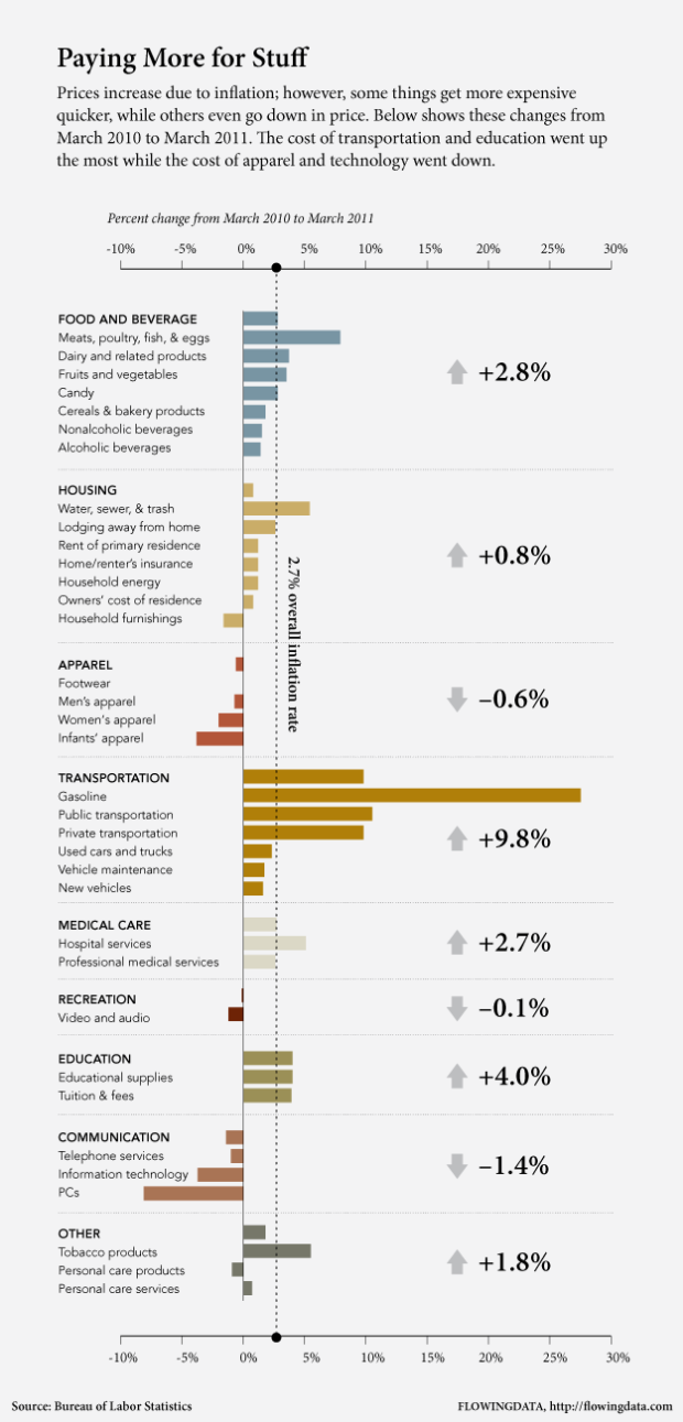
In any case, price changes alone are still interesting. Relative to overall inflation (2.7 percent), transportation prices increased the most by far, at plus 9.8 percent. The cost of gasoline alone went up 27.5 percent.
Education also took a hit, going up 4.0 percent. Meanwhile, the cost of apparel and technology went down this past year by 0.6 and 1.4 percent, respectively. Having a baby? Now might be good time to buy some onesies.
 Visualize This: The FlowingData Guide to Design, Visualization, and Statistics (2nd Edition)
Sorry, but do a tiny bit of research before complaining about the CPI format. Just off the top of my head, here are three ways to overcome your problem.
You can find many, many formatting options through the “Databases” section of the CPI homepage.
http://www.bls.gov/cpi/#data
You can download the data direct if you know the series code you want (CPI = CUuR0000SA0) by going to the “Series Report” page on BLS.gov.
http://data.bls.gov/cgi-bin/srgate
You can get multiple CPI series in multiple formats, with graphs and data transformations, from the St. Louis Federal Reserve Bank’s FRED site.
http://research.stlouisfed.org/fred2/categories/9
@Russ – Thanks for the refs. I’ve used the first two at one point or another. My main point about the format is that all of it is outdated. The databases tool in particular really shows its age once you start looking for multiple datasets.
Great graphic
One thing that might refine the graph a little further is a distinction between “core inflation” and “overall inflation” (CPI) – although it might start to get pretty crowded with two dotted lines…
P. Krugman has a very brief but good writeup (with a pretty good line graph too!) explaining the difference: “core inflation” excludes Food and Energy costs because they’re so much more volatile than other indices – and its what the Fed uses to inform policy making decisions.
CPI is based on the overall inflation trend…
I agree. A core inflation benchmark would be better, or at least complementary to the overall inflation line.
The current line actually provides little info–it’s more or less the average of all the data represented. The core inflation is a better baseline rate.
@Blisko — Thanks. I’ve learned something new. For clarity’s sake, the change for all items less food and energy is 1.2 percent for the same time period, which can be found here (PDF) in Table 1: http://www.bls.gov/cpi/cpid1103.pdf
Forgot the link to Krugman’s piece:
http://krugman.blogs.nytimes.com/2011/04/26/data-miconceptions/
Interesting graphic, wondering what such a graph would look like for the Netherlands.
Is there any reason why you picked the vague color for Medical Care? It’s harder to distinguis from the background then the other colors.
I’d like to see this expressed in a “weighted” format. The chart says that overall inflation is 2.7%. But what is inflation when you consider how much or what percentage of our income is spent on these items. If you spend significantly more of your income on energy expenses then might our overall inflation impact be greater than 2.7%.
Nice breakdown, but I wonder what the Tax portion would look like… In Canada, a family with an average income of around 70,000+ would expect to pay over 40% of their income on taxes.
http://cnews.canoe.ca/CNEWS/Canada/2011/04/26/18067236.html
from the story:
“In 1961, the average Canadian family spent 33.5% of its income on taxes, and 56.5% on food, clothing and shelter, the study found.
The report found that since 1961, the average family’s tax bill has gone up by 1,686%. Over that same time period, spending on shelter increased by 1,175%, spending on food went up 498% and spending on clothing went up by 510%.”
also note that the above revolves around what consumers are ‘paying’, not the actual ‘cost’ of items
Another strange facet of this data is that apparel prices have decreased. As someone who works in the clothing business I can say with absolute certainty that this is not true from the manufacturing side. Raw materials prices have risen, cotton especially, as well as the cost of labor in China, all of which have yet to be reflected at the retail level.
Towards what / whom did our dollars go?
I’d like to see these chart bars segmented by their components into stacked bars.
I often hear, for example, that changes in food costs are effected most by energy/tranport costs and supply & demand for commodity futures.
communications services down are due to social media networks like twitter and Facebook
these companies must be cursing themselves because facebook took their good share of revenue :D
Natan: Which software did you use to make this graph? Was it R can you share the source code? Thank you, that was very interesting.
Hi,
Nice graphic and write up.. but I’m wondering.. you why are using the CPI which i don’t see as accurate at all.
The US Govt. much be looking at the cost of Campbell’s soup or a Taco Bell burritto (in other words, very cheap, low nutritional, high chemical value foods). Because food that is nutritious has my food budget up 25% since the first of the year. We eat meat and eggs (organics.. if you don’t eat organic you are eating meats that are fed GMO corn and soy.. which in the EU has been proven to lead to 100% sterility in 2 generations from eating a GMO based diet, as well as Alzheimer’s, strokes, heart disease, cancers, etc etc..which is why they don’t allow GMO there), beans in non-pba cans, organic fruits and veggies.. corn chips that aren’t fried, corn tortillas.. all organic. Because if it’s corn, wheat, soy bean or rice.. and it’s not organic, it’s GMO.
I pretty much ONLY buy things on sale, and in season. Out of season is way way too expensive as is the regular price. 6 months ago, we gave up cheese and wheat products except on rare occasions (just too expensive) and limit dairy to plain yogurt.
The bottom line is.. we’ve cut things that are pricy 6 months ago.. and we still are up 25%. And in 2010, it went up 25% by last summer.. then the fall settled down to the new prices and didn’t go up.. until this January/ February. It’s about 45% overall (from $500 to $725 a month for two people).
Essentially, I have to be my own FDA / EPA by reading the EU studies and data. So where is the price data on eating healthy, real actual healthy food, and what that costs in the US?
I think you would find it’s a lot more than up by 4-5%. if you are going to avoid plastics and pesticides (hormone disrupters and cancer causers, specifically prostate and breast cancer), GMO, and produce grown with chemical nitrates (causes the vitamins to be cut in half and the psyllium to double or triple which turns into instant sugar.. one link to the massive increase in type 2 diabetes in the US) you are going to spend 25% more than you would have 6 months ago.
Forget about soda, sugary drinks of any sort, desserts other than an occasional thing we bake, foods out of season, cheese, junk food, fast food.. that’s all way too expensive for the nutritional value.
I’d love to see a healthy food cost index and pricing over time.
mary