Arthur Buxton breaks down van Gogh paintings for a view of color schemes. My instincts tell me you are either loving this or hating it like the black plague.
[Arthur Buxton via Flavorwire | Thanks, Elise]
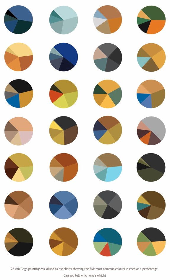
Arthur Buxton breaks down van Gogh paintings for a view of color schemes. My instincts tell me you are either loving this or hating it like the black plague.
[Arthur Buxton via Flavorwire | Thanks, Elise]
 Visualize This: The FlowingData Guide to Design, Visualization, and Statistics (2nd Edition)
New tools, refined process.
Love!
beautiful rendering as a visual art; the human eye is trained starting at birth to look for symmetry, and this piece understands that quite well.
however, it is practically space-wasting as an infographic (no amount of data can be derived since the answers are hidden!)
I like it as a piece of art. I would like to see people try to guess the painting from the pie chart. I think 2,2 (from top left) is Starry Night.
It looks as if Van Gogh’s paintings were analyzed in their unrestored condition, or from online snapshots without the correct color. And why is white not one of the colors? Maybe it’s okay as a tool for picking a color palette, not great as analysis of art.
Though I can appreciate the effort here, I think some data just doesn’t need to make its way into pie chart form.
Pingback: Van Gogh Visualizations | Kindrapolis
it would be nice to see this for various artists–seems you could tell a lot about them just from the overall palette they used. You can see here that Van Gogh used a lot of earth colors–it would be interesting to see Gaugin or Matisse.
If you happen to visit Holland, you should visit the real living van Gogh: http://janvangogh.com/
At first I thought this was truly horrible (so many pies! eek!) but I quickly realized how useful it would be if I could get a color distribution for any given document (especially a web page) to get a working palette.
in each instance you reduced his impressionist paintings – loaded with colors – to FIVE colors. The point of reducing to five is weak novelty, rather than any kind of study. You’ve reduced this to something 20 x simpler than paint by number.
Look at his paintings, and be blown away by his variety and uncanny use of color. Chart THOSE, and you have something noteworthy.
Well said. I was trying to guess some of the pies and quickly realize it is impossible considering the many paintings he made and the amount of colors in each of them. Furthermore, dismissing less used colors that are used for focal highlights (i.e. near white and warm colors in Starry Night) is a big mistake considering the distribution of these colors is an important principle of design. These don’t even work as basic color schemes.
And no, I don’t hate this like the plague. It just needs more – and as it is, is unworthy of the painter.
I love this. his palettes were absolutely wonderful and reduced to this pure form, the colors speak so vibrantly! I know I’m asking for trouble. but I’ve got a designer’s brain and this makes sense to me in a way that his paintings sometimes don’t.
I’m afraid I agree with the bulk of the ‘haters’ of this. I think the idea, in theory, is a good one, but without something to further explain the infographic (if it can indeed be called that) is nothing more than different coloured pie charts.
Also, it’s Monday and I’m grumpy, so very little is likely to impress me today :-P
Scott: you would THINK he used a lot of earth tones by this simplification. But it’s why this is so misleading and ultimately, inaccurate.
ARTHUR: try copying ALL the colors in a given painting, and arrange THOSE by their relative acreage. That isn’t impossible with the eyedropper tool in photoshop. I bet that would be infinitely more interesting than five.
Or, hey, carry this forward: Rothko may not have used 5 colors in some paintings. Jackson Pollock: 50% white, 50% black.
Or, let’s just read the Cliff’s notes instead of original classic literature. Maybe those can be reduced, or turned into a graph. Hmmm.
Sample any given music, using 5 notes. That might have merit. Try it on a toy piano while you’re at it.
That gets the essence of the music, right?
Me? I like that you gave us something to talk about, so in that, you have done something worthwhile. Kudos! And yes, I find that I AM inspired:
I’m going into the kitchen for a piece of pecan pie with hot coffee. Thanks everybody.
Nathan,
You were eerily prescient because I don’t like this at all. I found my way here from cartographer Tim Wallace’s place. He seemed to like this post.
I studied art history. I visited Tim Buxton’s blog which was provided as the source, hoping to get additional explanation. Nada. I’m looking at a grid of earth-toned pie charts. They seem to take the wonder that is Vincent van Gogh and reduce it into, well less than nothing. That sounds so negative. I’m sorry.
But I might have failed to notice something of significance. Is there anywhere that identifies which color wheel corresponds to each of Vincent van Gogh’s art works? Probably is right in front of me and I failed to see it!
Hope all is well for you! Flowing Data keeps getting cited in one blog after another! Good job.
Regards,
Ellie
I appreciate the efforts. It’s like the Cliff’s Note of van Goh!! LOL
Can you love the black plague?
I don’t understand the more angry responses here. I understand if you think this was a pointless exercise, but some people are reacting as if these images were created with the intent of replacing Van Gogh’s paintings.
I think they are an interesting curiosity, but nothing more.