
I found this on Serious Eats, but it looks like it’s from a book. Anyone know what book it is? This picture is awesome. Maybe one day, with enough practice, sweat, and tears, you will be able to tame the breath of the dragon.
Read More
Happy Friday, everyone. If you’ll allow me, I’d like to take a moment…
I found this on Serious Eats, but it looks like it’s from a book. Anyone know what book it is? This picture is awesome. Maybe one day, with enough practice, sweat, and tears, you will be able to tame the breath of the dragon.
Read More
Last week, there were rumblings over the end of the Statistical Abstract, and I suggested that it was just a sign of changing technologies. I thought that Data.gov and similar sites were the natural progression. Here’s the problem with that argument. Congress is planning on shutting down Data.gov and other transparency sites in the next few months.
Read More
My many thanks to the FlowingData sponsors. Without them, this blog would probably be a big collection of posts apologizing for not posting in a long time. Check out what these groups have to offer. They help you make use of your data, and you can try all of them for free.
IDV Solutions Visual Fusion — Business intelligence software for building focused apps that unite data from virtually any data source in a visual, interactive context for better insight and understanding.
InstantAtlas — Enables information analysts and researchers to create highly-interactive online reporting solutions that combine statistics and map data to improve data visualization, enhance communication, and engage people in more informed decision making.
Tableau Software — Combines data exploration and visual analytics in an easy-to-use data analysis tool you can quickly master. It makes data analysis easy and fun. Customers are working 5 to 20 times faster using Tableau.
Want to sponsor FlowingData? Contact me at [email protected] for more details.
Amusing from graphic designer Joe Stone, although not as good as the crazy-detailed one from a couple of years ago. [Joe Stone | Thanks, John]
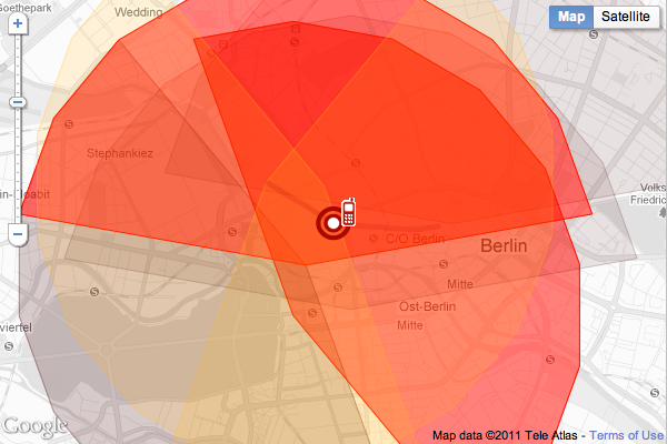
Not many people understand the importance of data privacy. They don’t get out how little bits of information sent from your phone every now and then can show a lot about your day-to-day life.
As the German government tries to come to a consensus about its data retention rules, Green party politician Malte Spitz retrieved six months of phone data from Deutsche Telekom (by suing them), to show what you can get from a little bit of private mobile data. He handed the data to Zeit Online, and they in turn mapped and animated practically every one of Spitz’ moves over half a year and combined it with publicly available information from sources such as his appointment website, blog, and Twitter feed for more context.
Read More
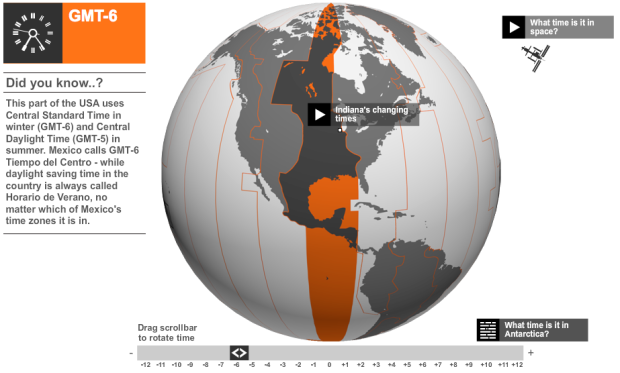
Do you understand how time zones work around the world and when exactly you need to move your watch forward or back? Me neither. BBC News provides a brief history of time zones via interactive globe.
Read More
The data marketplace Infochimps recently expanded their API to include datasets such as Twitter People Search and IP to demographic. To get that data into R, you could easily download the full dataset and import, but why do that when you can connect to the Infochimps API directly from R? Drew Conway recently updated his own R package, available on GitHub, to allow for new API calls, so now it’s even easier to explore 60,000+ UFO sightings.

With the success of FitBit and the current wave of self-tracking, it was only a matter of time before something like Basis came out (currently for pre-order). It’s the same idea as FitBit, which is a clip that tracks your movement so you can see how much you move and monitor your sleep patterns. However, instead of a clip, Basis is a watch and comes with additional sensors for heart rate, temperature, and galvanic skin response (sweat). Come near your computer and data uploads automatically via bluetooth.
Read More

It’s a good idea to have a meeting place in case of an emergency and you get split up from your loved ones. Safety Maps, a straightforward application, helps you tell others the safety location. Simply mark your spot, and then share. You can make it public or only let the people you select see the map. Additionally, you get a PDF version via email for printing.
Read More
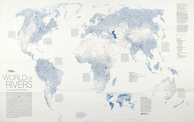
The annual Malofiej awards, for top graphics in journalism, were handed out last week. The best map of 2010 went to National Geographic for the World of Rivers. Every river system in the world was mapped and scaled by annual discharge.
We live on a planet covered by water, but more than 97 percent is salty, and nearly 2 percent is locked up in snow and ice. That leaves less than one percent to grow our crops, cool our power plants, and supply drinking and bathing water for households.
Showing everything doesn’t always work with so much data, but it does in this case. It reminds me of Ben Fry’s All Streets. See the full-sized interactive version on National Geographic.
Read More
“The problem isn’t that specialised companies lack the data they need, it’s that they don’t go and look for it, they don’t understand how to handle it.”
—Hans Rosling, A Data State of Mind, March 2011
Google UK produced a short book called Think Quarterly to distribute to partners and advertisers, but it’s actually pretty interesting for a more general audience. Articles feature Hans Rosling, Hal Varian, and others. Also a hat tip to FlowingData in Simon Rogers’ list of sexy resources.
Pete Warden does the data community a solid and wraps up a collection of open-source tools in the Data Science Toolkit to parse, geocode, and process data.
A collection of the best open data sets and open-source tools for data science, wrapped in an easy-to-use REST/JSON API with command line, Python and Javascript interfaces. Available as a self-contained VM or EC2 AMI that you can deploy yourself.
Many of the services are available via public APIs, but the usual benefits apply of running your own service such as privacy, independence, and no limits. Hit your machine with as many requests as you want. The code is available in its entirety on GitHub.

Aww, how cute. As a birthday gift, a couple sent their best wishes to a friend overseas via deconstructed cupcake graphic.
Happy Friday, everyone. Leading into the weekend, HistoryShots has kindly put three prints up for grabs to decorate that plain wall of yours with data and information. HistoryShots has been around for a while, but in case you’re not familiar, they “create elegant graphics and diagrammatic art that visually tell stories about subjects, time periods and events.” Some are vintage reprints from the 1800s and others are original designs.
How do you win a free print? Go to the HistoryShots list of available prints, and then come back here and leave a comment saying which one you want by Sunday, March 27 at 10pm. I’ll pick three winners at random. Good luck!
Update: Winners picked. If you won, you’ve received an email from me. Thanks for entering!
There are rumblings, mostly among librarians, over the end of the Statistical Compendia branch of the Census Bureau, in 2012. The branch has produced the Statistical Abstract of the United States every year since 1878.
Read More

Okay, it’s kind of a given for why we need to make sure great teachers keep teaching America’s children. If you’ve had a great teacher, you know what I mean. If you’ve had a bad teacher, you know what I mean. StudentsFirst argues for the end of last in, first out, which is a firing policy based on seniority. If teachers are going to be fired, the last teachers hired have to go first.
Read More
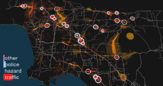
Los Angeles has a lot of things to do. The trouble is, compared to a city like San Francisco, everything is spaced out and you have to drive almost everywhere you go. There’s also a ton of people and therefore, lots of cars on the freeway. Waze, in collaboration with Gray Area Foundation and Nik Hanselmann, visualize 24 hours of traffic in Los Angeles, a subject that holds a bitter spot in my heart.
Read More
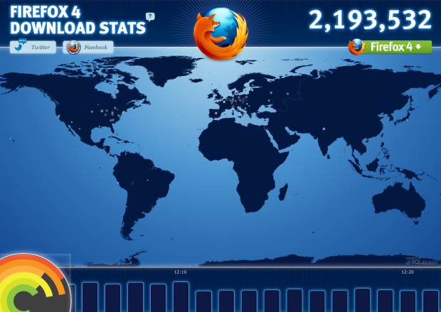
Firefox 4 came out of beta today and is now available for download. As of writing this, there have been about 2.2 million downloads worldwide, and you can watch the action in real-time. Little bits of fairy dusts shimmering worldwide with a counter up top and an hourly time series chart on the bottom.
The new browser boasts faster browsing, a new way of organizing your tabs, and plenty of other updates. Will it be enough to bring former Firefox users who switched to Chrome? I just closed Chrome, and am writing this in Firefox. We’ll see how this goes.
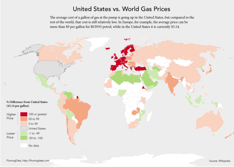
Since we’re on the subject of US gas prices, let’s take a look at how they compare to the rest of the world. Having talked to some of my international friends a while back, I already knew that gas is relatively cheap here, what with all of the government subsidies and what not.
But of course we still complain. I see $3.90 per gallon and I can’t help but give the stink eye, while our friends over there in the UK are forking over nine bucks per gallon.
Read More
 Visualize This: The FlowingData Guide to Design, Visualization, and Statistics (2nd Edition)
New tools, refined process.


