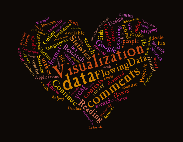
Love ’em or hate ’em, tag clouds, or the more recent incarnation, Wordles, are everywhere (especially in slide presentations). Well, Wordle wasn’t enough. I mean, you can’t even make shapes with it. Gees. That’s where Tagxedo comes in. It works pretty much just like Wordle, except you have one more option. You can select from a variety of shapes to arrange your words into. Score.
-
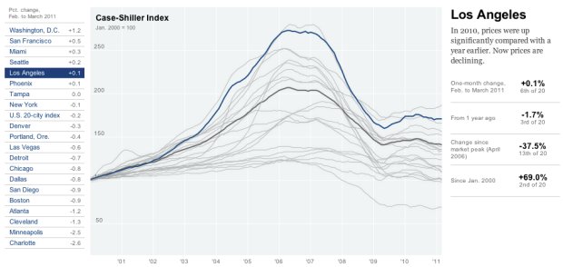
Kevin Quealy and Jeremy White report for The New York Times on the rise and fall of housing prices with an interactive time series chart:
The Standard & Poor’s Case-Shiller Home Price Index for 20 major metropolitan areas is one of the most closely watched gauges of the housing market. The figures for March, released May 31, showed prices at their lowest point since the downturn began.
It’s similar to the home run count graphic from last year, although there’s a key difference. It’s not in Flash. It works equally well though.
Either click a city of interest on the left, or interact with the graph directly for more information. Not surprisingly, Detroit have been falling longer than any of the other 19 selected cities, whereas prices in Washington, D.C. have risen the most since February.
-
Sometimes visualizing everything can turn out beautiful results. It seems to work especially well when the data is geographic, as we saw with All Streets, OpenStreetMap edits, and tourist maps. It turns out the everything method works for fictional worlds, too. The above and the video below are nothing but 11.3 million deaths by impact with object or terrain in the game Just Cause 2.
Read More -
The Very Large Telescope (VLT) in an array of four telescopes operated by European Southern Observatory, and together the array “can achieve an angular resolution of around 1 milliarcsecond, meaning it could distinguish the gap between the headlights of a car located on the Moon.” I don’t know much about telescopes or lenses, but I think that’s good. Watch the array at work, exploring galaxies far, far away and boldly going where no man has gone before in this breath-taking time-lapse.
Read More -
Do you know where your fish comes from? Well, yeah, it comes from the water, but there’s a little more to it than that. Nigel Upchurch, who previously explained the benefits of turning off your computer at night, describes in this short one-minute video why eating farmed fish isn’t the best idea. In short, while farming fish seems like a good solution to depleted wild supply, the process actually ends up using even more natural resources.
I like Nigel’s understated approach. Not too flashy that it makes you dizzy, but engaging enough to get you looking. The video is light on data, but that works well for a public service announcement.
Read More -
Aaron Koblin, Creative Director of Google’s Data Arts team, shares some of the many projects that he’s worked on his recent TED talk (video below). Even if you don’t know the name, you’ve undoubtedly come across his work. The takeaway of his talk:
An interface can be a powerful narrative device, and as we collect more personally and socially relevant data, we have an opportunity and maybe even an obligation to maintain a humanity and tell some amazing stories as we explore and collaborate together.
It’s not all facts and figures, dontcha know.
-
Formatting data is a necessary pain, so anything that makes formatting easier is always welcome. Data Wrangler, from the Stanford Visualization Group, is the latest in the growing set of tools to get your data the way you need it (so that you can get to the fun part already). It’s similar to Google Refine in that they’re both browser-based, but my first impression is that Data Wrangler is more lightweight and it feels more responsive.
Read More -
 The Pew Research churns out a lot of interesting results from a number of surveys about online and American culture, but they usually only shared aggregated results, pre-made charts and graphs. This is well and good for the information-consuming public; however, these results can spawn curiosities that are fun to dig into. Luckily, the Pew Research Center launched a Data Sets section that provides raw survey responses and the questions in a variety of easy-to-use data formats.
 Our raw data, previously posted only as SPSS files, is now available in comma-delimited (.csv) format for all reports going back to 2003. We hope that making our data available in this open-source format will make analysis easier for researchers who don’t own a copy of SPSS to analyze our data.
This should be fun. Recent datasets include the social side of the Internet, health tracking habits, and reputation management.
[Pew Research via @kzickhur]
-
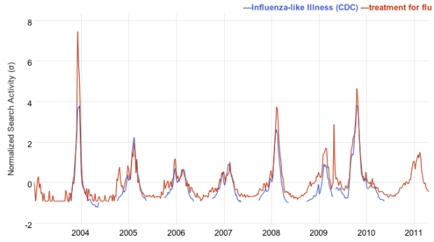
A while back, Google showed how Influenza outbreaks correlated to searches for flu-related terms with Google Flu Trends. It helped researchers and policy-makers estimate flu activity much sooner than with previous methods. Google Correlate is the evolution of Flu Trends in that now you can correlate search trends with not just flu cases, but with your own data or other search queries.
Read More -
 The best way to learn how to visualize data is to grab a dataset and see what you can do with it. You can read as many tips and tricks as you want, but you’re not going to get any better until you actually try. Contests are a fun way to do this.
 Participate
So here are a handful of visualization contests to get your hands dirty. Hey you might even win a couple of thousand dollars. Not that money matters to you, because as well all know, learning is your reward.
Hacking Education — A contest for developers and data crunchers. DonorsChoose.org has inspired $80 million in giving from 400,000 donors, helping 165,000 teachers at 43,000 schools, and the donation site has opened up this data. Can do you do something with it? Deadline: June 30, 2011.
Data In Sight — A hands-on competition in San Francisco’s SoMa district with surprise data sources. Some talks, lunch, dinner, and a 24-hour hackathon. Event date: June 24, 2011 (better to register your team early).
Tableau Interactive Viz Contest — This one is coming up the quickest, but is the most straightforward. Plus, you get a t-shirt just for entering. Grab some business, finance, or real estate data and go to town with Tableau Public. Deadline: June 3, 2011.
Know of any other data/visualization contests coming up? Let us know in the comments.
-
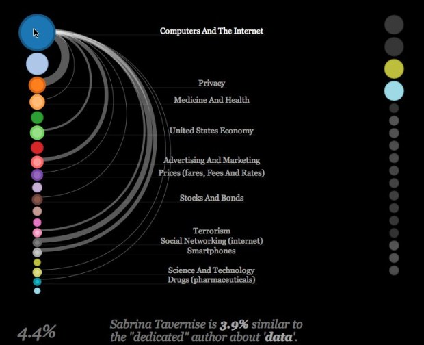
The IBM Visual Communication Lab published their first of what I hope many sketches exploring topics covered by The New York Times and its authors called NYTimes Writes, by Irene Ros. Start with a search term, and the tool will fetch related articles from the past 30 days. You’ll get something that looks like the above, which is what I got when i searched for “data.”
Read More -
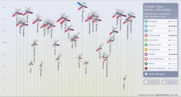
OECD, with the help of Moritz Stefaner and Raureif, promote a well-being index beyond GDP in the Better Life Initiative:
There is more to life than the cold numbers of GDP and economic statistics — This index allows you to compare well-being across countries, based on 11 tpoics the OECD has identified as essential, in the areas of material living conditions and quality of life.
Based on topics such as health, housing, and education, each country is represented with a flower, and each petal on a flower represents a metric. The higher the index, the higher the flower appears on the vertical axis, and if the flower metaphor is too abstract for you, roll over each flower to see the breakdown by bar graph.
Read More -
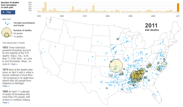
As reported by The New York Times, the tornado in Joplin, Missouri, known to have killed at least 100 people, makes 2011 the deadliest year of tornadoes since 1953 (519 deaths). There have been over 450 tornado-related deaths this year. This NYT interactive shows number of deaths per year with yellow circles and tornado touchdowns and paths with blue lines and dots.
Read More -
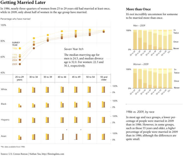
The United States Census Bureau just released results from the Survey of Income and Program Participation (SIPP) on marriage and divorce, and my wife and I just celebrated an anniversary this past weekend, so naturally I had to take a look.
Read More -
On the Media’s episode last week was on data, namely personal data collection, journalism, and two cautionary tales. I haven’t listened to it yet, but I have a feeling it’s going to be a good listen. Part one on personal data embedded below to kick things off. [via]
-
The New York Times, citing a number of bits from a recent McKinsey report on big data, reports:
One hurdle is a talent and skills gap. The United States alone, McKinsey projects, will need 140,000 to 190,000 more people with “deep analytical” skills, typically experts in statistical methods and data-analysis technologies.
Additionally:
McKinsey says the nation will also need 1.5 million more data-literate managers, whether retrained or hired. The report points to the need for a sweeping change in business to adapt a new way of managing and making decisions that relies more on data analysis. Managers, according to the McKinsey researchers, must grasp the principles of data analytics and be able to ask the right questions.
I’ve said it before, but if digging into data is your idea of fun, there’s a whole mess of excitement and adventure headed your way. There are lots of opportunities already out there in marketing, journalism, tech, the Web, government, and pretty much everywhere you look. And more importantly, there are lots of opportunities that you can make for yourself. This is a great time for data heads.
-
Richard Florida for The Atlantic takes a closer look at hate groups in the United States:
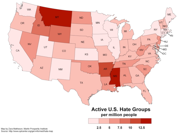
Since 2000, the number of organized hate groups — from white nationalists, neo-Nazis and racist skinheads to border vigilantes and black separatist organizations — has climbed by more than 50 percent, according to the Southern Poverty Law Center (SPLC). Their rise has been fueled by growing anxiety over jobs, immigration, racial and ethnic diversity, the election of Barack Obama as America’s first black president, and the lingering economic crisis. Most of them merely espouse violent theories; some of them are stock-piling weapons and actively planning attacks.
The map provides a basic state-by-state view of hate groups per capita. Montana and Mississippi have the highest rates. Straightforward stuff. The interesting part, however, is how the rate correlates to other factors, such as support for John McCain. The greater the support for McCain, the more hate groups per capita a state tends to have.
Read More -
The title just about says it all:
The Photopic Sky Survey is a 5,000 megapixel photograph of the entire night sky stitched together from 37,440 exposures. Large in size and scope, it portrays a world far beyond the one beneath our feet and reveals our familiar Milky Way with unfamiliar clarity. When we look upon this image, we are in fact peering back in time, as much of the light—having traveled such vast distances—predates civilization itself.
Play around with the super high-resolution image, get the desktop wallpaper, or get the print.
-
Oh. My. God. Fathom Information Design compiles every recipe from the show MacGyver:
Have you ever wondered in how many different episodes MacGyver has made an arc welder (answer: 3 times in episodes 6, 52, and 87)? Or perhaps you forgot about your favorite episode (season 1, episode 12) when Mac escapes via a casket that transforms into a jetski. And how many times has Mac made a diversion? In order to placate all of your MacGyver-related curiosities, we offer you MacRecipes.
There is a column for each episode, and each square represents a recipe for how to get out of trouble. Want to make a parasail? Just get a wind tunnel fan, wire, and tent material. Need to create a diversion to get out of a bind? Matches and rum. You can also browse recipes by ingredient, such as those that use rope or a paper clip.
I loved MacGyver growing up. His mullet holds a special place in my heart where all you need is imagination and some know-how to get you to where you need to go. I was one of the many to start wielding a trusty Swiss Army knife that my parents got me. I still have it, actually. Still useful. The whole series is on Netflix Instant in case you’re interested.
-
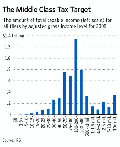
The argument behind this graph in The Wall Street Journal is that the middle class has most of the money and ties into a larger argument about who should be taxed what. There is after all a spike in the middle. Is that really the case though? Sound off in the comments.
(Cheat sheet: Jonathan Chait explains what’s going on and Kevin Drum improves the graph to show more truth, although his graph can be improved, too. Grab the data here [Excel spreadsheet] from the IRS, and give it a go.)
[Wall Street Journal via @joandimicco]






 Visualize This: The FlowingData Guide to Design, Visualization, and Statistics (2nd Edition)


