The Gulf of Mexico has been renamed to the Gulf of America in the Geographic Names Information System (GNIS) by the U.S. Geological Survey. When you search for the gulf on USGS, you get the following result that defaults to Gulf of America.
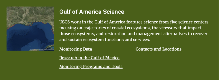
Only the main title changed though. “Research in the Gulf of Mexico” appears underneath and if you follow the link, Mexico is the point of reference.
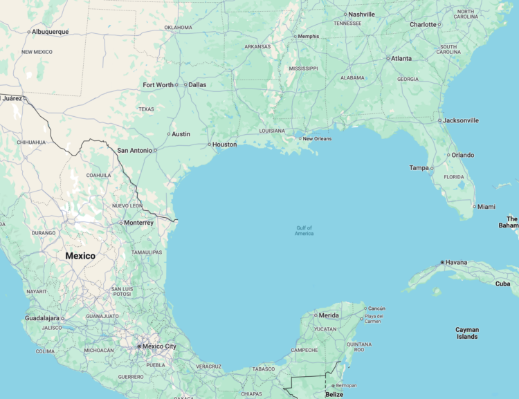
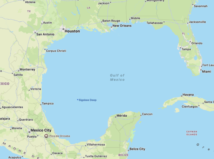
But now, when you search Google Maps, which follows the naming defined by the GNIS, you get the Gulf of America, as shown above. As of the evening of February 10, 2025, Apple Maps still shows the Gulf of Mexico:
It’s shocking how quickly the names can change in the system. The GNIS started in the 1970s. How many times have geographic areas and features changed over the years? Is there a space that has been renamed many times?
In the U.S., the Geographic Names Information System (GNIS) has officially updated “Gulf of Mexico” to “Gulf of America.” As we announced two weeks ago and consistent with our longstanding practices, we’ve begun rolling out changes to reflect this update. People using Maps in the U.S. will see “Gulf of America,” and people in Mexico will see “Gulf of Mexico.” Everyone else will see both names.

I honestly thought this was a joke.


 Visualize This: The FlowingData Guide to Design, Visualization, and Statistics (2nd Edition)


