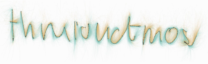
For most, crying isn’t an especially common occurrence over a long period of time, but when it happens, it’s often because something significant occurs in one’s life. Over the course of a couple of years, Robin Weis has 394 such occurrences. She knows this because she tracked when she cried and then later classified each event.
Read More
-
-
Terrapattern is a fun prototype that lets you search satellite imagery simply by clicking on a map. For example, you can click on a tennis court, and through machine learning, the application looks for similar areas.
Terrapattern uses a deep convolutional neural network (DCNN), based on the ResNet (“Residual Network”) architecture developed by Kaiming He et al. We trained a 34-layer DCNN using hundreds of thousands of satellite images labeled in OpenStreetMap, teaching the neural network to predict the category of a place from a satellite photo. In the process, our network learned which high-level visual features (and combinations of those features) are important for the classification of satellite imagery.
-
Flight pattern maps are fun to look at and reveal the complexity of air transportation on a daily basis. But, there are other angles to look at this data from. Martin Grandjean used a force-directed graph to focus less on geography and more on volume and connections. Color represents continent, circles represent airports, and circle size represents number of routes.
Read More -
Hilary and Roger touch on some interesting topics in the most recent Not So Standard Deviations, specifically on scalable and automated data analysis.
At the surface, it can seem like computers should be able to do the bulk of any analysis. Plug in the data, crunch the numbers in an algorithmic black box, and presto change-o you get a list of actionable insights. From that point-of-view, you should be able to build software that does almost everything for you. That’s almost never the case, and you realize it quickly once you dig into the data yourself.
It’s the same deal with visualization.
You see the end result, and it’s easy to imagine applying the same chart to another dataset. Geometry and color are easy to make with a couple lines of code. The chart should be generalizable, right? Sure, but the challenge is getting to that final point. There are various paths you can take when you start with a dataset — what it means, the questions you want to ask — along with various decisions along the way.
Automating the process. That’s the hard part.
-
Predictive policing seems to be playing a bigger role in court decisions these days. People charged with crimes can be given a risk score based on priors and their background, which represents a fuzzy likelihood that they commit a crime again. ProPublica investigates the reliability of these scores, using data from Broward County, Flordia, between 2013 and 2014
Read More -
Nadja Popovich for the Guardian delves into America’s drug overdose epidemic, starting with an animated map that shows changes from 1999 to 2014.
Read More -
The American Community Survey is an ongoing survey run by the United States Census Bureau that collects data about who we are. The map maker bot by Neil Freeman is a Twitter bot that automatically generates county-level maps based on this ACS data. It’s been running for the past month, making one map per hour, so there are already lots of demographic breakdowns to browse.
Pretty awesome. The implementation gets extra plus points for making the maps straight out of a government pamphlet.
-
If you’re looking for a knowledge bomb during your lunch breaks, the OpenVis Conf talks from this year are all online. Naturally, you can sift through the talks with a visual interface that gives you a good idea of what each talk is about before you get into it. Nice.
-
If you think of network visualization as a collection of nodes and edges, you typically get a bunch of circles and lines that vary in width to represent volume or strength of connection. However, in this visualization, Fathom used dots to represent patients moving between different states of a health network. The more dots the more patients, or in terms of networks, the stronger the connections.
I don’t find the topic all that interesting, but the implementation is pretty sweet.
-
As we all know these days, there exists a gender pay gap across most major professions in the United States. The Wall Street Journal charts the average differences for 446 occupations.
Read More -
-
Quantified Selfie is a project to find narratives in an individual’s personal dataset. It’s not about optimization or self-improvement. It’s about facets of the everyday, which is my favorite kind of personal data collection. In the most recent addition, peek into a woman’s rocky move from San Francisco to New York, through the lens of her music listening habits over a year. [via Waxy]
-
Using motion capture methods, Tobias Gremmler collected movement data for two kung fu masters. Then he visualized the results with various interpretations, such as particles, fabric, and scaffolding. Pretty:
[via Colossal]
-
-
-
Sumo has a long history that goes back centuries. Unlike most things that old though, there are detailed records of tournaments and wrestlers, which allows a comparison over the years. Matthew Conlen for FiveThirtyEight charted them all in an interactive. Go through the explainer, and then use the last chart to look at the data by various dimensions.
See also the full article on sumo.
-
Last year Quartz announced Atlas, which was a place to find all of their charts. Now they’re slowly opening up their platform, namely the chart-making tool, so that others can make charts and share their own data.
Why might you want to create charts with Atlas? It’s a chance to use our widely acclaimed charting tool, which makes it easy to visualize data in a simple, consistent, and mobile-friendly style. Every chart published on Atlas has its own page. You and others can share the chart, embed it elsewhere, grab an image, or download the underlying data.
It should be interesting to see where this goes. It reminds me a lot of Swivel from back in 2010, and that one didn’t fare so well.
-
Global temperature is on the rise, as most of us know. Ed Hawkins charted it in this spiral edition of temperature over time.
Spiralling global temperatures from 1850-2016 (full animation) https://t.co/YETC5HkmTr pic.twitter.com/Ypci717AHq
— Ed Hawkins (@ed_hawkins) May 9, 2016
See also the Bloomberg chart that uses a standard coordinate system but stacks lines on top of one another.
-
Emotions are complex and only partially understood, yet such a force in how we live our lives. The Atlas of Emotions, produced by Stamen Design, shows what we know about these things, based on research and conversations between the Dalai Lama and psychologists Paul and Eve Ekman.
Using a geographic metaphor, the interactive starts with five universal emotions or “continents”: Anger, Fear, Sadness, Disgust, and Enjoyment. From there, you can see what states each puts you in and what actions come about.
But do I really have to say anything more than Dalai Lama? What.
See the project here and find more background on the atlas here.