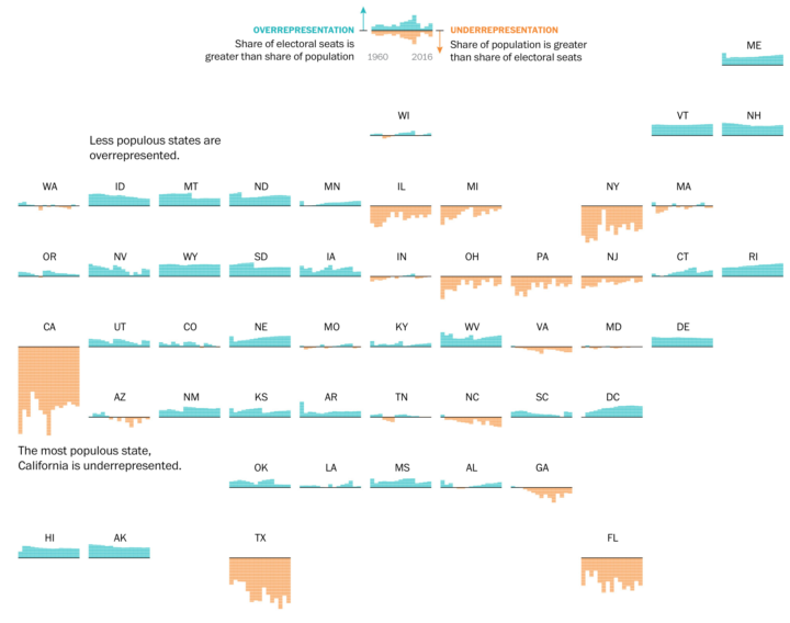
By design, the electoral college and population don’t quite match up state-by-state. This results in a lower ratio of electoral seats to people for the higher populated states and a higher ratio for the lower populated states. Denise Lu for The Washington Post provides a small multiples state grid to show the differences.
These charts show the difference between each state’s share of the national population and its share of votes in the electoral college since 1960. If the bars are above the line, the state has a greater share of electoral votes than it does population, meaning it is overrepresented. If the bars are below the line, the state is underrepresented.


 Visualize This: The FlowingData Guide to Design, Visualization, and Statistics (2nd Edition)
