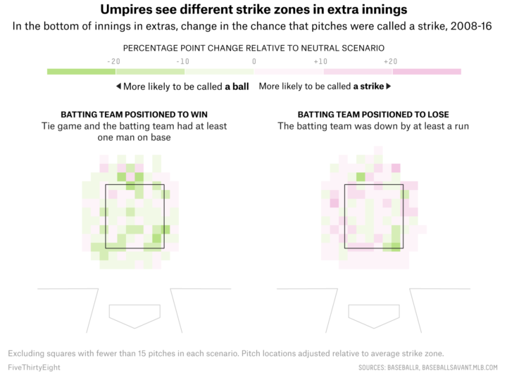
• Membership
  • Newsletter
  • Projects
  • Learning
  • About
  • Member Login
  • Troubling pick for Census Bureau deputy director

    November 21, 2017

    Topic

    Statistics  /  census, government

    The administration’s current pick for deputy director of the United States Census Bureau is Thomas Brunell. He is a political science professor outside of the Bureau and argues against “competitive elections.”

    Danny Vinik and Andrew Restuccia, reporting for Politico:

    Since 2005, he has worked at the University of Texas at Dallas, where his research and writing has focused on redistricting and voting rights cases. He has frequently advised states on redrawing their congressional maps. In his 2008 book, “Redistricting and Representation,” he argued that partisan districts packed with like-minded voters actually lead to better representation than ones more evenly split between Democrats and Republicans, because fewer voters in partisan districts cast a vote for a losing candidate. He has also argued that ideologically packed districts should be called “fair districts” and admits that his stance on competitive elections makes him something of an outlier among political scientists, who largely support competitive elections.

    Hm.

    I’m not familiar with Brunell’s research, but shouldn’t the pick for deputy director of the giant statistical, nonpartisan agency be, um, a statistician? Someone who is familiar with how the Bureau and its 5,000-plus employees function day-to-day?

    Hm.

  • Global cycling and running heatmap

    November 21, 2017

    Topic

    Maps  /  biking, running, Strava

    A few years back, cycling and running app Strava mapped the paths of its users. Now with a lot more data and the challenges that come with that, Strava provides a more fine-tuned rendering of where the world cycles and runs.

    Beyond simply including more data, a total rewrite of the heatmap code permitted major improvements in rendering quality. Highlights include twice the resolution, rasterizing activity data as paths instead of as points, and an improved normalization technique that ensures a richer and more beautiful visualization.

  • Scrollama.js, a JavaScript library for scrollytelling

    November 20, 2017

    Topic

    Coding  /  JavaScript, scrollytelling

    Russell Goldenberg released Scrollama.js in an effort to make scrollytelling more straightforward to implement.

    Scrollytelling can be complicated to implement and difficult to make performant. The goal of this library is to provide a simple interface for creating scroll-driven interactives and improve user experience by reducing scroll jank. It offers (optional) methods to implement the common scrollytelling pattern to reduce more involved DOM calculations. For lack of a better term, I refer to it as the sticky graphic pattern, whereby the graphic scrolls into view, becomes “stuck” for a duration of steps, then exits and “unsticks” when the steps conclude.

    Bookmarked for later.

  • Getting Started with Network Graphs in R

    Add the vertices. Connect them with edges. Repeat as necessary.

  • Based on your morals, a debate with a computer to expose you to other points of view

    November 17, 2017

    Topic

    Statistics  /  bias, morality

    Collective Debate from the MIT Media Lab gauges your moral compass with a survey and then tries to “debate” with you about gender bias using counterpoints from the opposite side of the spectrum. The goal isn’t to be right. Instead, it’s to try to understand the other side. At the end, you see how you compare to others.

  • Data Underload  /  work

    Switching Jobs

    When people move to different jobs, here’s where they go.

    Read More
  • Every tax cut and increase in House Republicans’ bill

    November 15, 2017

    Topic

    Infographics  /  New York Times, scrollytelling, taxes

    The House Republicans will vote on a tax bill soon that adds about $1.4 trillion to the federal debt. Alicia Parlapiano and Adam Pearce, reporting for The New York Times, look at every change in this scroller.

    I like that the visual is kept simple with a two-column, stacked bar chart as the backdrop. The chart provides scale, but the focus in on the text.

  • How generative music works

    November 15, 2017

    Topic

    Data Art  /  music

    Generative music comes from the design of a system that produces notes that follow a set of rules. Tero Parviainen provides a detailed, interactive explainer for how this works in practice using ample examples. Take your time with this one.

  • 3-D tube chart of global CO2 concentration and temperature

    November 14, 2017

    Topic

    Statistical Visualization  /  animation, climate change, temperature

    Because you can never have enough time series charts that show increases of CO2 and temperature over decades. By Kevin Pluck:

    [arve url=”https://www.youtube.com/watch?v=WEGwCPmELh8″ /]

    Differing from the variations we’ve seen before, time is on the circle, and the metrics are on the vertical. Then it rotates for dramatic effect.

    See also the the two-dimensional Cartesian version from Bloomberg and the polar coordinate version by Ed Hawkins. There are also plenty more temperature charts. I think after this, we’re set for a while.

  • Looking for patterns and structures from the sky

    November 13, 2017

    Topic

    Data Art  /  photography, physical

    Photographer Bernhard Lang takes pictures in small planes and helicopters, pointing his camera towards the ground. In the ongoing project Aerial Views, he focuses on patterns and structures, which makes for interesting visuals that you’d miss on the ground.

  • A daily high-resolution image of Earth

    November 13, 2017

    Topic

    Maps  /  satellite, space

    Planet monitors Earth with hundreds of satellites, and after six years, they’ve built out their pipeline to piece together a full image on the daily.

    At Planet, we’ve been pursuing Mission 1: to image the entire Earth’s landmass every day. I couldn’t be more excited to announce that we have achieved our founding mission.

    Six years ago, our team started in a garage in Cupertino. Mission 1 was the north star: we needed to build the satellites and systems, secure the launches, bring down the data to capture a daily image of the planet at high resolution, and make it easy to access for anyone. It became the heart and soul of our company and guiding light for Planeteers.

  • The words used by men and women to write about love

    November 10, 2017

    Topic

    Statistical Visualization  /  love, Upshot, words

    Josh Katz, Claire Cain Miller, and Kathleen A. Flynn for The Upshot plotted words used in essays above love submitted to The New York Times, focusing on a comparison between men and women’s word usage.

    When writing about love, men are more likely to write about sex, and women about marriage. Women write more about feelings, men about actions.

    Even as gender roles have merged and same-sex romance has become more accepted, men and women still speak different languages when they talk about love — at least, if Modern Love essays submitted to The New York Times are any indication.

  • Importance of form and survey design to gain an accurate picture

    November 10, 2017

    Topic

    Design  /  forms, Lena Groeger

    Lena Groeger, writing for Source, shifts attention upstream from analysis to the design of forms in the data collection process.

    Whether you’re filling out a form or building it yourself, you should be aware that decisions about how to design a form have all kinds of hidden consequences. How you ask a question, the order of questions, the wording and format of the questions, even whether a question is included at all—all affect the final result. Let’s take a look at how.

    Census surveys, election ballots, and racial profiling. Oh my.

  • Changing internet markets for sex work

    November 9, 2017

    Topic

    Statistics  /  Internet, sex

    The internet changed how sex workers and clients find each other and how the former does business. Allison Schrager, Christopher Groskopf, and Scott Cunningham, reporting for Quartz, delve into actual numbers using scraped data from The Erotic Review:

    Sex work is as old as civilization, but in the past 20 years the market for illegal sex services has undergone a radical transformation thanks to the internet, upending how it is sold and priced. There are now more women selling sex, more overall encounters, and—unlike in many other industries disrupted by the web—higher wages for workers.

    Also safer (although still with its inherent risks).

  • Google maps street-level air quality using Street View cars with sensors

    November 8, 2017

    Topic

    Maps  /  air quality, environment, Google

    Google equipped their Street View cars with air quality sensors and sent them around several California areas.

    We’re just beginning to understand what’s possible with this hyper-local information and today, we’re starting to share some of our findings for the three California regions we’ve mapped: the San Francisco Bay Area, Los Angeles, and California’s Central Valley (the Street View cars drove 100,000 miles, over the course of 4,000 hours to collect this data!) Scientists and air quality specialists can use this information to assist local organizations, governments, and regulators in identifying opportunities to achieve greater air quality improvements and solutions.

    Maps.

  • How to Make (and Animate) a Circular Time Series Plot in R

    Also known as a polar plot, it is usually not the better option over a standard line chart, but in select cases the method can be useful to show cyclical patterns.

  • Cities projected to be under water by 2100

    November 6, 2017

    Topic

    Maps  /  climate change, flood, Guardian

    Using Climate Central sea-level rise estimates, The Guardian plots and maps the potential consequences of a 3.2-degree rise in temperature by 2100.

    One of the biggest resulting threats to cities around the world is sea-level rise, caused by the expansion of water at higher temperatures and melting ice sheets on the north and south poles.

    Scientists at the non-profit organisation Climate Central estimate that 275 million people worldwide live in areas that will eventually be flooded at 3C of global warming.

  • Carbon emissions goals vs. current paths

    November 6, 2017

    Topic

    Statistical Visualization  /  climate change, environment, New York Times

    Brad Plumer and Nadja Popovich reporting for The New York Times:

    Under the Paris deal, each country put forward a proposal to curtail its greenhouse-gas emissions between now and 2030. But no major industrialized country is currently on track to fulfill its pledge, according to new data from the Climate Action Tracker. Not the European Union. Not Canada. Not Japan. And not the United States, which under President Trump is still planning to leave the Paris agreement by 2020.

    A series of charts shows the path we’re headed, what we need to do to reach the goals of the Paris Agreement, and what we need to keep warming under 2 degrees Celsius above pre-industrial levels.

    Not looking good.

  • PowerPoint history lesson

    November 5, 2017

    Topic

    Software  /  history, Powerpoint

    David C. Brock writing for IEEE Spectrum delves into the origins of PowerPoint.

    PowerPoint is so ingrained in modern life that the notion of it having a history at all may seem odd. But it does have a very definite lifetime as a commercial product that came onto the scene 30 years ago, in 1987. Remarkably, the founders of the Silicon Valley firm that created PowerPoint did not set out to make presentation software, let alone build a tool that would transform group communication throughout the world. Rather, PowerPoint was a recovery from dashed hopes that pulled a struggling startup back from the brink of failure—and succeeded beyond anything its creators could have imagined.

    Little did the creators know, they would be responsible for so many kittens’ lives.

  • Page 152 of 392
  • <
  • 1
  • ...
  • 149
  • 150
  • 151
  • 152
  • 153
  • 154
  • ...
  • 392
  • >

Analyze, visualize, and communicate data usefully, beyond the defaults.

Become a member →

Recently for Members

May 8, 2025
When the data is not what it seems

May 1, 2025
Finding the Right Charts

April 24, 2025
Visualization Tools, Datasets, and Resources – April 2025 Roundup

April 17, 2025
Breaking Out of Chart Software Defaults

April 15, 2025
Line Chart with Decorative Neon Accents

Browse by Chart Type See All →

Stacked Bar Chart Moving Bubbles Line Chart Grid Map Parallel Sets Line Map Venn Diagram Table Organogram Voronoi Diagram

Browse By Topic

  • Visualization

    Seeing data

  • Maps

    Seeing geographic data

  • Infographics

    Explaining data

  • Networks

    Connecting data

  • Statistics

    Analyzing data

  • Software

    Working with data

  • Sources

    Getting data

  • Design

    Making data readable

Get the Book

Visualize This: The FlowingData Guide to Design, Visualization, and Statistics

Available now.

Order: Amazon / Bookshop

Made by FlowingData

  • The Process

  • Data Underload

  • Chart Everything

  • Guides

  • Books

  • Shop

  • About
  • Contact
  • Newsletter
  • LinkedIn
  • Instagram
  • Bluesky
  • RSS
Copyright © 2007-Present FlowingData. All rights reserved.