4 Tools to Pick Your Chart Colors
I used to manually select my color schemes with trial and error, but these days, there are a lot of tools to help you pick colors for your charts. The motivation for most of them is to help you visualize your data in a way that is perceptually correct. That is, perceived differences translated between your eyeballs and your brain match the actual quantitative differences.
While there are new tools released fairly often, I tend to stick to these four simple and quick ones. Here they are by purpose.
When you’re in a rush but need something better than defaults
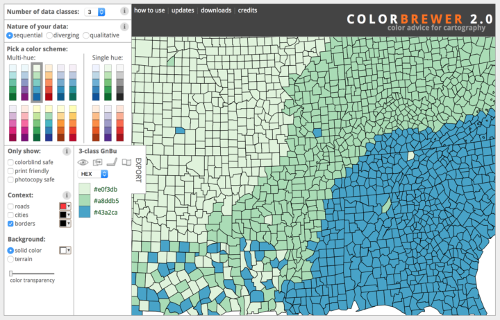
ColorBrewer is the old standby. It’s backed by research from Cynthia Brewer and Mark Harrower, and this tool was developed by AxisMaps to make the color schemes more accessible. There are a fixed number of color schemes and several options to choose from, which lets you accommodate various datasets. Select between sequential, diverging, or qualitative data. Multi-hue or single hue. Number of classes.
ColorBrewer color schemes are also baked into many packages and tools, like d3.js and R.
When you have more time to browse
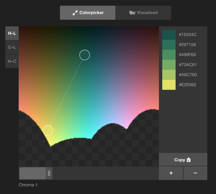
The Colorpicker for Data tool by Tristen Brown is straightforward and kind of fun to play with. You select two endpoints and the tool spits out colors that are visually equal in distance.
It’s as quick to use as ColorBrewer, but you might catch yourself finicking more than you wanted with the endless color choices.
When you need new color ideas
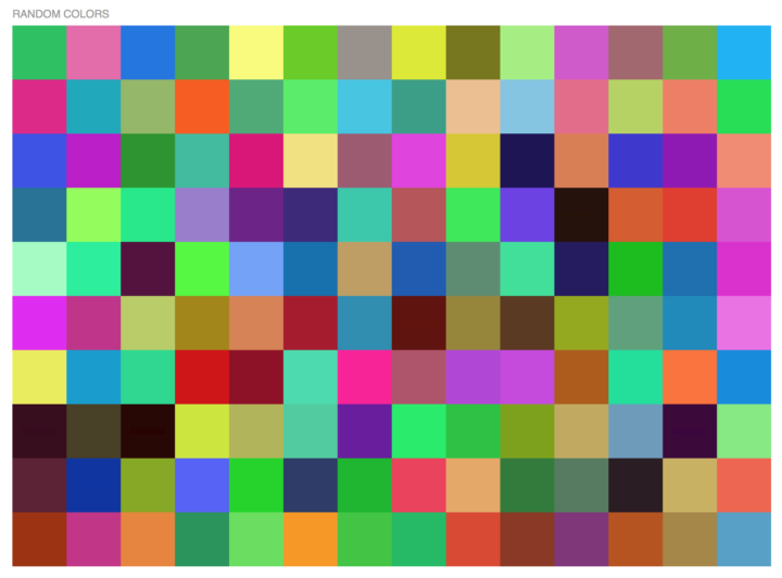
I use 0to255 to look at palettes of random colors. Maybe I’m looking for a new color scheme or trying to rework an existing one.
When you select a specific color, the tool provides a gradient of light to dark, and from there you can copy and paste. I’m almost certain there’s a better tool option by now. (It still requires Flash to copy hex colors.) But I’ve been using it for years, and well, if it ain’t broke.
When you need to match a color on your screen
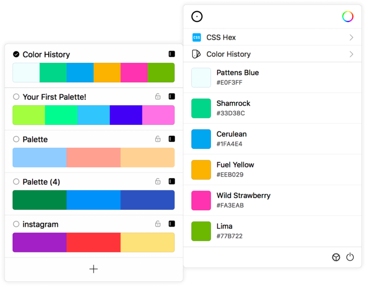
I use Sip for Mac to grab hex color codes from my screen. Sometimes I want to copy an existing color scheme and I’m too lazy to dig up old code, or I want to use a logo color or some color scheme related to a dataset’s subject matter.
You just point and click at the color you want, and Sip copies the hex color code.
There are a lot of other tools out there. Many of them are research-based and some promise to do things automatically for you, but I’ve found most to be lacking in usability. I’m looking for quick and responsive to input so that I can see various schemes right away, and these four always check those boxes for me.
If you’re interested in what drives many color-picking tools, I’d check out Gregor Aisch’s article on equidistant colors. You might also like Lisa Charlotte Rost’s friendly guide to colors.
Become a member. Support an independent site. Make great charts.
See What You Get
