SimCity-like views using satellite imagery

Mar 30, 2018

Maps typically show a view from straight above, which is good for navigation and to see regional patterns over large areas. However, missing out on the extra dimension of height can mean missing out on context. Robert Simmon for Planet Labs shows off some work in getting the less abstract perspective at a large scale.

Become a member. Support an independent site. Make great charts.

See What You Get
Learn to Visualize Data See All →

Loading Data and Basic Formatting in R

It might not be sexy, but you have to load your data and get it in the right format before you can visualize it. Here are the basics, which might be all you need.

How to Make Chord Diagrams in R

Show connections in the circular layout for a more compact presentation.

How to Make Cartograms in R

While the reshaped geography doesn’t work all the time, the use of size to show data can be more intuitive in some cases.

How to Visualize Anomalies in Time Series Data in R, with ggplot

Quickly see what’s below and above average through the noise and seasonal trends.

Favorites

Jobs Charted by State and Salary

Jobs and pay can vary a lot depending on where you live, based on 2013 data from the Bureau of Labor Statistics. Here’s an interactive to look.

Causes of Death

There are many ways to die. Cancer. Infection. Mental. External. This is how different groups of people died over the past 10 years, visualized by age.

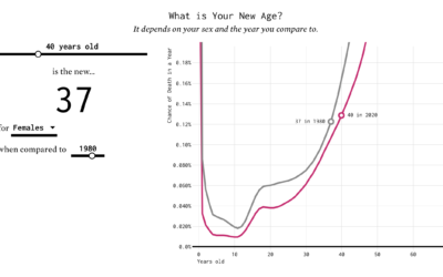
Finding the New Age, for Your Age

You’ve probably heard the lines about how “40 is the new 30” or “30 is the new 20.” What is this based on? I tried to solve the problem using life expectancy data. Your age is the new age.

Who We Spend Time with as We Get Older

In high school, we spend most of our days with friends and immediate family. But then we get jobs, start a family, retire, and there’s a shift in who we spend our days with.