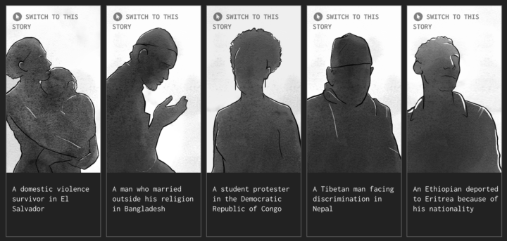
Sisi Wei for ProPublica and Nick Fortugno of Playmatics made a game to provide a feeling of what it’s like for someone who needs escape from their home.
Based on the real case files of five asylum seekers from five countries and interviews with the medical and legal professionals who evaluate and represent them, The Waiting Game is an experimental news game that lets you walk in the shoes of an asylum seeker, from the moment they choose to come to the United States to the final decision in the cases before an immigration judge.
Take your time with this one, and use your headphones.
In the game format, I felt more engrossed in the individual stories than I think if it were a linear profile story.
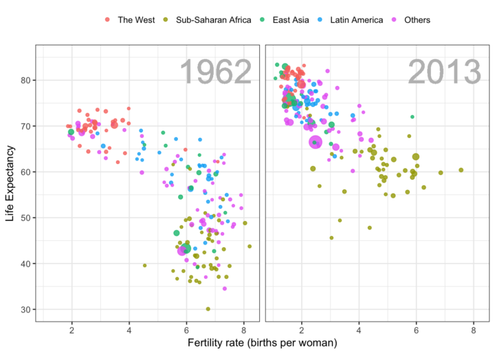
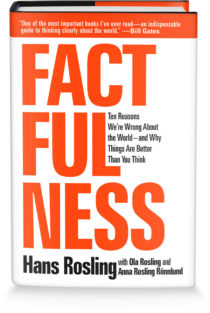 Hans Rosling was able to build excitement around data like no other. Truth and progress was his rally cry. Before he died, he was working on a book with his Gapminder co-founders Anna Rosling Rönnlund and Ola Rosling. The book,
 Visualize This: The FlowingData Guide to Design, Visualization, and Statistics (2nd Edition)


