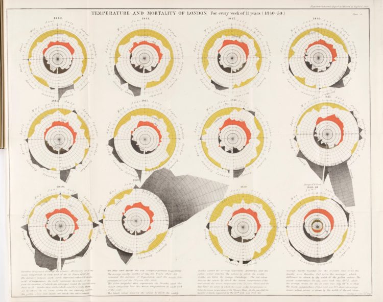
• Membership
  • Newsletter
  • Projects
  • Learning
  • About
  • Member Login
  • Inside Hurricane Maria, a 3-D perspective

    October 8, 2018

    Topic

    Statistical Visualization  /  3-d, hurricane, NASA, VR

    [arve url=”https://www.youtube.com/watch?v=A7MIVsE2oMM” /]

    This 3-D view inside Hurricane Maria, from NASA’s Scientific Visualization Studio and NASA’s Goddard Space Flight Center, lets you see the data and the lead-up to the storm in a neat 360-degree view. Be sure to watch it on your phone or with a VR thingy for full effect. Disregard the questionable color scale.

  • Unreliable gun data from the CDC

    October 5, 2018

    Topic

    Statistics  /  FiveThirtyEight, guns, The Trace, uncertainty

    FiveThirtyEight and The Trace investigate the uncertainty and accuracy of gun injury data released by the Centers for Disease Control and Prevention:

    An analysis performed by FiveThirtyEight and The Trace, a nonprofit news organization covering gun violence in America, found that the CDC’s report of a steady increase in nonfatal gun injuries is out of step with a downward trend we found using data from multiple independent public health and criminal justice databases. That casts doubt on the CDC’s figures and the narrative suggested by the way those numbers have changed over time.

    It might be time to update the statistical models used to estimate injuries.

  • Chromebook Data Science

    October 4, 2018

    Topic

    Statistics  /  Chromebook, data science

    Getting into data science typically requires that you have access to a decent computer or server. You also usually need to install software. Chromebook Data Science, a set of online sources from the Johns Hopkins Data Science Lab, lets people learn with just a Chromebook and an internet connection:

    Today I’m excited to announce the first part of our new system, a new set of massive online open courses called Chromebook Data Science. These MOOCs are for anyone from high schoolers on up to get into data science. If you can read and follow instructions you can learn data science from these courses!

    The reason they are called Chromebook Data Science is because philosophically our goal was that anyone with a Chromebook could do the courses. All you need is a web browser and an internet connection. The courses all take advantage of RStudio Cloud so that all course work can be completed entirely in a web browser. No need to install software or have the latest MacBook Computer.

    It’s pay-what-you-want with a $0 minimum and it’s designed specifically for people with no data science experience. Sounds pretty sweet.

    Find out more here.

  • Members Only

    This is Misleading, This is Not Really Misleading

    October 4, 2018

    Topic

    The Process  /  misleading

    The truth is that all charts are misleading. In some sense. The key is minimizing how much.

  • Mapping opportunity for children, based on where they grew up

    October 3, 2018

    Topic

    Maps  /  census, children, demographics, opportunity

    Opportunity Atlas, a collaboration between Opportunity Insights and the Census Bureau, is the product of ongoing research on the demographics of people, based on the neighborhood they grew up in.

    The Opportunity Atlas provides data on children’s outcomes in adulthood for every Census tract in the United States through an interactive map providing detailed research on the roots of these outcomes, such as poverty and incarceration rate, back to the neighborhoods in which children grew up. This tool will enable policy makers, practitioners, and the public the unprecedented ability to look within their city to understand better where opportunity exists and how each neighborhood shapes a child’s future economic and educational success.

    The map application was developed by Darkhorse Analytics. Zoom in to an area of interest, subset on demographics such as income level, race, and gender, and see how the people who grew up in those areas fared later in life. You can also download the tract-level data to look for yourself.

  • Data Underload  /  mortality

    Shifting Causes of Death

    The most common causes of death changed over the years. They vary across sex and age group. This animation shows the details of these changes.

    Read More
  • Coral-like cities to show road networks

    October 1, 2018

    Topic

    Data Art  /  coral, traffic

    Craig Taylor from Ito World used a coral metaphor to visualize road networks in major cities around the world:

    For the past six months I have been fascinated by the concept of making city networks look like living corals. The varying patterns of urban forms are inherently dictated by their road network; a complex, seemingly organic connection of links moving people across their city. Like branches of coral they have a pattern and a function, I chose to expose this pattern and manipulate it to become something far more conceptual. However, whilst being incredibly beautiful they are derived from various geo-spatial analysis of drive-times catchments making them somewhat informative as well.

    Pretty.

  • The Markup is a new journalism venture to examine technology through data

    September 28, 2018

    Topic

    News  /  data journalism, technology

    Founded by Sue Gardner, the former head of the Wikimedia Foundation and Julia Angwin and Jeff Larson, journalists formerly for ProPublica, The Markup will aim to use data to help non-experts better understand everyday technologies that often go unchecked.

    When Angwin and Larson worked together at ProPublica, their data-driven investigations included exposing discriminatory advertising practices at Facebook, bias in software that is used in criminal sentencing and algorithms that result in unfair car insurance pricing. They also uncovered evidence of domestic surveillance practices in the Snowden archives and revealed technology vulnerabilities at the President’s Mar-A-Lago country club.

    “I’m excited to build a team with deep expertise that can really scale up and advance the work Jeff and I began at ProPublica,” Angwin said. “We see The Markup as a new kind of news organization, staffed with journalists who know how to investigate the uses of new technologies and make their effects understandable to non-experts.”

    “People know that these new technologies are important and want to better understand their societal effects. We will help them do that,” said Larson. “The Markup will hold the powerful to account, raise the cost of bad behavior, and spur reforms.”

    The venture is primarily backed by a $20 million donation from Craigslist founder Craig Newmark and $2 million from the Knight Foundation. Amazing.

    Looking forward to this.

  • Constructing charts and graphs

    September 28, 2018

    Topic

    Statistical Visualization  /  components, Jeffrey Heer, lunch talk

    [arve url=”https://www.youtube.com/watch?v=ouIFSDQwkQM” /]

    Jeffrey Heer, a computer science professor at the University of Washington, provides an overview of building charts for analysis and exploration. It’s an iterative process between acquisition, cleaning, integration, visualization, modeling, presentation, and dissemination. [via @albertocairo]

  • Summer rain levels compared to the norms

    September 27, 2018

    Topic

    Maps  /  rain, Washington Post, weather

    Tim Meko and Aaron Steckelberg for The Washington Post compared this summer’s rains with the average. The combination of mapping as terrain and color-encoding provides an interesting foam-looking aesthetic.

  • Members Only

    Practicing with a Visualization Toolbox, Tools and Additional Resources Roundup – September 2018

    September 27, 2018

    Topic

    The Process  /  roundup, tools

    If you’re trying to learn how to work with data, make time to fiddle with the toys in your growing toolbox. Otherwise, you just have a bunch of bookmarks and no new skills.

  • Morph, an open-source tool for data-driven art without code

    September 26, 2018

    Topic

    Data Art  /  generative art, Google

    Morph, by Datavized in collaboration with the Google News Initiative, is a tool to generate abstract images from data:

    Morph exists to engage users in the creative expression of data without having to code. Generative art based algorithms turn data into a visual representation and the user can affect how their data interacts with the final visual via the algorithm. The algorithms themselves are not fixed; the user can randomly mutate, evolve and generate new algorithms creating new visuals, encouraging the sense of creative exploration and discovery.

    Just upload your data, select some options to map variables to visual encodings (or have the app pick random ones for you), and see what you get. Be sure to try the “evolve” option at the end, which shows a bunch of variations of your generated image.

    The results are pretty abstract, so I’m not sure if it has practical uses in the traditional data settings, but it’s fun to play with. And maybe it could be useful to quickly flip through visual encodings.

  • Data Underload  /  alcohol, risk

    One Drink Per Day, Your Chances of Developing an Alcohol-Related Condition

    While a drink a day might increase your risk of experiencing an alcohol-related condition, the change is low in absolute numbers.

    Read More
  • Timeline of Earth

    September 23, 2018

    Topic

    Infographics  /  Earth, timeline

    Here’s a fun piece by Andy Bergmann that shows the timeline of Earth. It’s a long-ish, straightforward scroller that vertically spaces significant events during the history of the planet. You start with the formation of Earth 4.6 billion years ago and work your way up to present day.

  • The rise and plummet of the name Heather

    September 21, 2018

    Topic

    Statistics  /  Heather, names, Quartz

    Hey, no one told me that baby name analysis was back in fashion. Dan Kopf for Quartz, using data from the Social Security Administration, describes the downfall of the name Heather. It exhibited the sharpest decline of all names since 1880.

    Talking to Laura Wattenberg:

    Wattenberg says the rise and fall of Heather is exemplary of the faddish nature of American names. “When fashion is ready for a name, even a tiny spark can make it take off,” she says. “Heather climbed gradually into popularity through the 1950s and ’60s, then took its biggest leap in 1969, a year that featured a popular Disney TV movie called Guns in the Heather. A whole generation of Heathers followed, at which point Heather became a ‘mom name’ and young parents pulled away.”

  • xkcd: Curve-fitting messages

    September 20, 2018

    Topic

    Infographics  /  curves, humor, xkcd

    xkcd tells it like it is.

  • Members Only

    Chart Components and Working On Your Graphics Piece-wise

    September 20, 2018

    Topic

    The Process  /  components

    Break the visualization into its basic pieces to make it easier to make, edit, and reuse.

  • How to Make a Tiled Bar Chart with D3.js

    Show individual data points by splitting bars into smaller cells.

  • Judging connectedness of American communities, based on Facebook friendships

    September 20, 2018

    Topic

    Maps  /  communities, connections, facebook, Upshot

    We talk about geographic bubbles a lot these days. Some areas are isolated, in their own bubble. Other areas seem more connected. Emily Badger and Quoctrung Bui for The Upshot looked at this geographic connectedness through the lens of Facebook friendships.

    In the millions of ties on Facebook that connect relatives, co-workers, classmates and friends, Americans are far more likely to know people nearby than in distant communities that share their politics or mirror their demographics. The dominant picture in data analyzed by economists at Facebook, Harvard, Princeton and New York University is not that like-minded places are linked; rather, people in counties close to one another are.

    There are two main parts to the piece. The first one is a county map that you can mouse over to see the likelihood of friendship with those in other counties. The second part imagines a country split up into regions based on Facebook connections. Be sure to catch them both.

  • Watch rising river levels after Hurricane Florence

    September 19, 2018

    Topic

    Maps  /  hurricane, New York Times, water, weather

    Hurricane Florence brought a lot of rain, which in turn made river levels rise. The New York Times animated the rise over a five-day period. The height of the bars represents the rise of the river level, as compared to levels on Thursday.

    I like the visual metaphor of bars going up with river levels. I’m not sure the sudden rise and falls in such short periods of time would appear as surprising.

  • Page 136 of 392
  • <
  • 1
  • ...
  • 133
  • 134
  • 135
  • 136
  • 137
  • 138
  • ...
  • 392
  • >

Analyze, visualize, and communicate data usefully, beyond the defaults.

Become a member →

Recently for Members

May 8, 2025
When the data is not what it seems

May 1, 2025
Finding the Right Charts

April 24, 2025
Visualization Tools, Datasets, and Resources – April 2025 Roundup

April 17, 2025
Breaking Out of Chart Software Defaults

April 15, 2025
Line Chart with Decorative Neon Accents

Browse by Chart Type See All →

Bubble Chart Pie Chart Dot Map Heatmap Voronoi Diagram Choropleth Map Alluvial Diagram Ternary Plot Glyph Chart

Browse By Topic

  • Visualization

    Seeing data

  • Maps

    Seeing geographic data

  • Infographics

    Explaining data

  • Networks

    Connecting data

  • Statistics

    Analyzing data

  • Software

    Working with data

  • Sources

    Getting data

  • Design

    Making data readable

Get the Book

Visualize This: The FlowingData Guide to Design, Visualization, and Statistics

Available now.

Order: Amazon / Bookshop

Made by FlowingData

  • The Process

  • Data Underload

  • Chart Everything

  • Guides

  • Books

  • Shop

  • About
  • Contact
  • Newsletter
  • LinkedIn
  • Instagram
  • Bluesky
  • RSS
Copyright © 2007-Present FlowingData. All rights reserved.