Practicality will make its self known whether you want to or not. So, try different visual forms and take it from there.
Practicality will make its self known whether you want to or not. So, try different visual forms and take it from there.
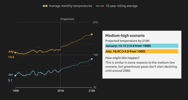
BBC News asks a straightforward question: How much warmer is your city? Enter your country and then your city. You get a time series along with projections. It reminds me of The New York Times piece from a few years ago, but the BBC one uses more recent data and covers major cities worldwide.
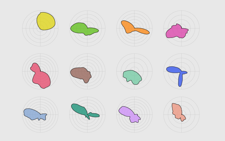
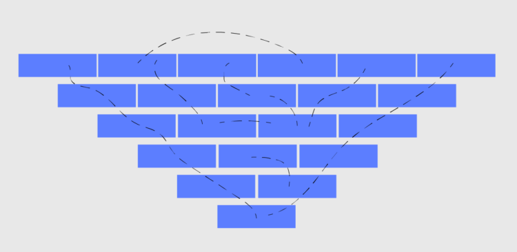
With cyclical data, a circular format might be useful. Combine that with a smooth density to reduce noise, and you got yourself a plot.
In survey data, there is usually an open-ended category for “not applicable” or “don’t know”. For Wired, Amit Katwala noticed an interesting subset of YouGov respondents who “didn’t know” things they should probably know:
But the thing that caught my eye when I came across the results on Twitter, and which quickly became an obsession, was the fourth option. Three per cent of Brits ‘don’t know’ whether they’ve tried surfing before. I was simultaneously baffled and enthralled.
Scrolling through the results of similar polls over subsequent days, weeks and months, I found a country that is deeply confused on a lot of seemingly straightforward issues. Two per cent of Brits don’t know whether they’ve lived in London before. Five per cent don’t know whether they’ve been attacked by a seagull or not. A staggering one in 20 residents of this fine isle don’t know whether or not they pick their nose.
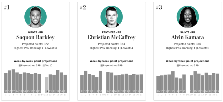
Football season is starting soon, which means many will participate in the age-old tradition of the fantasy football draft. For the Washington Post, Neil Greenberg and Reuben Fischer-Baum have your back:
Your fantasy football draft sets a season-long foundation for your team, but its ultimate result will be based on the weekly performance of your roster. That’s why The Washington Post is adding weekly point projections (using PPR scoring) to its draft rankings, based on a player’s role in his team’s offense and the difficulty of the matchup.
Look at all the players or pick a position and quickly get the rankings.
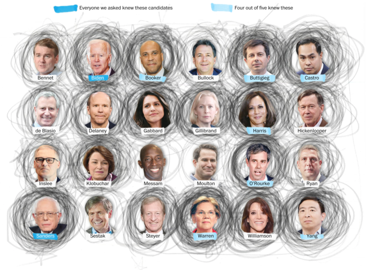
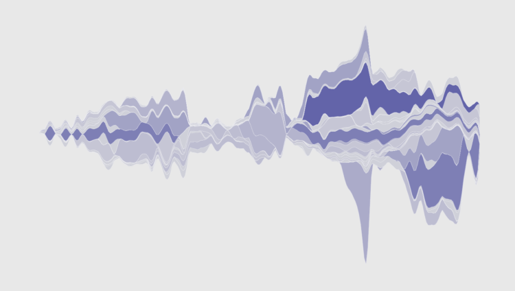
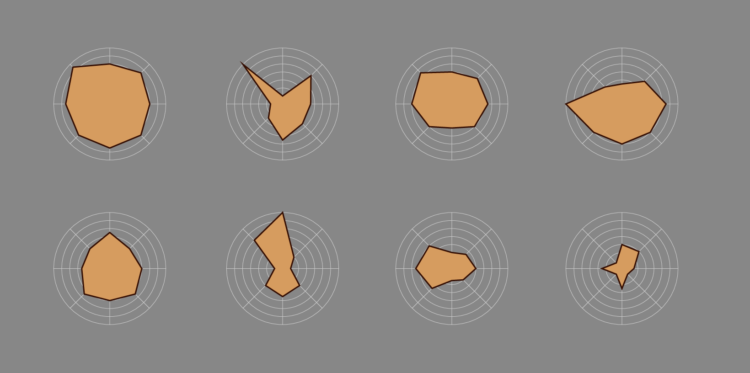
In a “radically unscientific survey” Kevin Uhrmacher and Kevin Schaul for The Washington Post asked 59 Iowa State Fair attendees if they could name Democratic candidates. Participants circled the ones they knew. Above are the results in aggregate.
I’m less interested in the results since I’m not so sure about the small sample, but the visual is fun. The scribble scrabble look is representative of the fuzzy dataset, and I wonder how this might apply to a larger dataset.
Cross this with that Quartz piece on drawing circles, split political leanings, and you’ve got yourself a humdinger.
Vox and Matt Daniels delved into falsetto in pop music over the years. Is falsetto a big trend now compared to the rest of the history? The process of finding the answer, noisy data and all, was just as interesting as the answer itself.
This week, we talk annotation and how it can make your charts more readable and easier to understand.
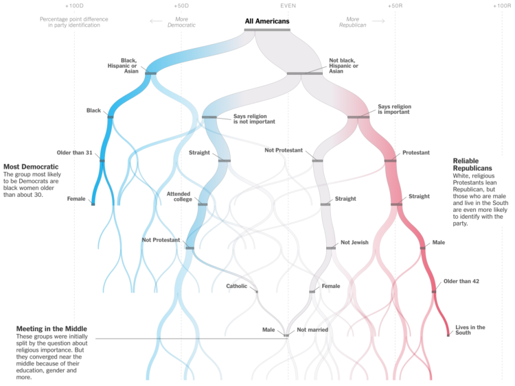
The New York Times is in a quizzy mood lately. Must be all the hot weather. Sahil Chinoy shows how certain demographics tend towards Democrat or Republican, with a hook that that lets you put in your own information. A decision tree updates as you go.
Reminds of the Amanda Cox decision tree classic from 2008.
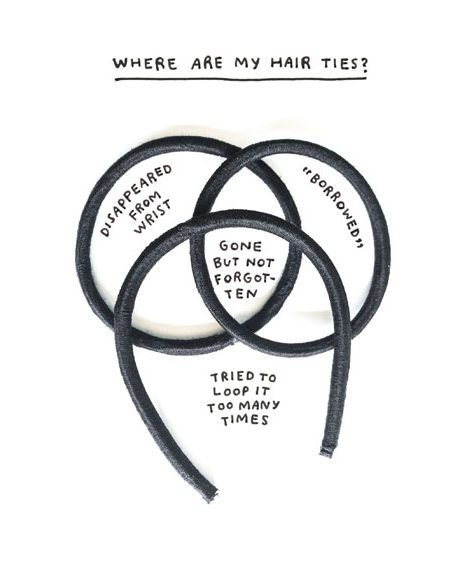
Add a book to the humorous-charts-documenting-the-everyday genre. Am I Overthinking This? by Michelle Rial charts the everyday. I like how Rial uses everyday objects to show everyday data informally. [Amazon link]
Which sandwich do people not like the most? The winner: the Cheese and Tomato, if that even counts as an actual sandwich.

Dorota M. Skowron et al. made the first 3-D map of the galaxy. Sean Greene and Andrea Roberson reporting for the Los Angeles Times:
Astronomers have understood since the 1950s that the galaxy is curved, but until now, they’ve based that idea on models and indirect measurements.
Over a six-year period, the researchers took more than 100 images of the galaxy from their observatory in the Chilean Andes. In particular, they monitored 2,400 stars called classical Cepheids, a category of “young” supergiants less than 400 million years old.
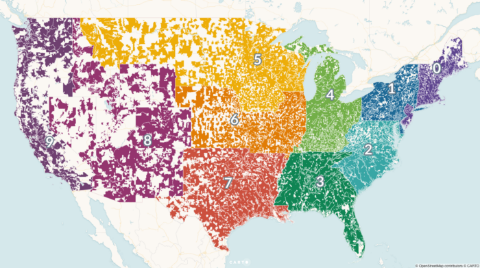
For Carto, Matt Forrest explains why you shouldn’t use ZIP codes for spatial analysis:
The problem is that zip codes are not a good representation of real human behavior, and when used in data analysis, often mask real, underlying insights, and may ultimately lead to bad outcomes. To understand why this is, we first need to understand a little more about the zip code itself.
In a nutshell, ZIP Codes don’t represent geographic areas, so it doesn’t make sense to treat them like they are.
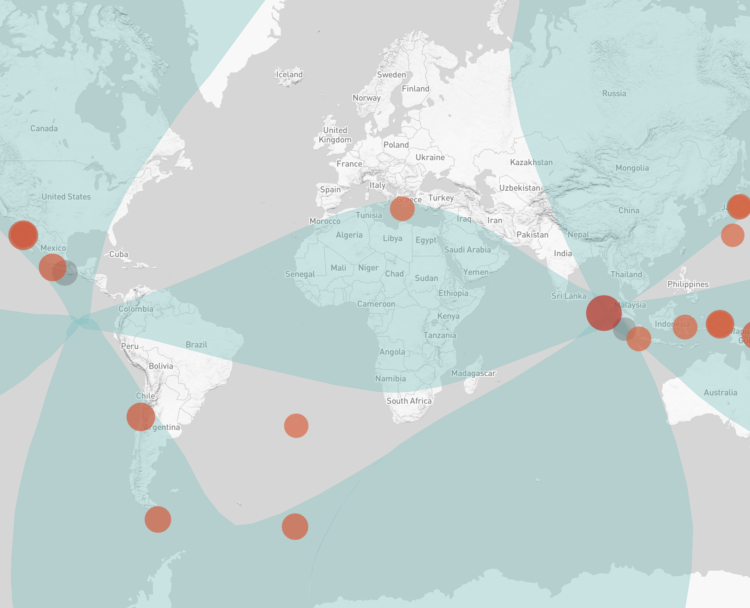
Speaking of earthquakes, Will Chase looked back at a 2012 earthquake in Sumatra that triggered not only a bunch of small ones in the vicinity, but other large ones around the world:
In the ten days following the Sumatra mainshock, 44 earthquakes M5.5+ were recorded. The statistics were clear: this nine-fold increase was highly significant, and most researchers agreed the likely explanation was remote triggering by the M8.6 Sumatra earthquake. This massive triggering of large earthquakes was unprecedented, and many wondered if the strike-slip mechanism at such a large magnitude was a unique combination that led to this outsized response.
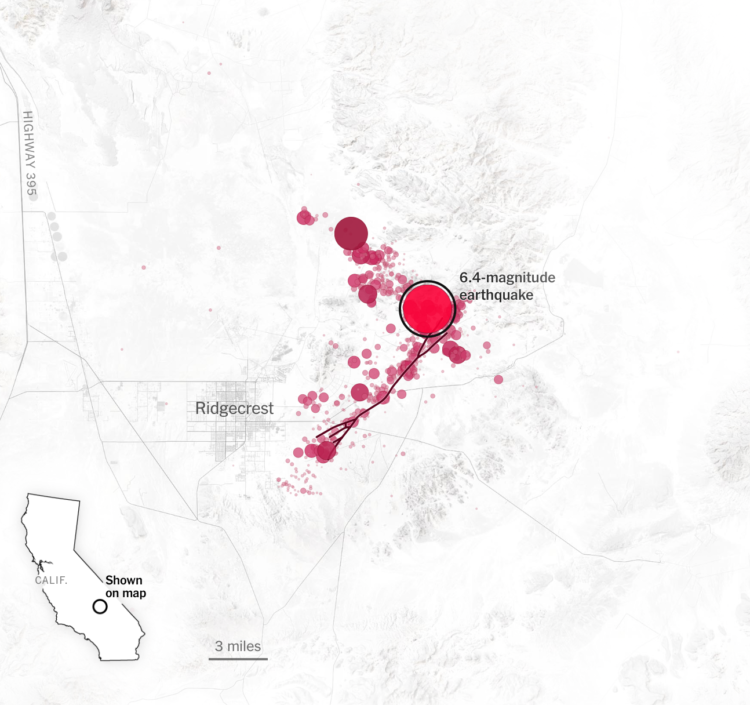
For The New York Times, Derek Watkins used animated maps to show how a large earthquake can lead to thousands of small ones.
Living in California, I’ve experienced a handful of these, but it had been a while before feeling one a few weeks ago. I may or may not have immediately started looking at earthquake insurance.
For everyone who does data visualization for a living right now, there was someone who came before.
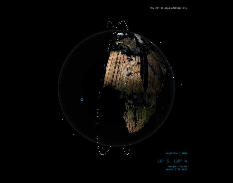
Over the past four years, Planet deployed 293 satellites in low orbit to take a snapshot of Earth every day. This animation by Nadieh Bremer shows how the snapshot gets pieced together. Most of me is like, yeah awesome. But then there’s that remaining bit of me that is a little bit nervous.

This animated interactive explains how a research group is using light to measure the speed of objects millions of miles away. Light that is farther away will appear to be a different color than a light that is closer. So by measuring the rate of color shifts, they can estimate velocity.
Survey participants were asked to grade fast food burger restaurants on eight criteria. This is how each restaurant ranked.
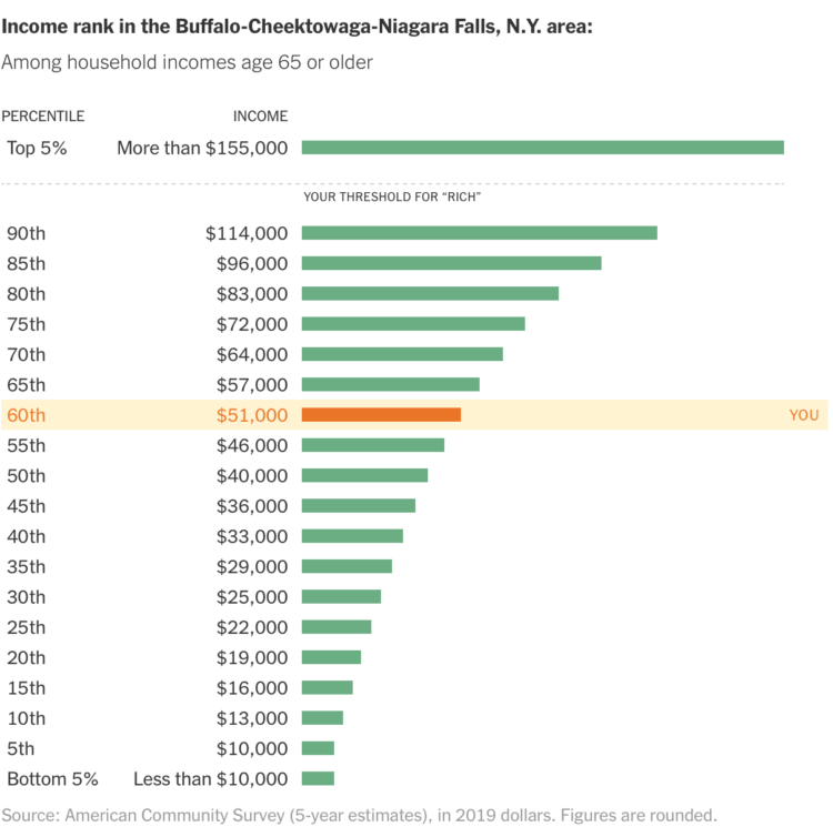
In a compare-your-preconceptions-against-reality quiz, The Upshot asks, “Are you rich?” Enter your nearest metro area, income, and what you consider to be rich. See where you actually land.
 Visualize This: The FlowingData Guide to Design, Visualization, and Statistics (2nd Edition)
New tools, refined process.


