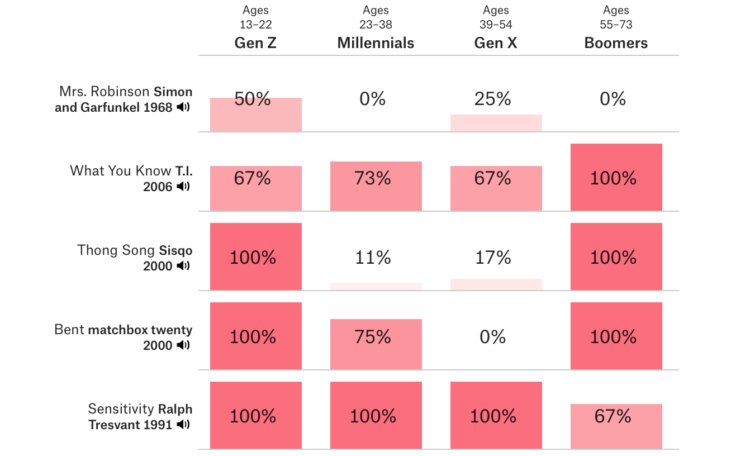
• On Multiple Views, the Interactions Lab talks about their experience as a design studio and how quickly implementations can change when you introduce real data into the system:

    It’s easy to assume that the tools and approaches used for general software design apply equally to data visualization design. But data visualization design and interface design are often deeply and fundamentally distinct from one another. We learned this the hard way when we turned our research lab into a collaborative data visualization design studio for a few years. Data permeates visualization interfaces in ways that pose challenges at every stage of the design process. These challenges are even greater within large visualization teams. By reflecting on and articulating these challenges, we hope to inspire new, powerful data visualization design tools and communication processes.

    Always start with real data. You’re wasting your time otherwise.

  • For Tampa Bay Times, Tracey McManus and Eli Murray delve into the purchasing of properties Clearwater, Florida by the Church of Scientology:

    The Church of Scientology and companies run by its members spent $103 million over the past three years buying up vast sections of downtown Clearwater.

    They now own most commercial property on every block within walking distance of the waterfront, putting the secretive church firmly in control of the area’s future.

    Most of the sales have not previously been reported. The Tampa Bay Times discovered them by reviewing more than 1,000 deeds and business records, then interviewed more than 90 people to reconstruct the circumstances surrounding the transactions.

    The lead-in scrollytelling through Clearwater is quite effective in laying the foundations of the story.

  • Microsoft just open sourced their data exploration tool known as SandDance:

    For those unfamiliar with SandDance, it was introduced nearly four years ago as a system for exploring and presenting data using “unit visualizations.” Instead of aggregating data and showing the resulting sums as bar charts, SandDance shows every single row of a dataset (for datasets up to ~500K rows). It represents each of these rows as a mark that can be colored and organized into different areas on the screen. Thus, bar charts are made of their constituent units, stacked, or sorted.

    Nice. I hadn’t heard about SandDance until now, but I’m saving for later. You can grab the source on GitHub.

  • Members Only

    Data represents the real world, and visualization represents data. But sometimes data and the real world disagree with each other.

  • [arve url=”https://vimeo.com/304321201″ /]

    When it comes to meaningful visualization, context is everything. Richard Brath, at the 2018 Information+ Conference, looks back on historical visualization approaches and how they might be applied today to make data graphics easier to read and use.

  • One person’s long commute is another’s dream. Another person’s normal might be someone else’s nightmare. What counts as a long commute depends on where you live.

  • A study found that a hospital program significantly reduced the number of hospitalizations and emergency department visits. Great. But then the researchers realized that the data was recoded incorrectly, and the program actually increased hospitalizations and emergency department visits. Not so great.

    They retracted their paper:

    The identified programming error was in a file used for preparation of the analytic data sets for statistical analysis and occurred while the variable referring to the study “arm” (ie, group) assignment was recoded. The purpose of the recoding was to change the randomization assignment variable format of “1, 2” to a binary format of “0, 1.” However, the assignment was made incorrectly and resulted in a reversed coding of the study groups. Even though the data analyst created and conducted some test analysis programs, they were of the type that did not show any labeling of the arm categories, only the “arm” variable in a regression, for example.

    Here’s the original, now-retracted study. And here’s the revised one.

    Data can be tricky and could lead to unintended consequences if you don’t handle it correctly. Be careful out there.

  • FiveThirtyEight has been predicting NBA games for a few years now, based on a variant of Elo ratings, which in turn have roots in ranking chess players. But for this season, they have a new metric to predict with called RAPTOR, or Robust Algorithm (using) Player Tracking (and) On/Off Ratings:

    NBA teams highly value floor spacing, defense and shot creation, and they place relatively little value on traditional big-man skills. RAPTOR likewise values these things — not because we made any deliberate attempt to design the system that way but because the importance of those skills emerges naturally from the data. RAPTOR thinks ball-dominant players such as James Harden and Steph Curry are phenomenally good. It highly values two-way wings such as Kawhi Leonard and Paul George. It can have a love-hate relationship with centers, who are sometimes overvalued in other statistical systems. But it appreciates modern centers such as Nikola Jokić and Joel Embiid, as well as defensive stalwarts like Rudy Gobert.

    I’ve mostly ignored sports-related predictions ever since the Golden State Warriors lost in the 2016 finals. There was a high probability that they would win it all, but they did not. That’s when I realized the predictions would only lead to a neutral confirmation or severe disappointment, but never happiness.

    I’m sure this new metric will be different.

  • For The Washington Post, Lauren Tierney and Joe Fox mapped fall foliage colors across the United States:

    Forested areas in the United States host a variety of tree species. The evergreens shed leaves gradually, as promised in their name. The leaves of deciduous varieties change from green to yellow, orange or red before letting go entirely. Using USDA forest species data, we mapped the thickets of fall colors you may encounter in the densely wooded parts of the country.

    Nice. Be sure to click through to the full story to see leaf profiles and an animation of the changing colors as fall arrives.

  • Members Only

    Visualization has a way of making things feel more concrete and definite. So how is it that interpretation gets so fuzzy?

  • Here in northern California, PG&E is shutting off power to thousands of households in efforts to prevent wildfires. Luckily, the area I live is just outside of the shutoff areas, but for others, a map of what’s up would be useful, right?

    However, instead of a map, which is “temporarily unavailable” at the time of this writing, PG&E is providing shapefiles. I mean, that’s kind of nice for people who like to make maps, but it’s not so great for the rest. There’s a metaphor in there somewhere.

    At least you can keep track with the San Francisco Chronicle:

  • A quick annotation by Jonnie Hallman on Twitter: “GitHub is really good at visualizing burnout.”

  • As discussed previously, the “impeach this” map has some issues. Mainly, it equates land area to votes, which makes for a lot of visual attention to counties that are big even though not many people live in them. So, Karim Douïeb used a clever transition to change the bivariate map to a cartogram. Now you can have a dual view.

  • How to Make Animated Visualization GIFs with ImageMagick

    Using the library command-line gets you more flexibility to highlight the important parts of the data.

  • Kelly Martin died of cancer on September 30. She was able to enjoy her final days at home, and as she knew the end was near, she kept track of her drug doses in a dashboard:

    Brain tumors are unpredictable. I don’t want my last days with a personality that isn’t mine. I wanted to laugh, to enjoy the days, and fart around in the garden as much as possible. We added in a variety of medications to use as needed to manage symptoms and tracked what worked and what didn’t in a Tableau dashboard. It was the only way to see the patterns and to get more good days.

    From Bridget Cogley, Martin’s friend who took over the writing as Martin grew too ill:

    63% of Canadians with a terminal illness want to die at home. Only about 15% do. Kelly Martin died on September 30, 2019 in her home with her son and me (Bridget) at her side and her mother on the phone. A true honor she gifted us knowingly. We used this dashboard to provide care and communicate with providers. It was crafted in a couple of hours, edited with Kelly’s feedback, and used to provide a better death. Seeing the data can truly be life-changing.

    I… just. Wow.

  • David Leonhardt, for The New York Times, discusses the relatively low tax rates for the country’s 400 wealthiest households. The accompanying animated line chart by Stuart A. Thompson shows how the rates have been dropping over the years, which are now “below the rates for almost everyone else.” Oh.

  • Visualization is a relatively new field. Sort of. The increased availability of data has pushed visualization forward in more recent years, but its roots go back centuries. Michael Friendly and Howard Wainer rewind back to the second half of the 1800s, looking at the rise of visual thinking.

    On the first construction of the periodic table of elements:

    On February 17, 1869, right after breakfast, and with a train to catch later that morning, Mendeleev set to work organizing the elements with his cards. He carried on for three days and nights, forgetting the train and continually arranging and rearranging the cards in various sequences until he noticed some gaps in the order of atomic mass. He later recalled, “I saw in a dream, a table, where all the elements fell into place as required. Awakening, I immediately wrote it down on a piece of paper.” (Strathern, 2000) He named his discovery the “periodic table of the elements.”

    I sometimes wonder what they will say about current visualization work a couple of centuries from now. At what point will the historians say, “This is when visualization crashed and burned, never to be seen again.” Or, maybe it’ll go the other way: “This is when everyone understood and communicated with data, and visualization was the vehicle to do it.”

  • Toph Tucker used to make graphics for Bloomberg Businessweek. Now he does enterprise visualization for finance. He wrote about the major differences between the two jobs. On the iconic Bloomberg Terminal:

    There are more things in Bloomberg than are dreamt of in your meetings. This was not the consensus when I worked at Bloomberg, but I now believe the Terminal is incredibly well-designed. Folks reply, “I get that it’s useful, but I don’t think that means it’s well-designed,” and I rejoin: No! It is well-designed in every way that matters, even visually! (Such nice high-contrast easy-to-spot color-coded inputs and affordances! So nice that it stretches rather than reflow critical content off the screen!) I want people to look, and recoil, and then remind themselves that Bloomberg is wiser than that disgust. If you haven’t been in the position it’s built for, it’s a deep-set Chesterton’s fence; only after you’ve understood it can you disagree with it.

    On Excel:

    One large hedge fund shows every new young software engineer a particular Excel spreadsheet that makes hundreds of millions of dollars a year as part of their orientation, to beat the programmer’s “Excel isn’t serious” hubris out of them upon arrival. At this level, Excel is not interchangeable with Google Sheets or Apple Numbers or even Excel for Mac.

    I love how there are these clusters of visualization that exist in the world, all making charts, but with completely different approaches and usage.

  • Members Only

    The visualizations are used and read differently, which requires that you approach their design differently.

  • How many US cities can you name? Here’s a quick and fun game by Ian Fisher to find out. Simply start entering as many as you can think of and rack up population counts as a sort of point system.