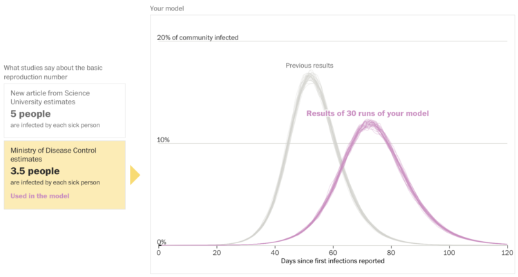
Harry Stevens and John Muyskens for The Washington Post put you in the spot of an epidemiologist receiving inquiries from policymakers about what might happen:
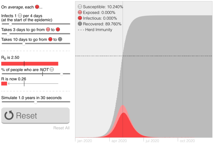
Imagine you are an epidemiologist, and one day the governor sends you an email about an emerging new disease that has just arrived in your state. To avoid the complexities of a real disease like covid-19, the illness caused by the novel coronavirus, we have created a fake disease called Simulitis. In the article below, we’ll give you the chance to model some scenarios — and see what epidemiologists are up against as they race to understand a new contagion.
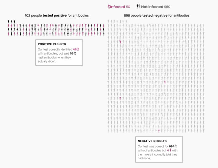
Fuzzy numbers, meet real-world decisions.


 Visualize This: The FlowingData Guide to Design, Visualization, and Statistics (2nd Edition)


