
If you have a room of monkeys hitting keys on typewriters for an infinite amount of time, do you eventually end up with a Shakespeare play? For The Pudding, Russell Goldenberg and Amber Thomas put the infinite monkey theorem to the test directing the computer to randomly generate musical note patterns to match classic songs.
All said and done, the point here isn’t the real numbers, but the faith that given enough time, randomness will prevail. Will our experiment eventually play even the simple Nokia ringtone in our lifetime? Almost certainly not. Given enough time would it? Almost surely.
The experiment has been running for 10 days so far, currently working on “Another One Bites the Dust” by Queen.


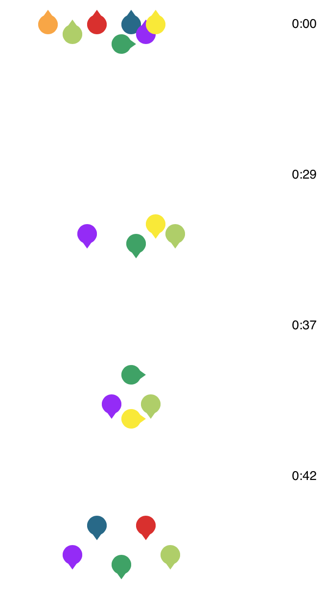 BTS, the South Korean boy band, is apparently really good at dancing. Ketchup Duck


 Visualize This: The FlowingData Guide to Design, Visualization, and Statistics (2nd Edition)


