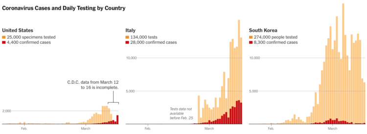
Coronavirus testing in the United States has been a slow process to say the least. The New York Times shows how test counts contrast against other countries. There’s some catching up to do.
Using R, we look at how your decreased interaction with others can help slow the spread of infectious diseases.
Coronavirus testing in the United States has been a slow process to say the least. The New York Times shows how test counts contrast against other countries. There’s some catching up to do.
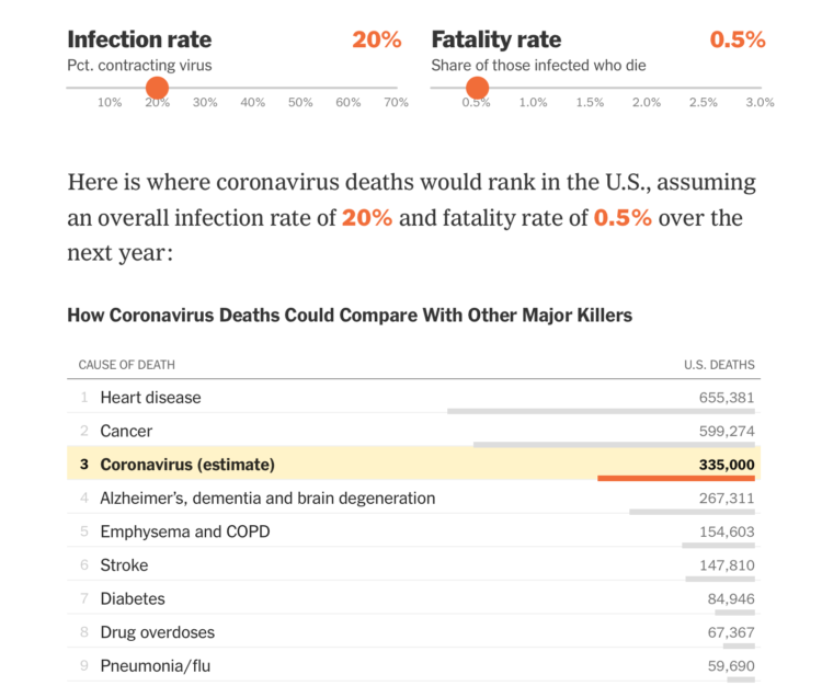
Based on estimates from public health researcher James Lawler, The Upshot shows the range of coronavirus deaths, given variable infection and fatality rate. Adjust with the sliders and see how the death count (over a year) compares against other major causes of death:
Dr. Lawler’s estimate, 480,000 deaths, is higher than the number who die in a year from dementia, emphysema, stroke or diabetes. There are only two causes of death that kill more Americans: cancer, which kills just under 600,000 in a year, and heart disease, which kills around 650,000.
A coronavirus death toll near the top of the C.D.C. range (1.7 million) would mean more deaths from the disease than the number of Americans typically killed by cancer and heart disease put together.
Can we all agree now that brushing off coronavirus by floating annual flu numbers is a bad comparison? The most worrisome part of the data we have is the uncertainty and then the range of possibilities that come out of that uncertainty.
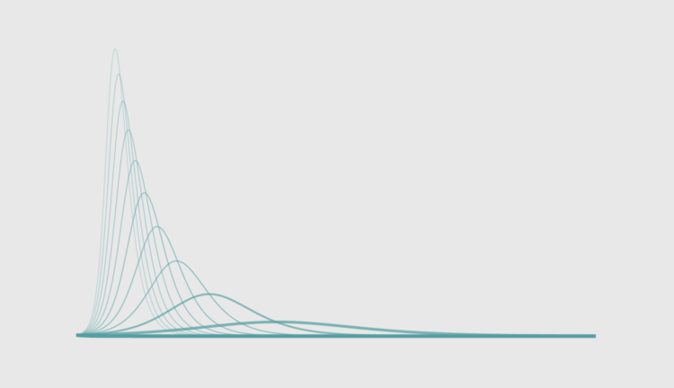
Social distancing is the game plan these days. Try to stay at home and avoid contact with others as much as you can. But why? For The Washington Post, Harry Stevens used simplified simulations of an imaginary virus to show how social distancing can flatten the curve.
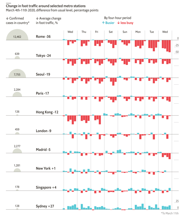
From The Economist, this chart shows the (mostly) decrease in foot traffic in major cities with coronavirus outbreaks. It’s based on data scraped from that section in Google Maps that shows how busy a location is, which I’m kind of surprised the Google limits allowed for. See James Fransham’s thread for more details on their process.

This issue of The Process is public.
Hi,
I don’t know about you, but I’ve been finding it hard to concentrate the past week or so. I keep getting guidelines on washing hands and reassurances from the kids’ school that everything is sanitized multiple times per day. There are empty shelves at the stores with toilet paper and hand sanitizer. It all just feels very uneasy.
And, as I’m sure you heard, the World Health Organization classified Covid-19 as a pandemic. Naturally, I continued voraciously consuming information about the coronavirus. Here’s a rundown of the useful visuals that have crossed my way. They didn’t help with the uneasiness, but they at least provide a window into what’s happening.
There’s a lot of figures and numbers floating around about the coronavirus disease. Some conflict with each other and some are from less trustworthy sources. It’s getting tough to filter through. So Our World in Data, which typically offers a view of global progress, has been compiling research and data with links to its sources:
Most of our work focuses on established problems, for which we can refer to well-established research and data.
COVID-19 is different. All data and research on the virus is preliminary; researchers are rapidly learning more about a new and evolving problem. It is certain that the research we present here will be revised in the future. But based on our mission we feel it is our role to present clearly what the current research and data tells us about this emerging problem and especially provide an understanding of what can and cannot be said based on this available knowledge.
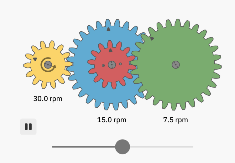
Bartosz Ciechanowski took a deep dive into how gears work and the physics behind the movement with a series of graphics and interactives:
I’ve always been fascinated by mechanical gears. There is something captivating about the way their teeth come together to create a fluid, unified motion.
In this blog post I’d like to look at these simple machines up close. I’ll explain how gears affect the properties of rotational motion and how the shape of their teeth is way more sophisticated than it may initially seem.
[Thanks, @mtoconnor3]

For The New York Times, Jonathan Corum and Carl Zimmer describe how the SARS-CoV-2 Coronavirus hijacks your cells, makes copies of itself, spreads through the body, and infects others.
The vertical scrolling provides a clear path from beginning to end of a life cycle, and the color transitions separate various stages. Informative.
Really wishing we could just skip to the end.
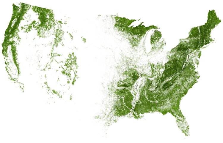
EarthArtAustralia mapped all of the trees and forests in the United States, based on data from researchers Hansen et al. at the University of Maryland.
Read More
3Blue1Brown explains exponential growth and epidemics and answers the question of when the curve levels off:
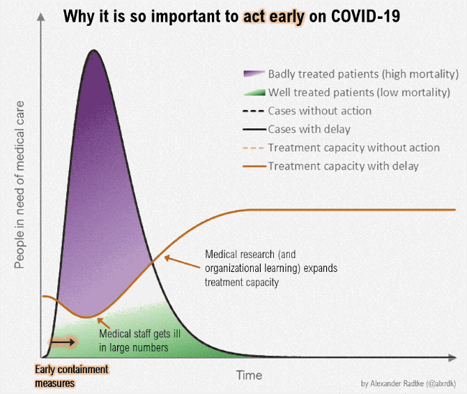
The coronavirus can possibly infect a lot more people than there are those who can provide medical care. But if we slow the spread, and there are fewer people in need of care at the same time, the difference might be less overbearing. This version of the “flatten the curve” graphic by Alexander Radtke, first made by Rosamund Pearce for The Economist, illustrates the difference in animated form.
Vicki Boykis riffing off the George Box quote, “All models are wrong, some are useful.”:
The point is that, whatever data you dig into, at any given point in time, that looks solid on the surface, will be a complete mess underneath, plagued by undefined values, faulty studies, small sample problems, plagiarism, and all of the rest of the beautiful mess that is human life.
Just as all deep learning NLP models are really grad students reading phone books, if you dig deep enough, you’ll get to a place where your number is wrong or calculated differently than you’ve assumed.
I think of statistics as uncertainty management. It’s about estimates and figuring out how much you can trust them. Working with data is rarely about getting an exact truth.
Hannah Davis works with machine learning, which relies on an input dataset to build a model of the world. Davis was working with a model for a while before realizing the underlying data was flawed:
This led to a perspective that has informed all of my work since: a dataset is a worldview. It encompasses the worldview of the people who scrape and collect the data, whether they’re researchers, artists, or companies. It encompasses the worldview of the labelers, whether they labeled the data manually, unknowingly, or through a third party service like Mechanical Turk, which comes with its own demographic biases. It encompasses the worldview of the inherent taxonomies created by the organizers, which in many cases are corporations whose motives are directly incompatible with a high quality of life.
Speaking of responsible visualization, Datawrapper provides 17 charts and maps you can use in your stories, without causing unnecessary panic.
Below is an embedded example:
You can easily edit the charts, download the data, or export as an image file. Datawrapper also describes the sources behind the charts and tips on using them in your stories, making for a solid resource.
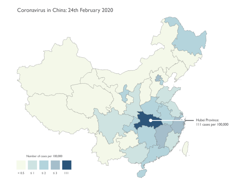
We’re seeing a lot of maps now about coronavirus. There are a lot counts, rates, and a little bit of panic involved. Kenneth Field provides guidance on mapping this data responsibly:
We’ll focus just on data for China in the following series of maps. They are designed to look like small maps you might find on a news media web site. Relatively simple, and with just the basic facts. Many of the issues I’ll note are equally applicable whether you’re making a small static map or an interactive web map.

These past few weeks, and especially this one, has been full of uncertainty. Probabilities, odds, and rates. In this issue of The Process we talk about ways to visualize this uncertainty.

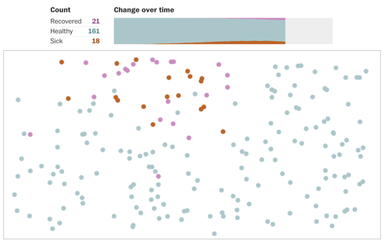
The CDC recommends that you do not touch your face to minimize the spread of the coronavirus. We do this quite a bit without even thinking about it, so Do Not Touch Your Face uses machine learning to help you adjust. Train the algorithm, and then the algorithm trains you.
The New York Times has a rundown of what happened on Super Tuesday, with five takeaways. One of the sections uses a ternary plot to show support for Sanders, Biden, and other candidates:
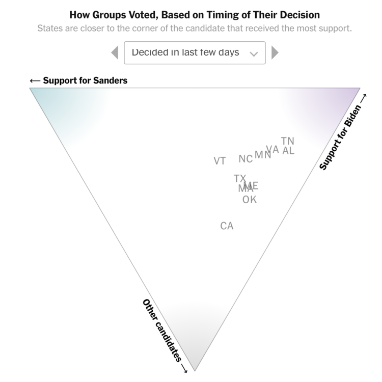
In case you’re unfamiliar, a ternary plot shows the ratios of three variables as a single position. In this case, the variables are support for Sanders, Biden, and Other. More support moves a point closer to the respective corner of the triangle.
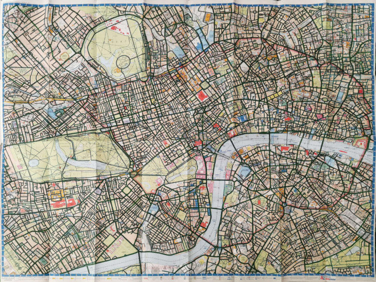
Davis Vilums set a goal to cycle every street in London on his way to work (without being late). After four years, he accomplished his goal:
I am a passionate cyclist, and I love the streets of London. Most of my travels are daily 25-minute rides to work. Over time my route became boring. I decided to make it a little bit more interesting by taking the parallel streets on my way there. I bought a map of central London and started to colour in the streets to mark the routes that I have taken. And then I got obsessed with it.


 Visualize This: The FlowingData Guide to Design, Visualization, and Statistics
Available now.