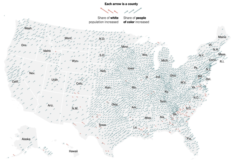
-
Using a wide array of sources, The New York Times shows how the virus spread at a granular level. The foundation is a map with moving dots, and the piece takes you through movements based on cell phone data and air travel in concert with known coronavirus cases.
Your jaw might drop a few times as you go through it.
Back in March, NYT published a similar work for how the spread started in China. We were talking about washing hands and restaurants closing. Thinking back to then and seeing where we are now stings.
-
Even though there was supposedly a person in the decision-making process and a surveillance photo wasn’t actually Robert Julian-Borchak Williams, he still ended up handcuffed in front of his own home. Kashmir Hill reporting for The New York Times:
This is what technology providers and law enforcement always emphasize when defending facial recognition: It is only supposed to be a clue in the case, not a smoking gun. Before arresting Mr. Williams, investigators might have sought other evidence that he committed the theft, such as eyewitness testimony, location data from his phone or proof that he owned the clothing that the suspect was wearing.
In this case, however, according to the Detroit police report, investigators simply included Mr. Williams’s picture in a “6-pack photo lineup” they created and showed to Ms. Johnston, Shinola’s loss-prevention contractor, and she identified him. (Ms. Johnston declined to comment.)
-
In crime shows, they often have this amazing tool that turns a low-resolution, pixelated image of a person’s face to a high-resolution, highly accurate picture of the perp. Face Depixelizer is a step towards that with machine learning — except it seems to assume that everyone looks the same.
-
Welcome to whose bar chart is it anyway: where the geometries are made up and the numbers don’t matter. [via @dannypage]
-
Kurzgesagt, in collaboration with Our World in Data, tackle the question of who is responsible for climate change and who should fix it. As you might imagine, the answer is not always straightforward.
-
Based on estimates from the United States Census Bureau released for July 2019, Millennials are the largest living generation in the country now.
-
Maybe you’ve seen a chart and wished you could look at the data yourself. Maybe you want to see it from a different angle. But the underlying dataset is nowhere to be found. The WebPlotDigitizer by Ankit Rohatgi lets you load an image and it will attempt to pull out the dataset. Amazing.
I can’t believe this has been around since 2010, and I’m just now hearing about it. [via @jburnmurdoch]
-
New York Times Opinion compared several demographics, such as unemployment and income, between majority-black and majority-white neighborhoods in the United States.
They come back to the zipper chart technique where the dots start together and then separate to emphasize the gaps. Horizontally, dots are sorted by smallest to largest difference.
-
Dylan Tallchief recreated “Take On Me” by a-ha in Excel.
It’s not the tools. It’s how you use them. Something something blah blah. It’s in Excel!
-
Members Only
-
Here is the breakdown for each state in the United States, based on estimates from the American Community Survey.
-
The name Karen. It’s not a common baby name these days. It peaked in the 1960s. The Pudding looked for other names in US history that followed similar trends:
To put this question to the test, we checked baby names from the last 100 years and eliminated those that: 1) never made it into the Top 20 most popular names in any year and 2) were not present in the top list for at least 50 out of 100 years. That left us with 129 female names and 76 male names (yes, we’re going there too!). We tested each of these names, looking for the ones that most closely matched Karen’s rise and fall in popularity.
You can also search for your own name to see if it’s a “future Karen.”
-
All you need is an old table, gift wrapping paper, and some varnish. I’m gonna have to do this. [via @datavisFriendly]
-
As a 100-day project, Alli Torban has been imagining what a data visualization designer’s wallpaper might look like through the years. She started in 1920, and with one design per year, she’s up to 1989.
The focus on aesthetics shows slow shifts in colors and patterns through time. Although I feel like the early 1980s, when The Visual Display of Quantitative Information was first published, should look super minimalist with a lot of space.
Good stuff.
-
Robert Hodgin built a procedural system he calls Meander to generate the beauty above, among several others:
My all-time favorite map-based data visualization was created in 1944. Harold Fisk, working with the US Army Corp. of Engineers, mapped the length of the Mississippi River. What sets his visualization apart from others is that he maps the river through time, and manages to do so in a way that is both beautiful and surprisingly effective. I want to pay homage to his series of maps by creating my own system for procedurally generating maps of meandering rivers.
Great.
Not only is the winding path imaginary, but so is the terrain, the place names, and the built-up lakes.
See also: the 1944 Fisk map that inspired Hodgin’s work, which is an interesting contrast against modern satellite imagery animations.
-
Members Only
-
The Economist launched their 2020 elections forecast. Right now a part of my brain is telling me to avoid election forecasts this year, but the other part of me is like, don’t fight it, you know you’re going to look.
At least The Economist put their modeling code up on GitHub (implemented in R and Stan) and is publishing their polling data (linked at the bottom of the forecast page as a Google sheet).
-
As we know, it typically takes years to develop a vaccine that is approved for wide scale use. For the coronavirus, researchers are trying to speed up that timeline. Jonathan Corum and Carl Zimmer for The New York Times have started a vaccine tracker to keep watch.
They’ve categorized the vaccines by phase and those that are part of Operation Warp Speed. (Earmarked for later: a closer look at government program names.)