That can’t be for real, right? Right? A basic chart is not quite what it seems.
Nathan Yau
-
Members Only
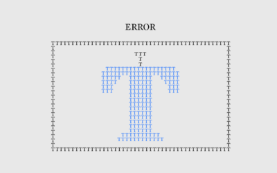
Mistaken Error
-

One home’s blackouts in Kyiv
Volodymyr Agafonkin and his family live in Kyiv, Ukraine. He visualized when the…
-

Conway’s Game of Life in infinite space
Conway’s Game of Life is a zero-person game where cells in a grid…
-

Bodybuilder risks
The human body has its limits, so many bodybuilders take steroids to increase…
-

Information Graphic Visionaries delivered
Visualization still seems like a relatively new thing, but it has a history…
-
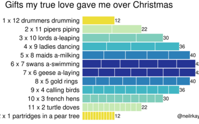
Gifts my true love gave to me over the 12 days of Christmas
From Reddit user neilrkaye. This is very important.…
-
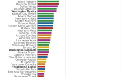
Perfect seasons needed to get over .500 overall
Here’s a fun one from Philip Bump for The Washington Post. Bump simply…
-
Members Only

Scratching Projects
Sometimes it’s not worth finishing what you start.
-

Life cycle of coronavirus at the molecular level
From Maastricht University:
What happens if a SARS-CoV-2 coronavirus enters your lung? This… -

Tour through the greatest movies of all time
Every ten years since 1952, Sight and Sound, a British film magazine, has…
-

Digital face aging with neural network
Disney Research demonstrates their use of neural networks to seamlessly age and de-age…
-

Asteroid simulator for before the big one hits
Knowing the impact of an asteroid falling in your city might not seem…
-
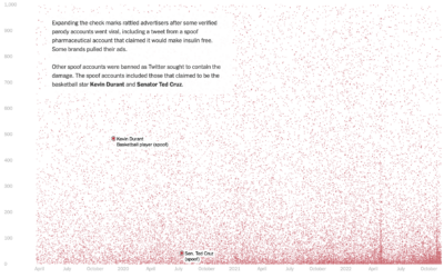
Who pays for Twitter
Twitter Blue is a subscription service from Twitter that primarily provided premium features…
-
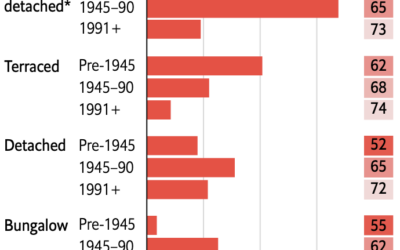
Retrofitting old British homes to improve energy efficiency
Speaking of old homes and energy efficiency in the UK, The Economist describes…
-

Managing temperature fluctuations through UK architecture
Philip Kennicott, Simon Ducroquet, Frank Hulley-Jones and Aaron Steckelberg, for The Washington Post,…
-
Members Only
Visualization Tools and Learning Resources, November 2022 Roundup
Here’s the good stuff for November.
-

Upward mobility through a personal lens
Aaron Williams, for The Pudding, shows upward mobility through his own experiences, moving…
-
On the Data Journalism Podcast
I had a short chat with Alberto Cairo and Simon Rogers on The…
-
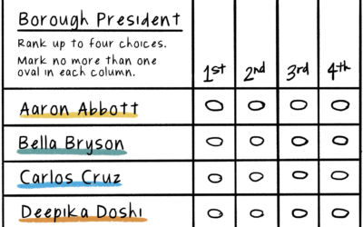
Illustration of ranked-choice voting
Connie Hanzhang Jin and Kaitlyn Radde, for NPR, used illustrations to explain how…
-
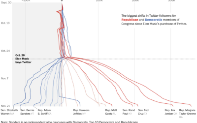
Republican and Democrat follower counts on Twitter
You might have heard that Elon Musk bought Twitter, and among the many…
Recently for Members
Second Edition
 Visualize This: The FlowingData Guide to Design, Visualization, and Statistics (2nd Edition)
 Visualize This: The FlowingData Guide to Design, Visualization, and Statistics (2nd Edition)
New tools, refined process.
Browse by Chart Type See All →


