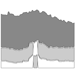
Andrew Wang-Hoyer built over 200 animations on and off over two years. They…
Nathan Yau
-

SVG and CSS animations, without JavaScript
-
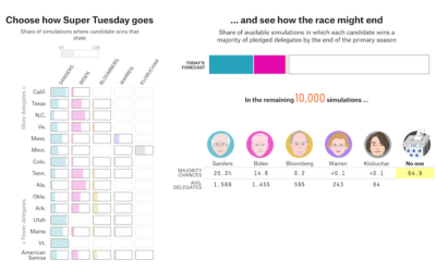
Super Tuesday simulator
With Super Tuesday on the way, there’s still a lot of uncertainty for…
-

Small multiples pizza baby
For each month in her child’s first year, Amanda Makulec took a picture…
-
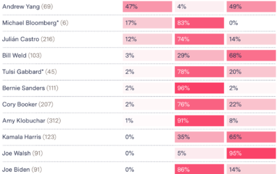
Testing Gmail’s tab choices on presidential candidates’ emails
For many, Gmail automatically categorizes incoming emails to the primary inbox, promotions, and…
-
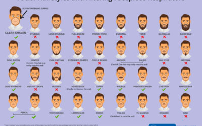
Face mask respirator and its usefulness with different beard styles
The Centers for Disease Control and Prevention made this graphic to show what…
-
Members Only

Visualization Tools, Datasets, and Resources — February 2020 Roundup (The Process #78)
Every month I collect useful tools and resources for visualization. Here’s the good stuff for February 2020.
-
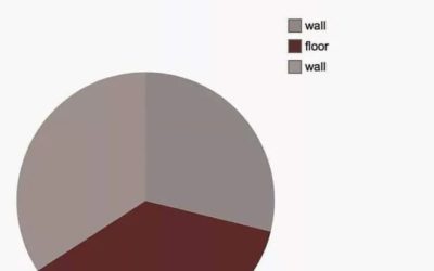
Living room corner pie chart
From reddit user shoru_lannister, here is a pie chart of their living room…
-

BellTopo Sans is is a free typeface based on maps from 1800s
While working on maps inspired by USGS maps from the 1800s, Sarah Bell…
-
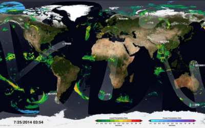
Map shows how NASA satellites collect global rain data
[arve url=”https://www.youtube.com/watch?v=bO9-dyYK3qQ” loop=”no” muted=”no” /]
We can download data as a single snapshot… -
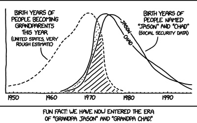
Grandpa Chad distribution
xkcd crossed a rough age distribution of people becoming grandparents with people named…
-
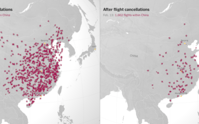
Canceled flights due to coronavirus
With an animated side-by-side map, The New York Times shows canceled flights in…
-
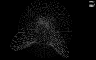
Map of mathematics
The Map of Mathematics from Quanta Magazine explains key concepts with animated visualizations:…
-

Scale of Bloomberg net worth
While we’re on the topic of Mike Bloomberg’s money, here’s another view from…
-
Members Only
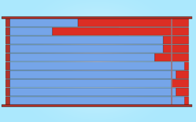
A Better Chart, Limitations Considered: Exit Poll Results (The Process #77)
Welcome to a new segment where I try to put myself in the shoes of someone who made a bad chart and try to make it better.
-

Bloomberg ad spending, relative to other candidates’
Mike Bloomberg’s ad spending might not be that much relative to his own…
-
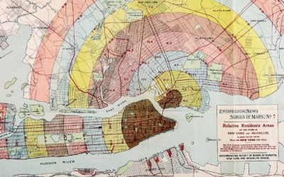
Forgotten map types
Geographer Tim Wallace likes to look at old maps, and is particularly fond…
-

Datylon Graph is a visualization extension for Illustrator
Adobe Illustrator has charting functions that can be useful if you’re on a…
-
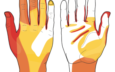
Most often missed areas while washing hands
This graphic from WakeMed shows the areas most often missed while washing hands.…
-

Botnet, a social network where it’s just you and a lot of bots
Botnet is a social media app where you’re the only human among a…
-
Members Only

Big Money You Can Relate To (The Process #76)
This week, a few projects went up on the internets about money and spending, each with different goals and approaches. In this issue of The Process, we look at each more closely.
Recently for Members
Second Edition
 Visualize This: The FlowingData Guide to Design, Visualization, and Statistics (2nd Edition)
 Visualize This: The FlowingData Guide to Design, Visualization, and Statistics (2nd Edition)
New tools, refined process.
Browse by Chart Type See All →