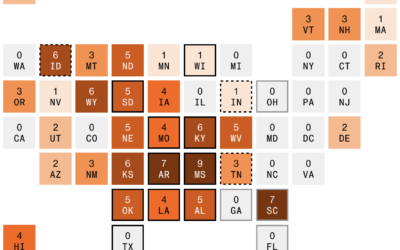
By Engaging Data, this interactive map shows various splits of the United States…
-
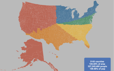
Splitting the US population evenly, with arbitrary shapes
-
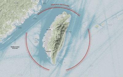
China’s possible blockade around Taiwan
It appears China wants to impose a blockade around Taiwan with ships, submarines,…
-
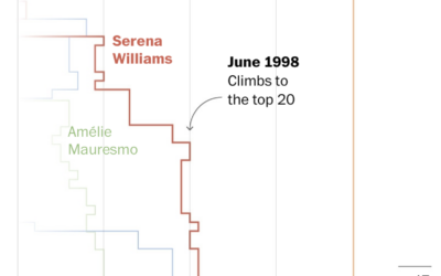
Losses and comebacks of Serena Williams
We tend to celebrate the wins in sports and often forget about or…
-

Big diagram of metabolic pathways
The contents of this diagram is not in my scope, but it is…
-
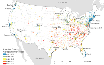
Where restaurant chains dominate
Researchers Xiaofan Liang and Clio Andris estimated the percentage of restaurants that are…
-

Introduction to Probability for Data Science, a free book
Introduction to Probability for Data Science is a free-to-download book by Purdue statistics…
-
Members Only

Visualization Tools and Learning Resources, August 2022 Roundup
Here’s the good stuff for August.
-

Meteorologist delighted by surprise map interaction
Meteorologist Greg Dutra was delivering the daily weather news for ABC Chicago and…
-
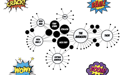
Network for Marvel Cinematic Universe
With a fun view of the Marvel Cinematic Universe, Tristan Guillevin walks through…
-
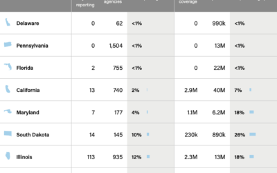
Incomplete crime data
When the FBI switched to a new data collection system, which relies on…
-

Welcome to Meltsville
It’s getting hot in cities around the world, each city with its own…
-

Megaflood scenario
Highlighting research by Xingying Huang and Daniel L. Swain, who studied “plausible worst…
-
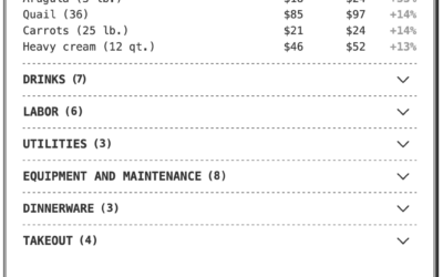
Breaking down the higher price on a restaurant receipt
If you’ve eaten at a restaurant lately, you might have noticed a substantially…
-
Members Only
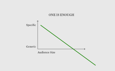
Visualization for One
Communicate to fewer people to reach more.
-
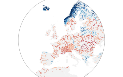
Worst drought in Europe, in 500 years
Dominic Royé mapped river discharge in Europe over the past few months:
A…
-
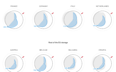
How much gas European sites have stored for the winter
Reuters goes with the radar chart to show gas supplies, as European countries…
-

Tracked while reading about being tracked at work
While reading this NYT article, by Jodi Kantor and Arya Sundaram, on the…
-
Google Maps incorrectly pointing people to crisis pregnancy centers
Davey Alba and Jack Gillum, for Bloomberg, found that Google Maps commonly points…
-
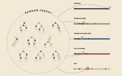
Visual explanations for machine learning
As part of a teaching initiative by Amazon, MLU-Explain is a series of…
-
Where the data from your car flows
Jon Keegan and Alfred Ng, for The Markup, identified 37 companies that collect…
Recently for Members
Second Edition
 Visualize This: The FlowingData Guide to Design, Visualization, and Statistics (2nd Edition)
 Visualize This: The FlowingData Guide to Design, Visualization, and Statistics (2nd Edition)
New tools, refined process.
Browse by Chart Type See All →


