During the election, The New York Times showed a live gauge to show the current forecast for Clinton and Trump. It moved to show a 25th to 75th percentile band of uncertainty:
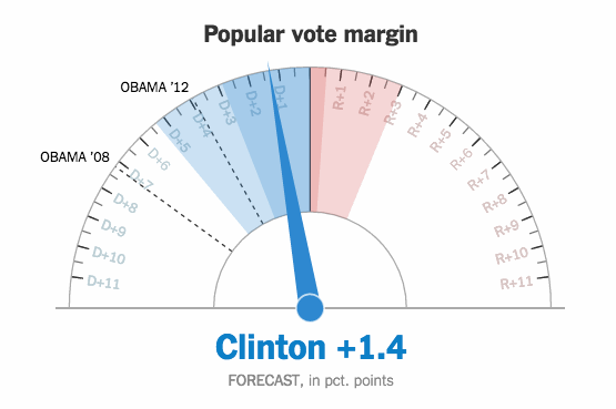
A lot of people didn’t get it, and it seemed to upset plenty of people too. Gregor Aisch, an NYT graphics editor, explains what they tried to accomplish with the gauges.
[W]e thought (and still think!) this movement actually helped demonstrate the uncertainty around our forecast, conveying the relative precision of our estimates. In our opinion, having the dial fluctuate a small amount – bound by the 25th and 75 percentile of simulated outcomes – was more successful at conveying the uncertainty around our forecast than simply listing what those percentiles were. As the night went on, the gauges fluctuated less and less as our forecast became more precise. By the end of the night, the gauges barely moved.
So it wasn’t just random jitter that some suggested.
I’m curious if a brief explanation of the needle movement would’ve made people less upset. I was a little confused too when I first saw it but an explanation on Twitter cleared things up quick.
Or, maybe it was just subject matter. I used movement to show uncertainty a couple of months back, and there was confusion, but it was definitely sans anger.
Maybe it was the choice of metaphor that confused people. Think of what gauges usually show in your everyday. There are speedometers in a car, thermometers in the kitchen or outside, and pressure gauges in air pumps. If any of those jittered, you’d be confused or assume something broke. So that’s something to consider.
Mainly though, I think most people don’t have a good grasp on uncertainty and how it relates to data, which makes me think this is more of a data literacy challenge than it is a visualization one. Data is often looked to as a place of concreteness and definite answers, but really, statistics is the study of chance, non-guarantees, and yes, uncertainty. From a statistician’s point of view, it’s a greater disservice to readers to not show uncertainty.
Oftentimes, the uncertainty is far more important than the estimate that it’s attached to. How do you get the general public to understand more concretely? I’m still not sure.
 Visualize This: The FlowingData Guide to Design, Visualization, and Statistics (2nd Edition)