A big thank you to FlowingData sponsors for their support. They help me…
-
FlowingData is brought to you by…
-

What different sorting algorithms sound like
Last month we saw sorting algorithms visualized in rainbow technicolor. Now, by Rudy…
-
Best of FlowingData – August 2010
It’s been a hectic month. With one month left until my thesis defense,…
-
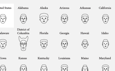
How to visualize data with cartoonish faces ala Chernoff
The goal of Chernoff faces is to show a bunch of variables at once via facial features like lips, eyes, and nose size. Most of the time there are better solutions, but the faces can be interesting to work with.
-

A house that knows when you’re happy and sad
Auger Loizeau, in collaboration with Reyer Zwiggelaar and Bashar Al-Rjoub, describe their smart-home…
-

The beauty of data visualization
Connoisseur of scaled rounded rectangles, bubbles, and triangles, David McCandless of Information is…
-

Asteroid discoveries over past 30 years visualized
This animation by Scott Manley of the Armagh Observatory shows a beautiful view…
-
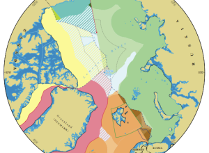
Map of who owns the Arctic
Do you know who owns the Arctic? As it turns out, it’s a…
-

Icons of the Web scaled by popularity
Nmap visualizes site popularity as scaled icons. Favicons, that is. They’re that little…
-
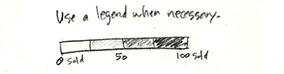
Graph Design Rule #2: Explain your encodings
This is part two in a seven-part series on basic rules for graph…
-
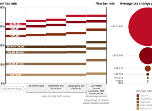
How tax breaks could affect your bottom line
Wilson Andrews and Alicia Parlapiano report for The Washington Post on how the…
-
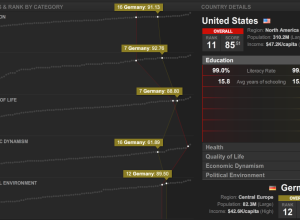
Countries of the world ranked by stuff
What country has the best education? Health? Quality of life? Thomas Klepl and…
-
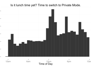
How people use private browsing
Private browsing. All the modern browsers have it. Turn it on, and the…
-
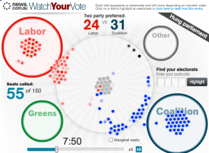
Election night in Australia relived
It was election night a few days ago in Australia, and News.com.au ran…
-
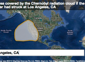
If major environmental disasters happened in your neighborhood…
When major environmental disasters occur, thousands of people are often affected, but it’s…
-
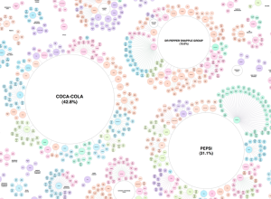
Pseudo-variety and ownership of the soft drink industry
When you buy soft drinks and other beverages at the grocery store, most…
-
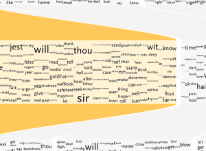
Understanding Shakespeare with visualization
Shakespeare literature is confusing. That’s not even an opinion. It’s a fact. Stephan…
-

Harvard scientist found guilty of misconduct
Shady research from Harvard scientist Marc Hauser is confirmed:
On Friday, Michael D.… -
Design advanced online and interactive maps with Polymaps
In a collaboration between SimpleGeo, who makes location data easier to access, and…
-
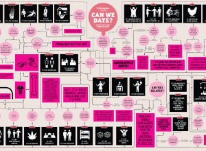
Is it okay to date your brother’s wife’s cousin? Flowchart it.
Dating can be tough. What should you talk about? Where should you go?…
Recently for Members
Second Edition
 Visualize This: The FlowingData Guide to Design, Visualization, and Statistics (2nd Edition)
 Visualize This: The FlowingData Guide to Design, Visualization, and Statistics (2nd Edition)
New tools, refined process.
Browse by Chart Type See All →


