Airlines have been merging, going out of business, and growing since forever. Karl…
-
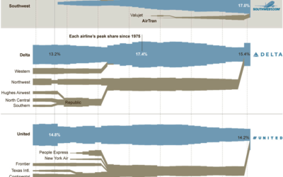
Charted history of airline mergers
-

Exploratory tool for school admissions
With thousands of applications, it can be tough deciding who to admit in…
-

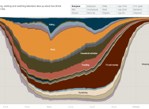
Music listening preferences by gender
Last.fm intern Joachim Van Herwegen has a quick look at listening habits by…
-
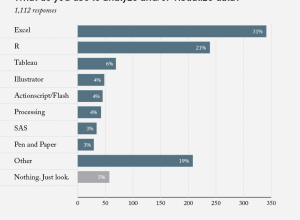
Poll results: What do you use to analyze and/or visualize data?
A couple of weeks ago I asked what you all use to analyze…
-
Journalism in the Age of Data
In the words of Terrell Owens, get your popcorn ready, because this video…
-
Why I blog
I answered a few questions for Amstat News not too long ago, and…
-
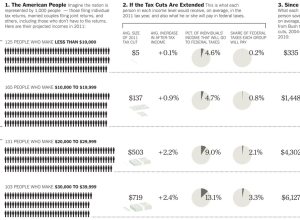
Who gets what if tax cuts are extended
There are some major tax decisions to be made soon, and they’ll affect…
-

Augmented reality atlas
The mockup examples are more cool factor than useful in this augmented reality…
-
your.flowingdata Users: Help Wanted. Five minutes of your time
As many of you know, your.flowingdata, an application to help you collect data…
-
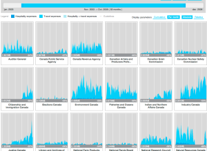
Expense visualizer
In an effort to make Canadian government expense data more accessible, FFunction designed…
-
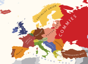
Europe geographically stereotyped
We tend to see the world in different ways, depending on what part…
-

History of the Blitz bombings
In September 1940, Nazi Germany began bombing London for 76 consecutive nights in…
-
Tune in live to Data Visualization and Infographics meetup
The NY Data Visualization and Infographics meetup is about to start, and you…
-

Bore hole for Chilean miners
As most of you know, there are 33 Chilean miners trapped 2,230 feet…
-

Race and ethnicity mapped by block
Instead of breaking up demographics by defined boundaries, Bill Rankin uses dots to…
-

Venn: Your grandfather
Yeah, you know what day it is. What category do you fall under?…
-

FlowingData book in the works
You read that right. There’s going to be a FlowingData book, published by…
-

Electronic Medical Records by the numbers
In 2009, legislation mandated that doctors make use of electronic medical records by…
-

History of the Iraq War through Wikipedia edits
Through high school and sometimes beyond we’re taught history as absolute fact. It’s…
-
The state of mapping APIs
O’Reilly Radar surveys the state of mapping APIs from old sources (like Google)…
Recently for Members
Second Edition
 Visualize This: The FlowingData Guide to Design, Visualization, and Statistics (2nd Edition)
 Visualize This: The FlowingData Guide to Design, Visualization, and Statistics (2nd Edition)
New tools, refined process.
Browse by Chart Type See All →


