Some movies are popular everywhere. Others are popular only in certain regions. The…
-

The Geography of Netflix Rentals
-
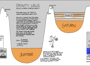
Need to Escape Jupiter’s Gravitational Pull? Good Luck
Randall of xkcd has been having fun with data visualization lately. In his…
-
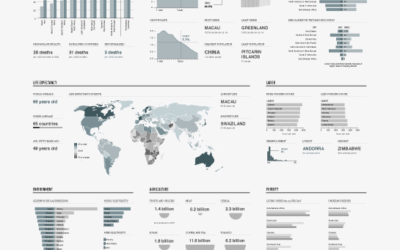
Graphical World Progress Report – A Sneak Peek
FYI: A new edition on the current state of the world is coming…
-
11 Ways to Visualize Changes Over Time – A Guide
Deal with data? No doubt you’ve come across the time-based variety. This is a guide to help you figure out what type of visualization to use to see that stuff.
-
Even Older Infographics from the 19th Century
Old graphics are awesome. We saw some from the 1930s already. These are…
-
A Visual History of Loudness in Popular Music
All Things Considered discusses why music sounds worse than it did a few…
-
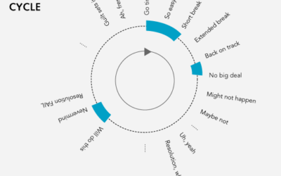
Data Underload #3 – The Resolution Cycle
Late at night, the new year’s resolution longed for a straight line.
-
The Universe as We Know It
The Known Universe from the American Museum of Natural History shows a view…
Recently for Members
Second Edition
 Visualize This: The FlowingData Guide to Design, Visualization, and Statistics (2nd Edition)
 Visualize This: The FlowingData Guide to Design, Visualization, and Statistics (2nd Edition)
New tools, refined process.
Browse by Chart Type See All →


