How to visualize data with cartoonish faces ala Chernoff
The goal of Chernoff faces is to show a bunch of variables at once via facial features like lips, eyes, and nose size. Most of the time there are better solutions, but the faces can be interesting to work with.
FlowingData reader Chris asks:
I was wondering, have you ever considered doing a Chernoff faces tutorial for R? I think Chernoff faces are pretty interesting and I haven’t seen much about them on the web.
This wasn’t the first time someone’s asked how to make Chernoff faces, so I did a quick search. Guess what. There’s an R package for that. This tutorial describes how to apply Chernoff faces to your own data.
Chernoff Faces
The point of Chernoff faces is to display multiple variables at once by positioning parts of the human face, such as ears, hair, eyes, and nose, based on numbers in a dataset. The assumption is that we can read people’s faces easily in real life, so we should be able to recognize small differences when they represent data. Now that’s a pretty big assumption, but debate aside, they’re fun to make.
1. Because these are faces rather than abstract geometric shapes, be careful what you show with this method and who you show it to. As was the case in this tutorial, those who aren’t familiar with the method might take the faces literally and take offense.We’ve seen them applied to baseball players and judge ratings. In this tutorial, we’ll look at US crime rate by state.1
Download R
Like in previous tutorials, we’ll be using R (surprise, surprise), the software environment for statistical computing and graphics, to make our Chernoff faces, so if you haven’t already, download and install R first before moving on. It’s free, open-source, and a one-click install. Go on, I’ll wait for you.
Step 1. Install package
Once you’ve opened up R, the first thing we need to do is install the aplpack (Another Plot Package) package by Peter Wolf. Go to the the “Packages & Data” menu in R, and select the “Package Installer.” Select “CRAN (binaries)” in the dropdown menu if it’s not already on that, and then click on “Get List.” Scroll down to “aplpack” and click on the “Install Selected” button and installation should begin.
The Another Plot Package will do most of the grunt work.
Alternatively, you can also just type this in the R console:
install.packages("aplpack")
Step 2. Load the data
Next we need to load the data into the R environment. Like I said, we’ll be looking at crime rates by state. I got the data from Infochimps, which is actually from Table 301 of the 2008 US Statistical Abstract, but it’s typically a headache going through dot gov navigation, so I avoid it when I can.
I cleaned the datafile I got from Infochimps a little bit more so it only includes the numbers we’re interested in. You can find it here, but you don’t need to download it. We’ll load it directly into R via the URL using the read.csv() command.
crime <- read.csv("http://datasets.flowingdata.com/crimeRatesByState-formatted.csv")
To view the data, type the following:
crime[1:6,]
This shows you the first six lines of our dataset. Note that there are eight columns. The first column is state name, with the exception of the row for US average and District of Columbia later on. The rest of the columns are seven categories of crime.
Step 3. Make some faces
Once the data is in, it's actually really easy to make some faces using the faces() function from the aplpack package. So far we've only installed the package, so now we'll load it:
library(aplpack)
If you get errors when you try to load, you might want to check to see if you installed the package correctly.
Okay, let's make some faces:
faces(crime[,2:8])
Here we're telling R to use the faces() function, using columns 2 through 8 of our crime data. Remember, the first column is state name. You get something that looks like this:
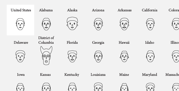
Default Chernoff Faces using faces()
Step 4. Change Features
This is pretty much what we want except for two things. The first is that the faces are labeled with numbers. That isn't of much use without a key. The second is that some of the faces are smiling. For more positive datasets like quality of life or baseball stats, that would make sense. The higher the value, the better. This is crime data though. The higher the value, the worse. Smiles for rate of larceny theft doesn't seem quite right.
Unfortunately, the faces() function doesn't let us choose what face parts to associate with each metric, so we need to find a workaround. According to the documentation (view by typing ?faces), the curve of the smile is applied to the sixth column in the input matrix, which is crime in this case.
Ah. Here's what we'll do. We make the sixth column in our data all the same value. That way all smile curves will be neutral. Here's how we can do that:
crime_filled <- cbind(crime[,1:6], rep(0, length(crime$state)), crime[,7:8])
The cbind() function combines multiple columns to form a matrix. In the above, we combine the first six columns of crime, stick a column of zeros whose length matches the number of rows in our crime data, and then we end with the last two columns in crime. We save the new matrix into a variable called crime_filled. Similar to in Step 2, you can type the following to see the first rows of crime_filled.
crime_filled[1:6,]
Notice the new column of zeros?
Now use faces() with crime_filled:
faces(crime_filled[,2:8])
We get similar faces, but with no more smiles:
Using different features to indicate variables
Step 5. Add labels
Instead of numbers, it'd be much more useful to include state names. Easy.
faces(crime_filled[,2:8], labels=crime_filled$state)
It's the same as previous, but we use the labels argument to use the state column in crime_filled to label with state names.
Add state name labels so it's not so ambiguous.
Much more useful now. We can easily associate the faces with a state. It's a little cluttered, but we can fix that up easy in Illustrator.
Step 6. Fix up in Illustrator (optional)
You can pretty much stop here if you like, but as most of you know, I like to save the image as a PDF, bring it into Adobe Illustrator (aff), and clean things up to make it more readable. You can also try Inkscape, the open-source alternative, although I've never tried it.
After some label cleanup and some annotation, here's our final result. What's going on there Washington, D.C.?
Uncluttered labels, unambiguous features, and cited data source
Not too bad, right?
Read the R documentation on faces() for more details on what else you can do with the function. Remember, documentation is your friend when it comes to making full use of R.
Now go on. Have some fun with your new Chernoff toy.
For more examples, guidance, and all-around data goodness like this, order Visualize This, the FlowingData book on visualization, statistics, and design.
Made possible by FlowingData members.
Become a member to support an independent site and learn to make great charts.
About the Author
Nathan Yau is a statistician who works primarily with visualization. He earned his PhD in statistics from UCLA, is the author of two best-selling books — Data Points and Visualize This — and runs FlowingData. Introvert. Likes food. Likes beer.

What you have done here is racist. Sorry to be so blunt. If you compare the facial features of a Caucasian with the one of an Afro-American, then the Afro-Americans have in average fuller lips than the Caucasians. Now you associate the fuller lips with “aggravated assault” and “robbery”. Seeing this, I am rather dubious about Chernoff faces at all. As you have put some effort in this and might not want to delete it, you might want to consider to reverse indicators. As I very much like you blog and am fond of all you other selections, please do not take this criticism personal. But I hope you can follow my reasoning. I am also happy to discuss with you via email.
Lars, you’re the person associating race to the images. Might want to do a double-take before pulling the race card…
Interesting how a visualisation like this can be misconstrued though.
Dear Robofish, thank you for your answer. Be assured that I am not a person being quick on pulling the race card. The argument you use I know. And I agree, that in many situations it is actually the interpreter who reveals more about his or her mindset (and that in a negative way) than about the object criticized. But on the other hand there are a number of codes understood by everyone in our culture which are used for communication. This starts with the same stop sign used around the world and continues with everyday iconography. Now when we turn to caricatures, then the full lips are an iconography used to depict people of African origin. So, I think that your argument does not carry. It is the same as saying that it is me who sees a Jew in a Nazi caricature that “only” shows a person with a beaked nose.
I hope and assume that you support the above reasoning. If this is the case then the discussion is about what is part of established everyday iconography – taking the context in which it shows up into account also – and what is an association that is only revealing about the interpreters mindset. As there is no way to define a clear boundary here, this will be a very subjective discussion – and its outcome, if there is one at all, probably not very relevant.
So in my view everyone trying to be conscious about such issues, should anticipate some of the potential criticism and at times make clear that his/her intentions are not of a racist nature and at other times ignore single opinions, so that the mindset of one will not cause divides where there were none before.
@lars: The Nazi example is a straw man. You’re familiar with Nazi ideology, so you can infer that they’re probably going to attack Jews.
Your argument relies on historical knowledge of the author. Since no ideological context exists here, you cannot make an informed decision about his intent.
FWIW, the faces with large lips looked like clowns to me, not any particular race or culture.
@lars – That honestly never crossed my mind, but I can see how you might see that now that you point it out. My apologies if it caused any offense. I hope people can see this only as a proof of concept over any kind of commentary on culture or race.
You mean, “disproof of concept.”
I’ve seen this and numerous other glyph systems used to try to convey information. Aside from showing pretty icons, they are practically useless. Recognizing emotions in facial features is inbred, but converting facial features to unrelated variables is cognitively impossible.
This data is better represented using parallel coordinates or a set of small multiple charts.
agreed. boo.
Robert already supplied a good critique of the methods:
http://eagereyes.org/VisCrit/ChernoffFaces.html
These are definitely not for analysis. Like I said already, they’re just for fun.
They might not have value for detail analysis, but they are excellent for a brief overview. This is the same for other glyph based methods.
For example, if you are a VP at a corporation and need to know who to yell at for the day, the District of Columbia, if for this example we consider a business unit, would be the whipping boy for the day. (Actually, for a good while considering its trend). Not very post positive, but it is an effective way for a manager to make a quick gut check.
I find it appropriate that D.C. is a Minotaur.
Chernoff faces are funny but not ver usefull, and if you use them for socio-economic data, it’s is like opening Pandora’s box.
If your audience believes that high crime is linked to black people or that rich people are fat, they expect to see that in your charts. If they don’t get that, there is a cognitive dissonance that it’s hard to explain. On the other hand, if you actually do it you’ll be called racist, sexist… and rightly so.
So, use Chernoff faces for pure demograpic data. Even if you think that your prejudices are not reflected in the faces, someone will think otherwise.
I’m making Chernoff faces at all of you. Right. Now.
Haah! You dare call an R package as a library?! Martin Machaeler will arrive in 5 minutes to correct you if he ever sees your post :lol:
hey, as long as it works. library.
Pingback: links for 2010-08-31 « links and tweets
Pingback: Wednesday Graph: Major League Chernoff Faces
Pingback: Dica do Leo Monasterio « De Gustibus Non Est Disputandum
what variable does the “big hair” (or is it a hat?) on DC represent?
Pingback: » Chernoff Face Tutorial on Flowing Data Karl Reinsch’s Blog
Pingback: Nathan Yau — The Face of Crime in the United States « lab2