How to Make Bubble Clusters in R
Represent individual counts with grouped units to make data feel less abstract.
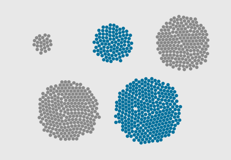
Clusters of bubbles might not be the most visually precise way to show counts, but the elements can lend weight to the individuals that aggregates represent as a whole. The one-to-one ratio between element and count feels less abstract than a bar or a line.
In this tutorial you learn how to create this one-to-one ratio.
To access this full tutorial, you must be a member. (If you are already a member, log in here.)
Get instant access to this tutorial and hundreds more, plus courses, guides, and additional resources.
Membership
You will get unlimited access to step-by-step visualization courses and tutorials for insight and presentation — all while supporting an independent site. Files and data are included so that you can more easily apply what you learn in your own work.
Learn to make great charts that are beautiful and useful.
Members also receive a weekly newsletter, The Process. Keep up-to-date on visualization tools, the rules, and the guidelines and how they all work together in practice.
See samples of everything you gain access to:
About the Author
Nathan Yau is a statistician who works primarily with visualization. He earned his PhD in statistics from UCLA, is the author of two best-selling books — Data Points and Visualize This — and runs FlowingData. Introvert. Likes food. Likes beer.