How I Made That: Searchable Time Series Chart
When there are too many options or categories, it can be helpful to make the data searchable.
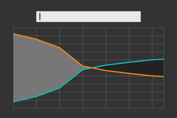
This was the last chart in a series of charts about shifting proportions of the sexes. After focusing on specific aspects of the data, I wanted to provide a way for people to look up their own jobs or any other job they were interested in.
With over 450-ish occupations, listing all the jobs or putting them in a dropdown menu didn’t make sense. It would take up too much space. A search bar on the other hand, lets someone immediately zoom in, which brought me to this:
This is how I made that.
To access this full tutorial, you must be a member. (If you are already a member, log in here.)
Get instant access to this tutorial and hundreds more, plus courses, guides, and additional resources.
Membership
You will get unlimited access to step-by-step visualization courses and tutorials for insight and presentation — all while supporting an independent site. Files and data are included so that you can more easily apply what you learn in your own work.
Learn to make great charts that are beautiful and useful.
Members also receive a weekly newsletter, The Process. Keep up-to-date on visualization tools, the rules, and the guidelines and how they all work together in practice.
See samples of everything you gain access to:
About the Author
Nathan Yau is a statistician who works primarily with visualization. He earned his PhD in statistics from UCLA, is the author of two best-selling books — Data Points and Visualize This — and runs FlowingData. Introvert. Likes food. Likes beer.