How I Made That: Interactive Heatmap
Add interaction so that you can show different segments of the data and allow comparisons.
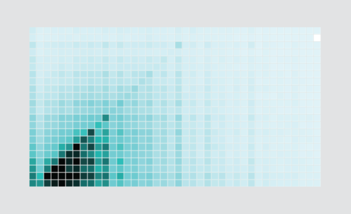
In its simplest form, a heatmap is a grid of cells that you color based on data. An interactive version can help you compare categories, groups, or in this example, time segments.
To compare male and female income in American households, I used a heatmap that looked like this:
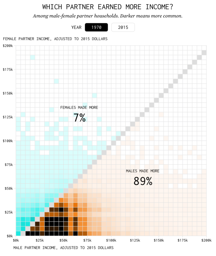
A click of the button lets you compare the distribution of income in the household in 1970 against 2015. Try it out here.
In this walk-through, I’ll show you a simplified version of the interactive and describe how you can apply this to your own data.
To access this full tutorial, you must be a member. (If you are already a member, log in here.)
Get instant access to this tutorial and hundreds more, plus courses, guides, and additional resources.
Membership
You will get unlimited access to step-by-step visualization courses and tutorials for insight and presentation — all while supporting an independent site. Files and data are included so that you can more easily apply what you learn in your own work.
Learn to make great charts that are beautiful and useful.
Members also receive a weekly newsletter, The Process. Keep up-to-date on visualization tools, the rules, and the guidelines and how they all work together in practice.
See samples of everything you gain access to:
About the Author
Nathan Yau is a statistician who works primarily with visualization. He earned his PhD in statistics from UCLA, is the author of two best-selling books — Data Points and Visualize This — and runs FlowingData. Introvert. Likes food. Likes beer.