How to Make an Animated Pyramid Chart with D3.js
Compare distributions side-by-side with a pyramid chart. Observe the change over the years by animating it.
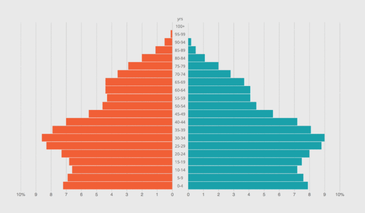
A pyramid chart is useful when presenting a distribution for two different categories (such as male/female). Essentially, it consists of two bar charts, placed side-by-side with the left one flipped so that their baselines meet.
When animated, the moving pyramid makes for a distinctive visual.
In this tutorial, you visualize US life expectancy data from 1980 to 2050. One side of the chart will show data for females and the other side for males. You will be able to select which year to view and be able to click a play button to cycle through the years.
To access this full tutorial, you must be a member. (If you are already a member, log in here.)
Get instant access to this tutorial and hundreds more, plus courses, guides, and additional resources.
Membership
You will get unlimited access to step-by-step visualization courses and tutorials for insight and presentation — all while supporting an independent site. Files and data are included so that you can more easily apply what you learn in your own work.
Learn to make great charts that are beautiful and useful.
Members also receive a weekly newsletter, The Process. Keep up-to-date on visualization tools, the rules, and the guidelines and how they all work together in practice.
See samples of everything you gain access to:
About the Author
Peter Cook is a freelance data designer and developer. He's also the author of D3 in Depth. You can find him on Twitter @peter_r_cook and his personal site.