How I Made That: Interactive Beeswarm Chart to Compare Distributions
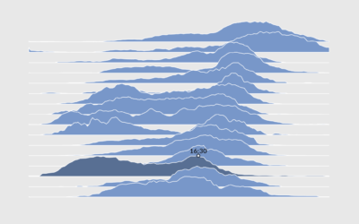
The histogram is my favorite chart type, but it’s unintuitive for many. So I’ve been using the less accurate but less abstract beeswarm.
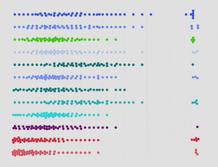
Distributions are far more interesting than means and medians, and statisticians most often use histograms to see the former. For me, a statistician, reading histograms is straightforward and unintuitive, but for those who don’t look at distributions on a regular basis, reading histograms can be a challenge.
Histograms require readers have a certain level of statistical knowledge. Readers need a mental image of how the spread works and how individual items or data points can abstract to bars.
To solve this problem, I’ve tried interaction and annotation with histograms on FlowingData a handful of times. It only seems to kind of work. In contrast, the beeswarm chart seems to more easily gain traction. My hunch is that people can relate better to individual shapes moving across a distribution range than they can bars moving up and down. Just a hunch though.
To access this full tutorial, you must be a member. (If you are already a member, log in here.)
Get instant access to this tutorial and hundreds more, plus courses, guides, and additional resources.
Membership
You will get unlimited access to step-by-step visualization courses and tutorials for insight and presentation — all while supporting an independent site. Files and data are included so that you can more easily apply what you learn in your own work.
Learn to make great charts that are beautiful and useful.
Members also receive a weekly newsletter, The Process. Keep up-to-date on visualization tools, the rules, and the guidelines and how they all work together in practice.
See samples of everything you gain access to:
About the Author
Nathan Yau is a statistician who works primarily with visualization. He earned his PhD in statistics from UCLA, is the author of two best-selling books — Data Points and Visualize This — and runs FlowingData. Introvert. Likes food. Likes beer.