Getting Started with D3.js
Learn how to build a custom visualization using D3.js and get acquainted with the popular JavaScript library.
D3.js is one of the most popular JavaScript libraries for creating web-based data visualisations. It has a unique and powerful way of working but a steep learning curve. Most charting libraries provide a selection of ready made charts such as bar, line and pie charts while D3 offers building blocks from which you construct a bespoke chart.
SVG (Scalable Vector Graphics) is a language that specifies shapes such as lines, rectangles and circles and can be included in web pages.This tutorial will get you started with D3 and shows you how a custom chart can be made. Along the way you’ll learn some of the key features of D3 such as loading CSV data into the browser, adding SVG elements, data-driven styling and user interaction.
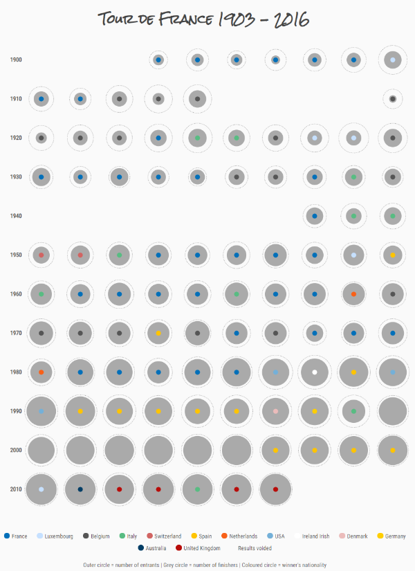
The chart you’ll make will visualize every Tour de France from 1903 onwards. Each race will be represented by a group of circles. Two circles will show the number of entrants and finishers while the remaining circle will show the winner’s nationality.
Overview
Typically, D3 creates SVG elements and styles them according to data.
For example, a circle can be created for each piece of data and sized according to one variable and colored according to another. This is how bespoke charts can be created with D3.
The D3 functions you’ll learn about are:
| Name | Purpose |
|---|---|
d3.csv() |
load CSV data into the browser |
d3.select(), d3.selectAll() |
select HTML or SVG elements |
.data(), .join() |
associat (or ‘join’) an array of data with a selection of HTML/SVG elements |
.style(), .attr() |
modify elements within a selection |
.text() |
set the text content of an element |
.html() |
set the HTML content of an element |
.on() |
respond to clicks and other mouse events |
d3.scaleSqrt() |
compute circle size |
The steps for creating the Tour de France chart are:
- Load the CSV data into the browser
- Draw a circle for each tour and size it according to number of entrants
- Add another circle for the number of finishers
- Add a third circle for the nationality of the winner
- Add an information popup for when the user hovers over a tour
- Add year labels
- Add a legend
- Add a title and description
- Detailed styling
Getting set up
You’ll need a text editor, web browser (ideally Google Chrome) and a local webserver.
Note that this tutorial uses version 5 of D3. (Version 5 has a simpler way of handling data joins.)All the code samples are in the download. If you’d like to follow along, there’s some boilerplate code to get you started.
You’ll load the data using D3’s .csv() function which means you need to have a web server running on your computer. If you have Python installed, you can follow along the instructions in Jim Vallandingham’s Small Multiples Tutorial. Alternatively use WampServer (Windows), MAMP (Mac) or LAMP (Linux).
Start with boilerplate code
The boilerplate directory in the download consists of these files and directories:
css/
	style.css
data/
js/
	index.js
index.html
CSS files specify the layout and style of HTML/SVG elements while JavaScript is a programming language within the web browser.The index.html file contains some boilerplate HTML including a wrapper div to contain the chart.
There are also links to a CSS file (css/style.css) and JavaScript files for D3 and our own code (index.js):
<!DOCTYPE html>
<html lang="en" >

<head>
  <meta charset="UTF-8">
  <title>My visualization</title>
  <link rel="stylesheet" href="css/style.css">
</head>

<body>
  <div id="wrapper">
  </div>
  <script src="https://cdnjs.cloudflare.com/ajax/libs/d3/5.9.2/d3.min.js"></script>
  <script src="js/index.js"></script>
</body>
</html>
The JavaScript file index.js contains one command:
alert('Hello!');
Set up your local server to serve from the directory containing index.html and open the page in your web browser (the address will look something like localhost:8080). You should see an alert appear:

Download data and convert to CSV
The data comes from Tableau Public’s sample data resource and is in .xlsx (Microsoft Excel) format.
Download the file from here and load into Excel (or similar). Save as a CSV file named tour_de_france.csv in the data directory.
tour_de_france.csv should look like:
Year,Winner's avg speed,Total distance (km),Number of stages,Finishers,Entrants,Winner,Winner's Nationality,...
1903.00,25.68,2428.00,6.00,21.00,60.00,Maurice Garin, France,...
1904.00,25.27,2420.00,6.00,27.00,88.00,Henri Cornet, France,...
1905.00,27.11,2994.00,11.00,24.00,60.00,Louis Trousselier, France,...
1906.00,24.46,4545.00,13.00,14.00,82.00,René Pottier, France,...
Load the data
D3 can also load data from TSV (tab separated value), JSON and XML files.To load a CSV file using D3 you use two functions d3.csv() and .then().
The parameter of d3.csv() is the CSV’s URL and the parameter of .then() is a callback function.
In index.js remove the alert and add:
d3.csv('data/tour_de_france.csv')
  .then(dataIsReady);
D3 converts the CSV file into an array of objects where each object represents a single row of data.
When the data is ready the callback function dataIsReady is called and D3 passes in the array.
Let’s create that callback function:
function dataIsReady(data) {
  console.log(data);
}
For now, the callback outputs the incoming data to the browser’s debug console.
The finished code for this section is snapshot-1 in the downloadSave your code and refresh the browser. When you open the developers console (if you’re using Chrome) you should see an array of data. Each element represents a Tour de France race. Try expanding the first element of the array:
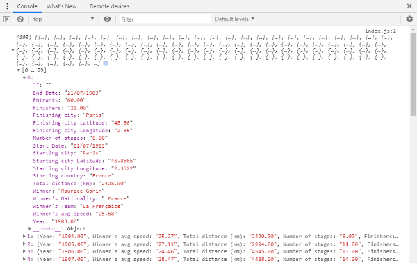
Can you see how this relates to the first row of the CSV file?
Draw circles for each item of data
This is where the fun starts! You’ll create a circle for each race and size it according to the number of entrants. You can do this using a D3 join which associates each element in an array of data with an SVG (or HTML) element:
The join makes the following tasks easier:
- Adding (or removing) HTML/SVG elements to match the number of array elements
- Updating an element’s style and attributes (such as color, size and position) according to it’s associated data (data-driven updates)
First add an svg element and a g element to index.html. This’ll contain the chart elements:
<div id="wrapper">
  <svg width="800" height="1000">
    <g class="chart">
    </g>
  </svg>
</div>
The most commonly used SVG elements in data visualization are rect (rectangles), line, circle, path (for freeform shapes) and g (for groups of elements).The steps to create a D3 join are:
- Use
.select()to select the HTML/SVG element which’ll contain the joined elements - Use
.selectAll()to select the HTML/SVG elements that’ll be joined to the array of data - Use
.data()to specify the array of data that you want to join to the HTML/SVG elements - Use
.join()to add and update the HTML/SVG elements
The D3 code for this is:
d3.select('svg g.chart')
  .selectAll('circle')
  .data(data)
  .join('circle');
d3.select('svg g.chart') selects the first HTML or SVG element that matches the CSS selector svg g.chart. In this case it’ll select the g element.
.selectAll('circle') makes a selection of all circles within the initial selection. Although there are no circles on the page, D3 will automatically add them when the join occurs.
.data(data) tells D3 that we want to join the array data to the selection.
.join('circle') tells D3 that we want to create circle elements for each array element.
Put this code in a function called updateChart() and call it from dataIsReady:
function updateChart(data) {
  d3.select('svg g.chart')
    .selectAll('circle')
    .data(data)
    .join('circle');
}

function dataIsReady(data) {
  updateChart(data);
}
When this code is run, D3 creates a circle for each array element. (You won’t actually see anything on the screen because each circle will have zero radius.)
Styling the circles
The circles can be styled and positioned using the functions .style() and .attr(). The first sets the circle style and is used for things like color and transparency. The latter sets things like position and size.
Set the circles position to the co-ordinates x=100 and y=50 and radius to 10:
function updateChart(eventData) {
  d3.select('svg g.chart')
    .selectAll('circle')
    .data(eventData)
    .join('circle')
    .attr('cx', 100)
    .attr('cy', 50)
    .attr('r', 10);
}
On saving this and refreshing the browser you should see a single black circle.

In actual fact, there are a hundred or so circles one on top of another. They all happen to be in the same place and of the same size.
Data driven styling
The + operator converts a string into a number.Now you’ll position and size the circles according to the data. To size each circle according to the joined data pass a function into .attr() instead of a value:
.attr('r', function(d) {
  return +d.Entrants;
})
D3 calls this function for each circle. The piece of data that’s been joined to the circle is the parameter d. The circle’s radius is set to the return value of the function. In this case the function returns the number of entrants so the circle’s radius will be set to the number of entrants.
The circles can also be positioned according to the array index:
.attr('cx', function(d, i) {
  return i * 5;
})
In this case, the second parameter i is the index of the circle within the selection. This means that the first circle will have an x co-ordinate of 0, the second will be at 5, the third at 10 etc.
Now look at the page and you should see:

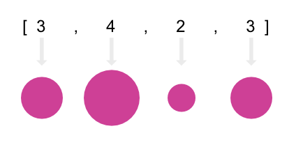
We’d like to make the circles a bit smaller and set their area (rather than radius) according to the number of entrants. This can be achieved using a D3 scale function.
A scale function maps from one number to another. The range of values of the input and output are named the domain and range, respectively.
In our case, we want to map from the number of entrants to a radius value. We’ll use a sqrt scale function so that the area (rather than radius) is scaled according to the number of entrants. The maximum number of entrants is around 210 so set the domain to [0, 210]:
var maxRadius = 20;
var rScale = d3.scaleSqrt().domain([0, 210]).range([0, maxRadius]);
Now use this function when setting the radius:
.attr('r', function(d) {
  return rScale(+d.Entrants)
})
The finished updateChart function is:
function updateChart(raceData) {
  d3.select('svg g.chart')
    .selectAll('circle')
    .data(raceData)
    .join('circle')
    .attr('cx', function(d, i) {
      return i * 5;
    })
    .attr('cy', 50)
    .attr('r', function(d) {
      return rScale(d.Entrants)
    })
    .style('opacity', 0.1);
}
The finished code for this section is snapshot-2 in the downloadNotice that the y coordinate is set to 50 to move the circles down the page and the opacity is set to 0.1 to make individual circles more apparent.
On refreshing the browser you should see:
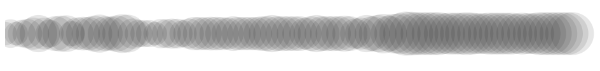
You can already see a trend in the number of entrants. It dipped down in the middle years and then rose around 2/3rds along and stayed close to this level.
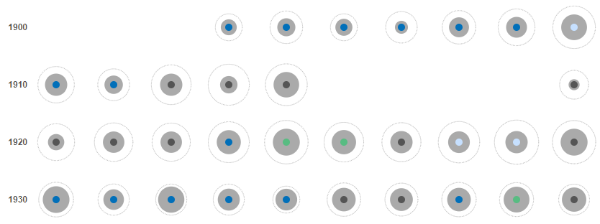
Arrange the circles in a grid
You’ll now arrange the circles in a grid. Each row will contain 10 circles and represent a decade. You’ll add a function named layout() which does the necessary calculations. This results in a clean separation between the geometry code and the code that updates the page.
The layout function will iterate through the data array and add an object (named layout) containing the co-ordinate and radius of each tour:
function layout(data) {
  var cellSize = 80, numCols = 10;

  data.forEach(function(d) {
    d.layout = {};

    var i = d.Year - 1900;

    var col = i % numCols;
    d.layout.x = col * cellSize + 0.5 * cellSize;

    var row = Math.floor(i / numCols);
    d.layout.y = row * cellSize + 0.5 * cellSize;

    d.layout.entrantsRadius = rScale(d.Entrants);
  });
}
There’s some clever math to calculate the position of each tour.
First, an index i based on the year is calculated. 1900 has index 0, 1901 has index 1 and so on.
The column number can be calculated using i % numCols. The % operator gives the remainder after dividing i by numCols. Therefore as i increments, the column number will be 0, 1, 2, 3, 4, 5, 6, 7, 8, 9, 0, 1, 2, 3, 4 etc.
The row number is calculated by dividing i by numCols and rounding down using Math.floor. Therefore as i increments the row number will be 0, 0, 0, 0, 0, 0, 0, 0, 0, 0, 1, 1, 1, 1, 1 etc..
The coordinate layout.x and layout.y is then calculated by multiplying col and row by cellSize.
The radius is calculated using the scale function rScale.
Now call layout() from updateChart() and update the remaining code to use the d.layout object:
function updateChart(data) {
  layout(data);

  d3.select('svg g.chart')
    .selectAll('circle')
    .data(data)
    .join('circle')
    .attr('cx', function(d) {
      return d.layout.x;
    })
    .attr('cy', function(d) {
      return d.layout.y;
    })
    .attr('r', function(d) {
      return d.layout.entrantsRadius;
    })
    .style('fill', '#aaa')
}
The finished code for this section is snapshot-3 in the downloadRefresh the browser and the visualisation should look like:

It looks like there’s some circles missing! Counting the years from 1903 the first missing year appears to be 1915.
Looking at the CSV data, 1915 to 1918 don’t have data. Neither do 1940 to 1946.
These periods correspond to the two world wars when the tour didn’t run. This is one of the things I love about visualization – a pattern that was not obvious when looking at the spreadsheet is immediately apparent when visualized.
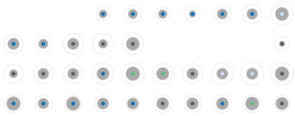
Add another circle for number of finishers
Let’s add a circle to represent the number of finishers in each race. To make the circles distinct you’ll give the number of entrants circle a dotted outline.
First create a g element for each layer of circles in index.html:
<svg width="800" height="1000">
  <g class="chart">
    <g class="entrants" />
    <g class="finishers" />
  </g>
</svg>
In index.js, toward the end of the layout function, add the line:
d.layout.finishersRadius = rScale(d.Finishers);
In the updateChart function select g.entrants instead of g.chart, change the fill to 'none' and set the stroke to gray and dotted:
d3.select('svg g.chart g.entrants')
    ...
    .style('fill', 'none')
    .style('stroke', '#aaa')
    .style('stroke-dasharray', '1 1');
At the end of updateChart() add code to create the second group of circles.
The code will be similar to the number of entrants code:
  d3.select('svg g.chart g.finishers')
    .selectAll('circle')
    .data(data)
    .join('circle')
    .attr('cx', function(d) {
      return d.layout.x;
    })
    .attr('cy', function(d) {
      return d.layout.y;
    })
    .attr('r', function(d) {
      return d.layout.finishersRadius;
    })
    .style('fill', '#aaa');
The finished code for this section is snapshot-4 in the downloadThe page will now look like:

Hopefully you can see how D3’s approach is unique. Rather than choosing a ready made chart you’ve added and manipulated shapes in a data-driven fashion. This approach requires more effort but it opens up a world of possibility.
Add user interaction with an information popup
One of the advantages of building charts in the browser is that user interaction (such as hovers and clicks) is supported. You can add features such an information pop-up which is a great way of giving the user access to more information without cluttering the page.
You’ll add a ready made pop-up component made by Flourish.
Include the pop-up library in index.html (above d3.min.js):
...
<script src="https://cdn.flourish.rocks/popup-v1.1.1.min.js"></script>
<script src="https://cdnjs.cloudflare.com/ajax/libs/d3/5.9.2/d3.min.js"></script>
...
At the top of index.js add a variable for the popup:
var popup;
Initialise the pop-up in dataIsReady:
function dataIsReady(data) {
  updateChart(data);
  popup = Popup();
}
We want to show the pop-up when the mouse hovers over a circle and hide it when the mouse leaves the circle.
You can respond to user interactions using D3’s .on() function. This accepts two parameters the first of which is the type of event (e.g. mousemove and mouseout) and the second is a function which gets called when the event fires.
In index.js add the following to the end of the number of finishers code:
.on('mousemove', function(d) {})
.on('mouseout', function() {});
The d parameter in the mousemove callback function represents the data joined to the hovered circle.
When a circle is hovered you need to do 3 things:
- Update the location of the popup
- Update the content of the popup
- Make the popup visible
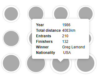
These are achieved using three functions .point(), .html() and .draw() respectively:
.on('mousemove', function(d) {
  popup.point(d3.event.clientX, d3.event.clientY);
  popup.html(popupTemplate(d));
  popup.draw();
})
d3.event is an object provided by D3 that gives details of the event that’s just occurred. We use the properties .clientX and .clientY which give the cursor position.
Now add a function popupTemplate() which accepts the joined data and outputs a string of HTML:
function popupTemplate(d) {
  var year = +d.Year;
  var distance = +d["Total distance (km)"];
  var entrants = +d.Entrants;
  var finishers = +d.Finishers;
  var winner = d.Winner;
  var nationality = d["Winner's Nationality"];

  var html = '';
  html += '<table><tbody>';
  html += '<tr><td>Year</td><td>' + year + '</td></tr>';
  html += '<tr><td>Total distance</td><td>' + distance + 'km</td></tr>';
  html += '<tr><td>Entrants</td><td>' + entrants + '</td></tr>';
  html += '<tr><td>Finishers</td><td>' + finishers + '</td></tr>';
  html += '<tr><td>Winner</td><td>' + winner + '</td></tr>';
  html += '<tr><td>Nationality</td><td>' + nationality + '</td></tr>';
  html += '</tbody></table>';
  return html;
}
We use a few tricks to format the data accordingly. + before a variable converts it into a number. It also removes some unnecessary decimal places in the CSV file.
Some of the property names contain spaces (such as Total distance (km)) so we use square brackets to reference the property instead of dot notation.
Now hide the popup when the mouse leaves the circle:
.on('mouseout', function() {
  popup.hide();
});
Finally add some style rules to style.css:
.flourish-popup {
  pointer-events: none;
}

.flourish-popup td:first-child {
  font-weight: bold;
}
The first of these disables event triggering on the pop-up itself. Without this you might get an annoying flicker when the pop-up obscures the circle!
The finished code for this section is snapshot-5 in the downloadRefresh the page and an info pop-up will appear when a circle is hovered:
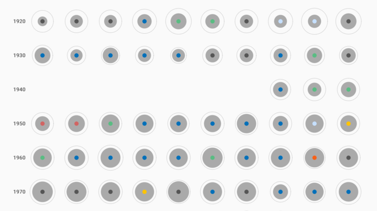
Add a coloured circle to show winner’s nationality
You’ll now add a third circle that shows the winner’s nationality. Unlike the entrants and finishers circles this circle will have a fixed radius but its color will change according to the winner’s nationality.
(You could also color the circle according to the winner’s name, but you’d need to figure out how to handle so many different colors. Using the winner’s nationality is a good compromise.)
First define an object that maps nationalities to colors in index.js:
var colorScale = {
  "France": '#016FB9',
  "Luxembourg": '#C6E0FF',
  "Belgium": '#555',
  "Italy": '#58BC82',
  "Switzerland": '#D16462',
  "Spain": '#FFC400',
  "Netherlands": '#F86018',
  "USA": '#74B0D8',
  "Ireland Irish": '#FFF',
  "Denmark": '#EBBCBB',
  "Germany": '#FFCE00',
  "Australia": '#013D65',
  "United Kingdom": '#B80C09',
  "Results voided": 'none'
}
These colors were chosen by hand. It was a bit challenging because reds and blues occur very frequently in national flags! You can change these colors if you prefer.
Add a group for the winner circles after the finishers group in index.html:
<g class="entrants" />
<g class="finishers" />
<g class="winners" />
In SVG the order in which elements are layered is determined by the order in which they appear in the SVG code. Thus the winners group will appear on top of the other two groups.
In the layout function add the winner’s nationality color:
d.layout.winnerColor = colorScale[d["Winner's Nationality"].trim()];
You need to trim the nationality as there are some spaces before some of the country names in the CSV.
Finally in updateChart() add the winner circles:
d3.select('svg g.chart g.winners')
  .selectAll('circle')
  .data(data)
  .join('circle')
  .attr('cx', function(d) {
    return d.layout.x;
  })
  .attr('cy', function(d) {
    return d.layout.y;
  })
  .attr('r', 5)
  .style('pointer-events', 'none')
  .style('fill', function(d) {
    return d.layout.winnerColor;
  });
Notice that the radius is a fixed value and the fill color is data driven. You also need to set pointer-events to none so that the popup still appears when hovering over this circle.
The finished code for this section is snapshot-6 in the downloadRefresh the page and you should see:
Add year labels
We’ll now add year labels 1900, 1910, 1920 etc. to the left of each row. This tells the audience that each row represents a decade of races.
Add a g element for the year labels after the winners layer in index.html:
<g class="entrants" />
<g class="finishers" />
<g class="winners" />
<g class="year-labels" />
Add a function updateYearLabels() to index.js and call it from dataIsReady:
function updateYearLabels() {
}

function dataIsReady(data) {
  updateChart(data);
  updateYearLabels();
  popup = Popup();
}
We can use D3 to add the labels by creating an array of years and joining this to SVG text elements:
function updateYearLabels() {
  var years = [1900, 1910, 1920, 1930, 1940, 1950, 1960, 1970, 1980, 1990, 2000, 2010];
  var cellSize = 80;

  d3.select('svg g.chart .year-labels')
    .selectAll('text')
    .data(years)
    .join('text')
    .attr('y', function(d, i) {
      return i * cellSize + 0.5 * cellSize;
    })
    .text(function(d) {
      return d;
    });
}
Remember that i represents the index of the element in the selection.
Now style the labels to be vertically centered, right justified, gray and bold:
.attr('dy', '0.3em')
.style('text-anchor', 'end')
.style('fill', '#555')
.style('font-weight', 'bold')
The finished code for this section is snapshot-7 in the downloadRefresh the page to see the year labels:
Add a legend
We’ll now add a legend to which color represents each nation. Just as with the year labels D3 can be used to add the legend items.
Start by adding a div element for the legend after the SVG element in index.html:
<svg width="850" height="1000">
  ...
</svg>
<div class="legend"></div>
In index.js add a function named updateLegend() and call it from dataIsReady:
function updateLegend() {
}

function dataIsReady(data) {
  updateChart(data);
  updateYearLabels();
  updateLegend();
  popup = Popup();
}
D3’s join works with arrays but not objects which is why we must use Object.keys() to extract an array of country names from the colorScale object.Get an array containing the keys of colorScale using Object.keys() and join it to div elements:
function updateLegend() {
  var countries = Object.keys(colorScale);
  d3.select('.legend')
    .selectAll('div')
    .data(countries)
    .join('div');
}
Now set the content of the div elements using .html() which sets the content of the div to an HTML string. This is useful when the content consists of more than one HTML element:
...
.join('div')
.html(function(d) {
  return '<span style="background-color: ' + colorScale[d] + ';"></span><span>' + d + '</span>';
});
The array contains country names so the variable d is the name of a country.
I had to Google this circle trick. See https://www.w3schools.com/howto/howto_css_circles.aspThe first span element is styled to look like a circle (by setting its background color and border radius) in style.css:
.legend div span:first-child {
  height: 12px;
  width: 12px;
  border-radius: 50%;
  display: inline-block;
  margin-right: 4px;
}
The flex box model makes arranging elements much easier. See here for more information.To style and align the legend items use CSS’s flex-box model:
.legend {
  display: flex;
  flex-wrap: wrap;
  justify-content: center;
}

.legend div {
  display: flex;
  align-items: center;
  margin: 5px 10px;
}
The finished code for this section is snapshot-8 in the downloadYour legend should look like:
![]()
Final Layout and Styling
The data visualization itself is now complete except for final polish and styling. A title and description will be added, different fonts will be used and the background color tweaked.
Add a title just before the SVG element in index.html:
<h1>Tour de France 1903 - 2016</h1>
and a description just after the legend:
<div class="description">
  <div>Outer circle = number of entrants | Grey circle = number of finishers | Coloured circle = winner's nationality</div>
  <div>Data from <a href="https://public.tableau.com/en-us/s/resources">public.tableau.com</a></div>
</div>
Style these in style.css:
h1 {
  color: #444;
  text-align: center;
}

description div {
  margin: 15px;
  text-align: center;
}
We’ll also add two Google Fonts Roboto and Rock Salt, the first for the main text and the latter for the main title.
In index.html add:
<link href="https://fonts.googleapis.com/css?family=Roboto|Rock+Salt" rel="stylesheet">
just above the style.css link in the head section.
Now in style.css add:
body {
  font-family: 'Roboto', sans-serif;
  ...
 }
and:
h1 {
  font-family: 'Rock Salt', cursive;
  ...
}
Finally set the background color of the body element to a light gray:
body {
  ...
  background-color: #fafafa;
}
The finished code for this section is snapshot-final in the downloadNow the visualisation is finished and looks like:
Wrapping up
We’ve created a custom visualization that shows the history of the Tour de France. We can see some interesting trends and patterns such as:
- The tour didn’t run during the two world wars
- The first non-European winner was in 1986 when Greg Lemond won
- In the first few decades, there was a much bigger gap between entrants and finishers. In 1928, for example, there were 162 entrants and just 41 finishers while in 2016 there were 198 entrants and 174 finishers
- Between 1999 and 2005 the results are voided. This is because the winner of these tours was Lance Armstrong who’s been disqualified from all tours
This visualization is a perfect example of D3’s strength in making bespoke data visualizations. We were able to visualize the data exactly as we wished and this resulted in a unique and insightful interactive.
Although we only covered a fraction of D3’s functionality, we looked at the most commonly used features and saw that they are enough to create a fully fledged data visualisation.
Hopefully this tutorial has given you a flavour of how D3 works and will inspire you to visualize your own data using D3.
Made possible by FlowingData members.
Become a member to support an independent site and learn to make great charts.
About the Author
Peter Cook is a freelance data designer and developer. He's also the author of D3 in Depth. You can find him on Twitter @peter_r_cook and his personal site.