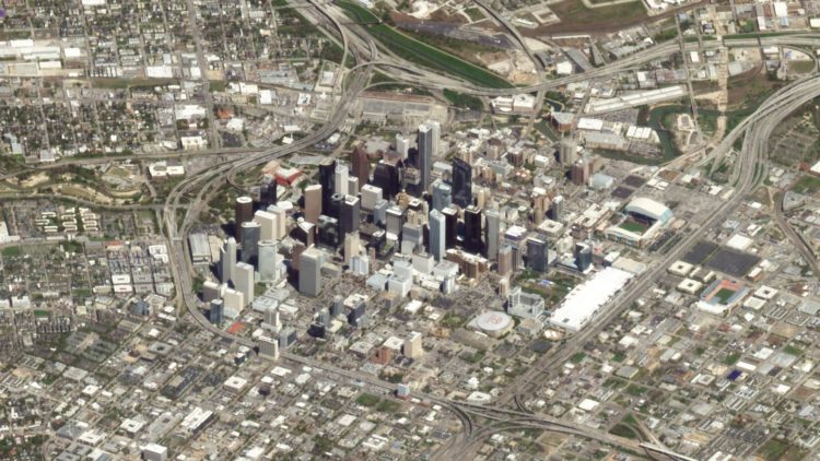
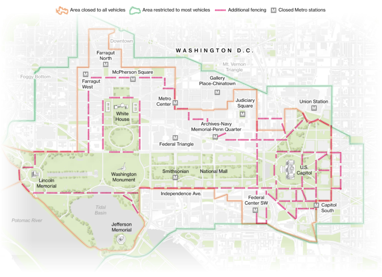
• Membership
  • Newsletter
  • Projects
  • Learning
  • About
  • Member Login
  • Mapping tree loss in rain forests over time

    September 15, 2020

    Topic

    Maps  /  Bloomberg, Brazil, rain forest

    Bloomberg mapped tree loss between 2000 and 2019 in Brazil:

    “What we have seen in Brazil is that rainforest protection is a highly political issue,” says Gerlein-Safdi of the University of Michigan. “With every change in government, laws can change very quickly, both for better or for worse.”

    In some areas, the damage has been done. Efforts to build roads through the forest have opened up large swaths to exploitation. Satellite images of a new highway through the Amazon show how fast the land use changes from primary forest to agricultural land once logging companies and farmers gain access.

    The maps are based on an analysis by University of Maryland geographers. The researchers compared satellite imagery over time to compare forest changes on a global scale, and you can download the data here.

  • Tracking the mail

    September 14, 2020

    Topic

    Statistical Visualization  /  coronavirus, delay, mail, Upshot, USPS

    With mail-in ballots looking to be more common than ever this year, NYT’s The Upshot is tracking the mail:

    The data here, covering more than 28 million pieces of first-class letters tracked by SnailWorks, shows how on-time delivery declined noticeably in July after the arrival of Louis DeJoy, the Trump-aligned postmaster general, and the start of policies to trim transportation costs. That drop in national performance was more abrupt than during the chaotic period when the coronavirus pandemic began spreading across the country.

    “We had a wave of our members, hundreds and hundreds of locals, telling us there were service problems a month ago,” said Jim Sauber, the chief of staff for the National Association for Letter Carriers.

    Hm.

    I wonder what the distributions for each time frame looks like. Even during non-pandemic times, it looks like a quarter of the mail is counted as late. And it’s at least a little bit comforting that we’re talking in units of days late rather than weeks or months.

  • Voting guide for your state

    September 14, 2020

    Topic

    Infographics  /  election, voting, Washington Post

    The Washington Post provides another straightforward voting guide, based on where you live and how you plan to vote.

    Election season is always interesting graphics-wise, because all of the news outlets are starting with the same data and information. But they all show the data a little differently, asking various questions or using different visual approaches.

    Things are just getting started, but contrast this Post piece with FiveThirtyEight’s voting guide. The former zeros in on the your voting scenario, whereas the latter still gives some space for the overall national view.

  • Disappearing animals as a matrix of dots

    September 11, 2020

    Topic

    Data Art  /  animals, extinction

    Reddit user WhiteCheeks used dot density to show population counts of various animals. Each dot represents an animal. So animals with lower counts show less obviously.

    This is similar to the use of pixelation to show endangered species, which I think works better since the size of the dots above don’t encode anything.

  • Members Only

    The Process 106 – Self-Imposed Visualization Constraints, for Focus and Fun

    September 10, 2020

    Topic

    The Process  /  constraints

    Constraints usually seem like a bad thing. Less freedom. You can’t do exactly what you want to do. You’re limited. But sometimes constraints can lead you towards unexpected paths.

  • Data Underload  /  California, wildfire

    Timeline of California Wildfires

    The wind was blowing smoke and ash from wildfires further up north from where I live. The sky turned an eerie orange. I wondered about past fires and made the chart below.

    Read More
  • Math behind wearing masks

    September 9, 2020

    Topic

    Infographics  /  Aatish Bhatia, coronavirus, mask, Minute Physics

    The math behind wearing a mask can seem unintuitive at times. Minute Physics and Aatish Bhatia break it down in this illustrated video to show why wearing masks works:

    The premise is that there’s a two-way effect with breathing in and breathing out. There are some assumptions here, but there’s an interactive component that lets you adjust the variables. They’ve also made the code available.

  • Telling stories in visual, data-driven essays

    September 8, 2020

    Topic

    Design  /  Ilia Blinderman, Pudding, storytelling

    For The Pudding, Ilia Blinderman rounds out his three-part series on creating visual, data-driven essays. This last part in on the fuzziest task of telling stories:

    Storytelling, however, is much more abstract — it’s not merely a technical matter of creating an image of a map, or designing the right chart; rather, it refers to the broader universe of considerations that impact nearly every decision you make in the way you frame and present a project. The focus is much less on the technical “how,” like in the first two installments of these guides, but on the “why” of designing the narrative. It certainly doesn’t help that technical tools are inherently more concrete: they’re ways of solving specific problems (e.g., “how do I show the locations where people are concentrated on a map?” or “how do get this visual element to move through this specific path?”), while storytelling is much more of a nebulous concept. Thus, in this guide, I’ll be focusing on the relevant questions and considerations that we, at The Pudding, tend to consider when creating data-driven projects.

  • Picking the right colors for your charts

    September 4, 2020

    Topic

    Design  /  color, Datawrapper, Lisa Charlotte Rost

    Picking colors for your charts can be tricky, especially when you’re starting a palette from scratch. For Datawrapper, Lisa Charlotte Rost has been writing guides on color as it pertains to political parties, gender, and more recently, colorblindness. Rost put the pieces together for a single, more comprehensive guide on the subject.

    Be sure to check out Rost’s other guides on making better charts. She has a knack for explaining visualization methods in a practical and concrete way.

  • Design your own election scenario

    September 4, 2020

    Topic

    Maps  /  election, Washington Post

    As we have seen, small shifts in voting behavior of various demographic groups can swing an election. The Washington Post provides an interactive that lets you shift these groups by both turnout and vote margin to see what might happen (based on a simplified model).

  • Members Only

    The Process 105 – Piecing Together the Basics

    September 3, 2020

    Topic

    The Process  /  basics, getting started, teaching

    You gotta walk before you crawl. Wait a minute.

  • Wanna know somefing?

    September 3, 2020

    Topic

    Self-surveillance  /  humor, kids, Reddit

    From Reddit user wequiock_falls, “What I’m about to learn about after my kid says, ‘Wanna know somefing?’ Data collected over the course of 7 days.”

    Sounds about right.

  • Data Underload  /  CDC, cherrypicking, coronavirus, mortality

    Multiple Causes of Death

    There’s a 6 percent figure from the CDC that could be easily misinterpreted. Here’s what it means.

    Read More
  • Red-blue electoral map and the green-gray in satellite imagery

    September 2, 2020

    Topic

    Maps  /  electoral, Krishna Karra, machine learning, satellite imagery, Tim Wallace

    For NYT’s The Upshot, Tim Wallace and Krishna Karra looked at how the red-blue electoral map relates to the green and gray color spectrum in satellite imagery:

    The pattern we observe here is consistent with the urban-rural divide we’re accustomed to seeing on traditional maps of election results. What spans the divide — the suburbs represented by transition colors — can be crucial to winning elections. It’s part of why President Trump, seeking to appeal to swing voters, has portrayed the suburbs as under siege and menaced by crime. But the suburbs are neither politically nor geographically monolithic. They are where Democratic and Republican voters meet and overlap, in a variety of ways.

    The breakdown and process are impressive. Be sure to check out the full rundown. Wallace also provides more details about how this came together on the Twitter.

  • Choose your own election outcome

    September 2, 2020

    Topic

    Infographics  /  election, New York Times, outcome, uncertainty

    The election is full of what-ifs, and the result changes depending on which direction they take. Josh Holder and Alexander Burns for The New York Times use a pair of circular Voronoi diagrams and draggable bubbles so that you can test the what-ifs.

    Contrast this with NYT’s 2012 graphic showing all possible paths. While the 2012 graphic shows you the big picture, the 2020 interactive places more weight on individual outcomes.

  • How to vote in each state

    September 1, 2020

    Topic

    Infographics  /  election, FiveThirtyEight, voting

    Each state is handling mail-in voting in a certain way with varying timelines and rules. FiveThirtyEight provides a straightforward state-by-state guide so you can see what your state is doing.

    I like the color-coded grid map doubling as quick navigation. You get the overview and a jump to the state of interest.

  • How to Untangle a Spaghetti Line Chart (with R Examples)

    Put multiple time series lines on the same plot, and you quickly end up with a mess. Here are practical ways to clean it up.

  • Audit advanced data science course online

    August 31, 2020

    Topic

    Statistics  /  course, data science, Jeff Leek, Johns Hopkins, Roger Peng

    Jeff Leek and Roger Peng started their course Advanced Data Science at Johns Hopkins University. It’s meant for JHU students, but you can learn from the weekly course material for free:

    The class is not designed to teach a set of statistical methods or packages – there are a ton of awesome classes, books, and tutorials about those things out there! Rather the goal is to help you to organize your thinking around how to combine the things you have learned about statistics, data manipulation, and visualization into complete data analyses that answer important questions about the world around you.

    So you know the methods and tools (or how to learn them on your own), but you want to learn more about putting it all together.

    Nice. I could probably use a refresher.

    You can get the weekly updates here.

  • Time for last-minute mail voting

    August 31, 2020

    Topic

    Statistical Visualization  /  election, New York Times, USPS, voting

    The New York Times provides a state-by-state chart timeline for voting by mail:

    But 16 states allow voters to apply for mail ballots so close to Election Day that their votes could be at risk of being too late if they are sent and returned through the Postal Service. Officials in these places recommend applying for and sending in ballots early, or dropping them off at local election offices or in secure drop boxes if available.

    In Minnesota, voters can request a ballot the day before the election, too late to be mailed to them on time. But if voters request their ballots early and postmark them by Election Day, they should arrive in enough time to be counted. Montana has the same deadline for requesting a ballot but does not accept those returned after the election.

    The takeaway is that you should vote early to make sure it counts. I’m just going to do it right when the ballot arrives.

  • Minimizing risk

    August 31, 2020

    Topic

    Statistics  /  coronavirus, New York Times, risk

    For NYT Opinion, Aaron E. Carroll on doing small things that sum to something bigger:

    Too many view protective measures as all or nothing: Either we do everything, or we might as well do none. That’s wrong. Instead, we need to see that all our behavior adds up.

    Each decision we make to reduce risk helps. Each time we wear a mask, we’re throwing some safety on the pile. Each time we socialize outside instead of inside, we’re throwing some safety on the pile. Each time we stay six feet away instead of sitting closer together, we’re throwing some safety on the pile. Each time we wash our hands, eat apart and don’t spend time in large gatherings of people, we’re adding to the pile.

    A lot of what we do and the choices we make are based on past personal experience. It’s a challenge to look at a dataset that seems beyond us as an individual. So if you’re trying to galvanize a population with numbers, look for all of the ways you could help the individual relate.

  • Page 96 of 391
  • <
  • 1
  • ...
  • 93
  • 94
  • 95
  • 96
  • 97
  • 98
  • ...
  • 391
  • >

Analyze, visualize, and communicate data usefully, beyond the defaults.

Become a member →

Recently for Members

May 8, 2025
When the data is not what it seems

May 1, 2025
Finding the Right Charts

April 24, 2025
Visualization Tools, Datasets, and Resources – April 2025 Roundup

April 17, 2025
Breaking Out of Chart Software Defaults

April 15, 2025
Line Chart with Decorative Neon Accents

Browse by Chart Type See All →

Parallel Coordinates Box Plot Difference Chart Area Chart Density Plot Connected Scatter Plot Surface Plot Pie Chart Frequency Trails Bar Chart Race

Browse By Topic

  • Visualization

    Seeing data

  • Maps

    Seeing geographic data

  • Infographics

    Explaining data

  • Networks

    Connecting data

  • Statistics

    Analyzing data

  • Software

    Working with data

  • Sources

    Getting data

  • Design

    Making data readable

Get the Book

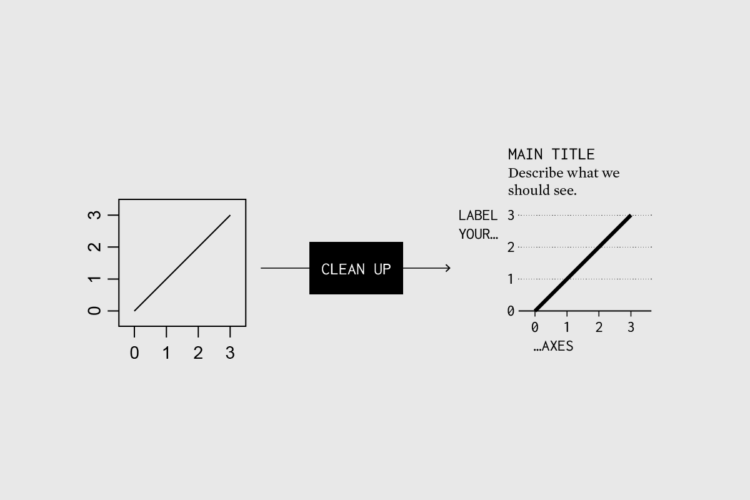
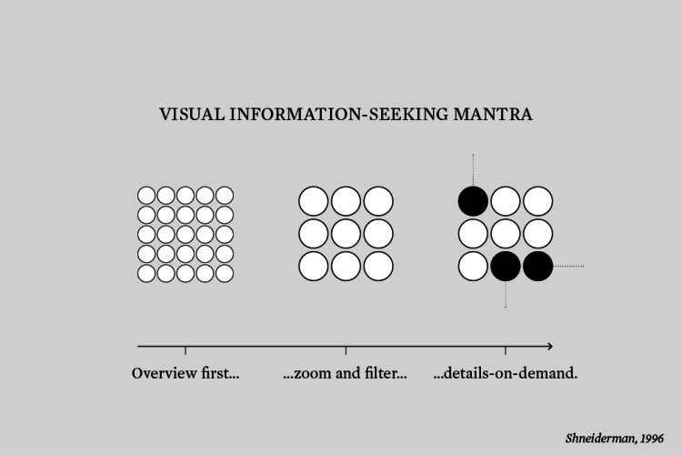
Visualize This: The FlowingData Guide to Design, Visualization, and Statistics

Available now.

Order: Amazon / Bookshop

Made by FlowingData

  • The Process

  • Data Underload

  • Chart Everything

  • Guides

  • Books

  • Shop

  • About
  • Contact
  • Newsletter
  • LinkedIn
  • Instagram
  • Bluesky
  • RSS
Copyright © 2007-Present FlowingData. All rights reserved.