Timeline of California Wildfires
Here in Northern California, we woke up to a dark, smokey, and orange sky. It was morning, but it looked like night. It was afternoon, but it looked like night. It was an eerie view outside my window of something that felt too close.
The wind was blowing smoke and ash from wildfires further up north from where I live. So, I wondered, as one does, about past fires and made the chart below.
California Fires
From 2004 to 2020, for incidents that burned at least 300 acres.
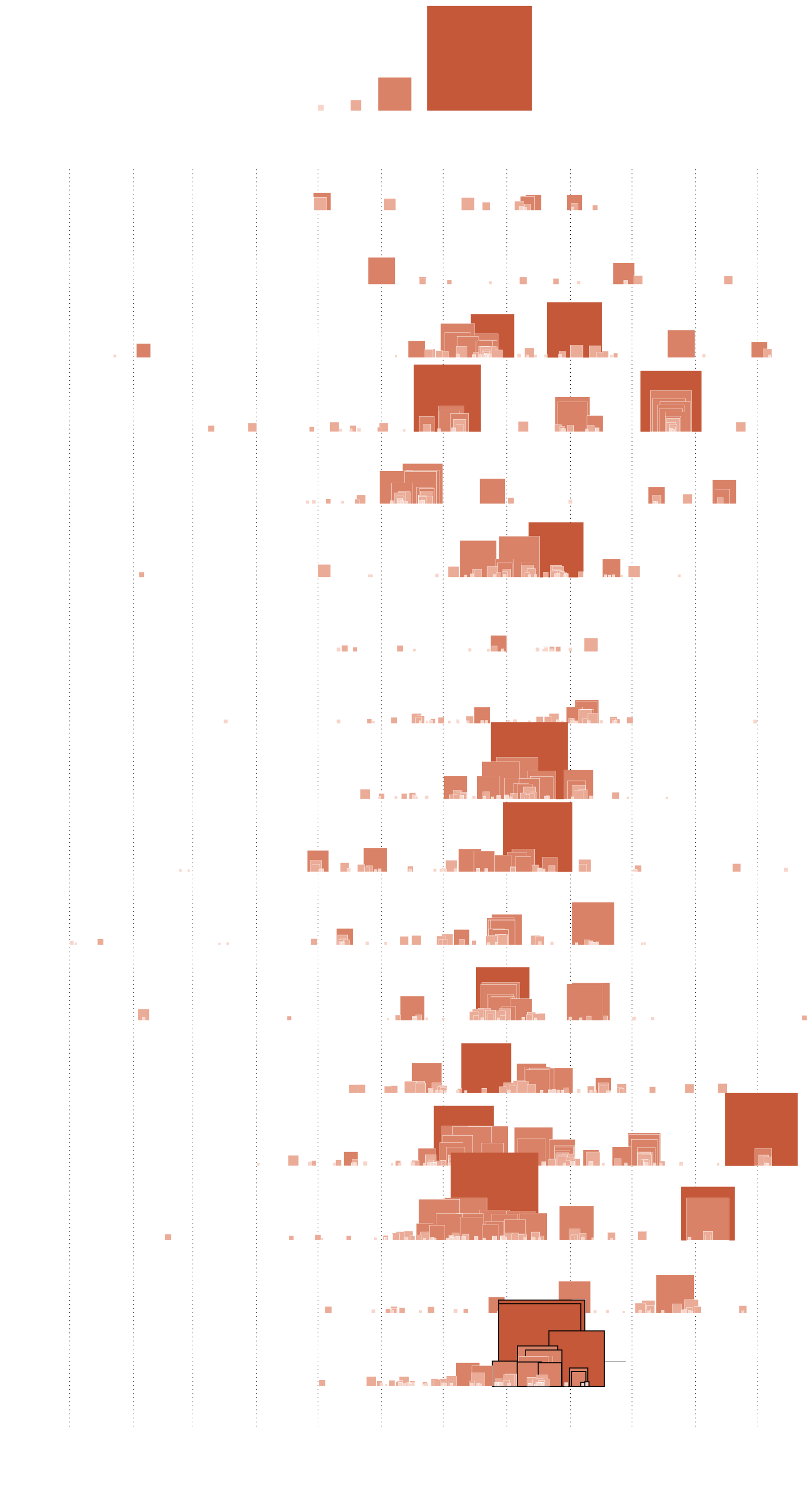
ACRES BURNED
300
1k
10k
100k
Jan.
Feb.
March
April
May
June
July
August
Sept.
Oct.
Nov.
Dec.
2004
2005
2006
2007
2008
2009
2010
2011
2012
2013
2014
2015
2016
2017
2018
2019
Still active
2020
Jan.
Feb.
March
April
May
June
July
August
Sept.
Oct.
Nov.
Dec.
SOURCE: CAL FIRE / BY: FLOWINGDATA
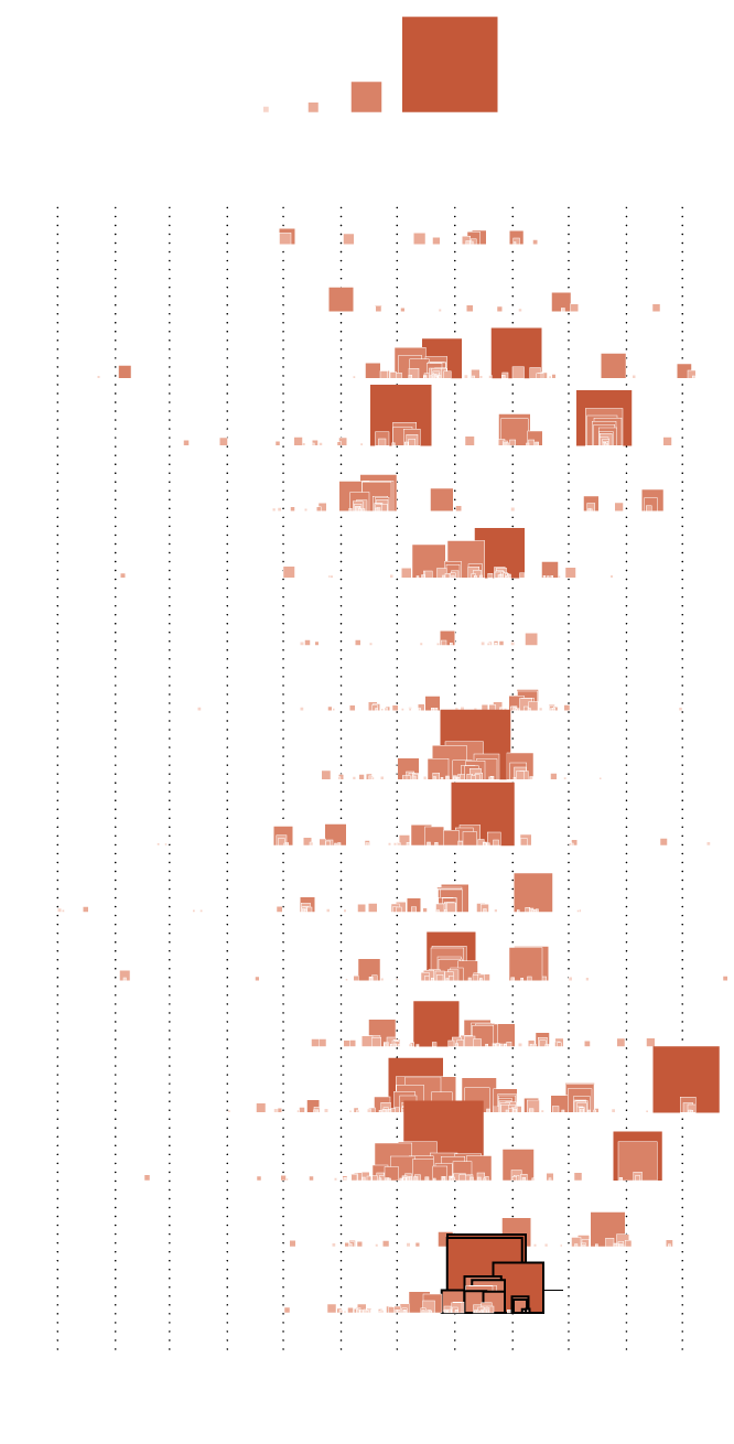
ACRES BURNED
300
1k
10k
100k
J
F
M
A
M
J
J
A
S
O
N
D
‘04
‘05
‘06
‘07
‘08
‘09
‘10
‘11
‘12
‘13
‘14
‘15
‘16
‘17
‘18
‘19
Still active
‘20
J
F
M
A
M
J
J
A
S
O
N
D
SOURCE: CAL FIRE / BY: FLOWINGDATA
This feels like a lot to take in.
Notes
I got the data from CAL FIRE. There’s a link at the bottom of the page to download data files. I originally planned to draw timelines for each incident, but for whatever reason, the extinguished date was not reliable. See also the Axios chart by Lazaro Gamio from a few years ago, which I had in mind while I made this one.
Become a member. Support an independent site. Make great charts.
See What You GetFlowingData is made possible by supporting members. Since 2007, I, Nathan Yau, a real person, have been analyzing and visualizing data to help more people understand and appreciate it in their everyday lives.
If you liked this or want to make similar data things, please consider supporting this small corner of the internet. You get unlimited access to visualization courses, tutorials, and extra resources. Thanks. — Nathan
Chart Type Used
