I’m also looking forward to Jer Thorp’s Living in Data, which comes out later this year but is available for pre-order now:
In this provocative book, Thorp brings his work as a data artist to bear on an exploration of our current and future relationship with data, transcending facts and figures to find new, more visceral ways to engage with data. Threading a data story through hippo attacks, glaciers, and school gymnasiums; around colossal rice piles and over active mine fields, Living in Data keeps humanity front and center. Thorp reminds us that the future of data is still wide open; that there are stories to be told about how data can be used, and by whom. Accompanied by informative and poetic illustrations, Living in Data not only redefines what data is, but re-imagines how it might be truly public, who gets to speak its language, and how, using its power, new institutions and spaces might be created to serve individuals and communities. Timely and inspiring, this book gives us a path forward: one where it’s up to all of us to imagine a more just and participatory data democracy.
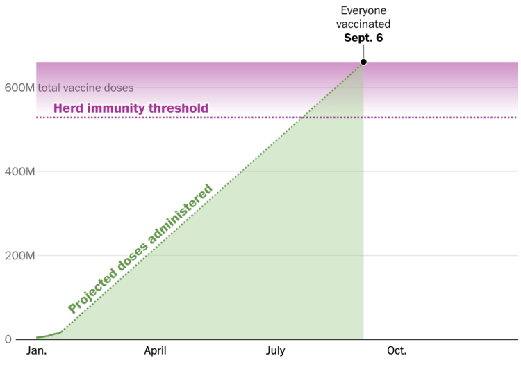
When I started FlowingData, Statistics and data almost always seemed highly technical and accessible to only a few. A few years later, understanding data was like a novelty that more people wanted to play with but still didn’t quite know the implications of what they were looking at. These days, spurred on by last year especially, interpreting data is an essential skill.
Over the next few years, Thorp’s perspective on how we live with these new streams, individually and as a society, will only grow more important.

 Visualize This: The FlowingData Guide to Design, Visualization, and Statistics (2nd Edition)


