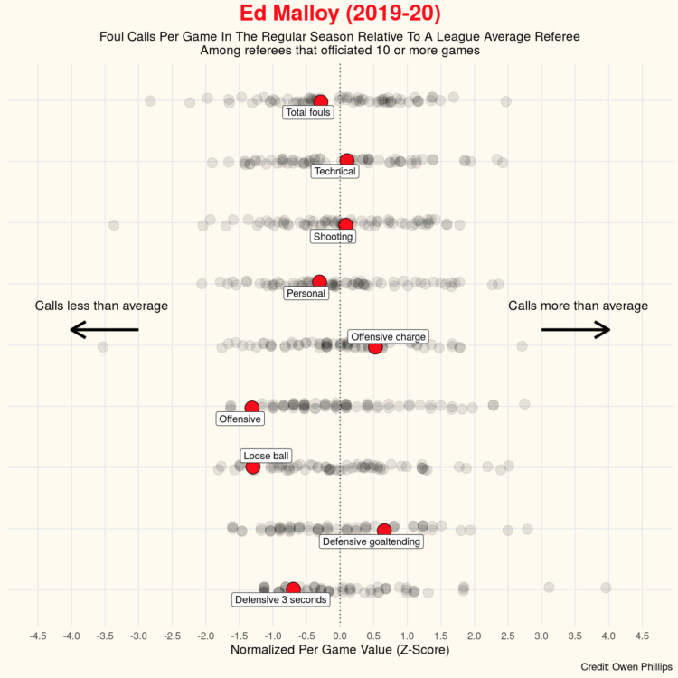
Owen Phillips compiled per game and cumulative foul calls for all NBA referees between the 2016-17 and 2019-20 seasons. On its own, I’m not sure it’s that exciting, but if you’re into basketball analytics, it might be fun to tie in with other data.
Owen Phillips compiled per game and cumulative foul calls for all NBA referees between the 2016-17 and 2019-20 seasons. On its own, I’m not sure it’s that exciting, but if you’re into basketball analytics, it might be fun to tie in with other data.

I’m sure you know this already, but just in case, air particles come out of your mouth when you talk, cough, etc. The Washington Post used an infrared camera to demonstrate:
To visually illustrate the risk of airborne transmission in real time, The Washington Post used an infrared camera made by the company FLIR Systems that is capable of detecting exhaled breath. Numerous experts — epidemiologists, virologists and engineers — supported the notion of using exhalation as a conservative proxy to show potential transmission risk in various settings.
Unemployment has hit some industries more than others. Here’s how the most recent estimates compare against last year’s.
For Domain of Science, Dominic Walliman attempts to chart all of the deadly events that threaten humanity on a scatterplot. On the horizontal axis he places number of casualties. On the vertical he places likelihood. So something like, oh, say, a global pandemic ends up in the top middle of the plot.
See also Walliman’s video of the same flavor where he attempts to illustrate everything in the known universe.
As visualization practitioners, we tend to sway towards the novel, but bar charts are still good.
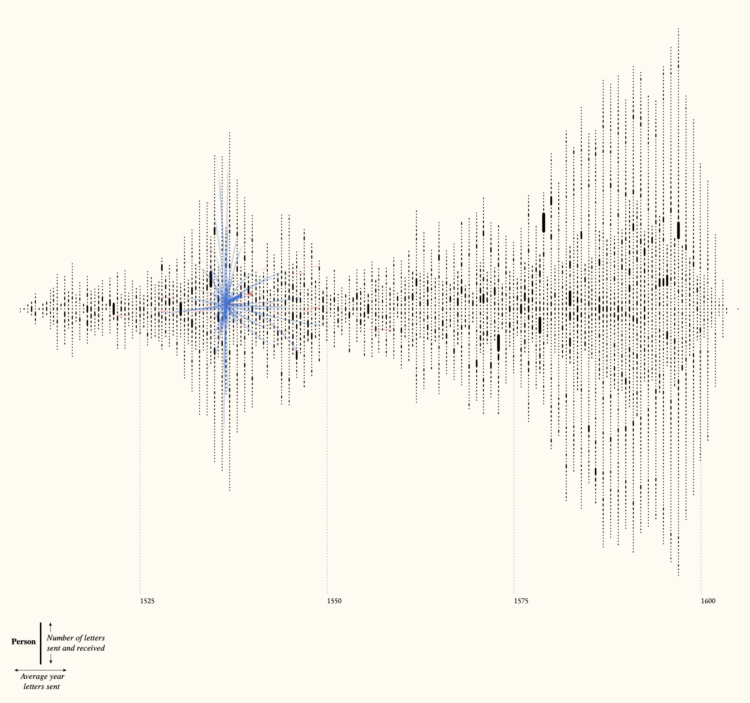
Kim Albrecht, Ruth Ahnert, and Sebastian Ahnert visualized the network of communications over time and space:
The Tudor government maintained a communication network that criss-crossed the globe. This visualisation brings together 123,850 letters connecting 20,424 people from the United Kingdom’s State Papers archive, dating from the accession of Henry VIII to the death of Elizabeth I (1509-1603).
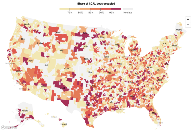
The New York Times mapped the seven-day average of ICU bed occupancy rates:
More than a third of Americans live in areas where hospitals are running critically short of intensive care beds, federal data show, revealing a newly detailed picture of the nation’s hospital crisis during the deadliest week of the Covid-19 epidemic.
Hospitals serving more than 100 million Americans reported having fewer than 15 percent of intensive care beds still available as of last week, according to a Times analysis of data reported by hospitals and released by the Department of Health and Human Services.
Oh.
It only took HHS many months into a pandemic to release the facility-level dataset.
It seems like there’s been more player movement than usual over the years. Didn’t players used to play on a single team for the entirety of their careers?
 Talking about the effectiveness of masks on TikTok, Bill Nye uses a map and some props to show mask-wearing against infection. He uses two transparent slides where the first shows mask-wearing and the second is an overlay that shows Covid-19 rates.
It seems so simple.
Jeffrey Schweers for Tallahassee Democrat:
State police brandishing firearms Monday raided the Tallahassee home of Rebekah Jones, the former Department of Health employee who built the state’s much-praised COVID-19 dashboard before being fired over what she said was refusing to “manipulate data.”
“They pointed a gun in my face. They pointed guns at my kids,” Jones tweeted shortly before 5 p.m.
After her firing in May, Jones started her own Covid-19 dashboard independently and has been maintaining it daily.
Strange.
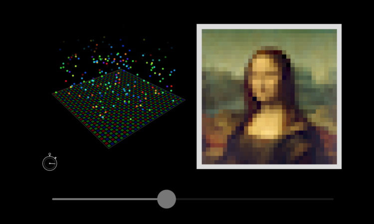
We use our cameras all of the time, and it almost seems like magic when you press that button and somehow an image is captured. But of course it’s not magic. Bartosz Ciechanowski provides a detailed interactive explainer on how the camera and lens record light.
There are a lot of satisfying sliders to adjust dimensions and see how the mechanics change. It reminds me of those exhibits at kid science museums with the big knobs and handles.
See also Ciechanowski’s explainer of a similar flavor on how gears work.
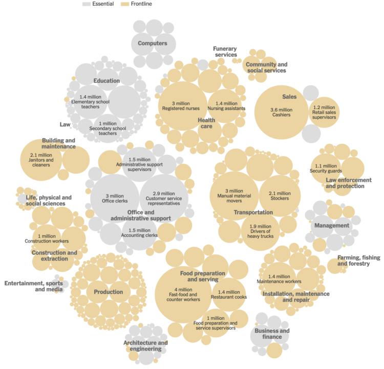
Matthew Conlen, in an article by Abby Goodnough and Jan Hoffman for NYT, charted essential and frontline workers by industry.
With limited doses, states have to decide who gets the vaccine after healthcare workers and the most vulnerable elderly. You’ve probably heard mentions of essential workers to be next in line, but under the CDC’s definition, 70 percent of workers are essential.
 Data Sketches was a one-year visualization collaboration between Nadieh Bremer and Shirley Wu that started in 2016. Each month they separately visualized a topic, and at the end of each month they’d have two very different pieces that were visually unique and showed different angles of the same thing.
They also documented their process and design decisions for every project, which provided another layer of depth to the work.
Now it’s a book and available for pre-order. Very cool.
(I’m trying to get over that this project started more than four years ago. Time has been moving slow these days, but also. Time. Passes. Fast.)
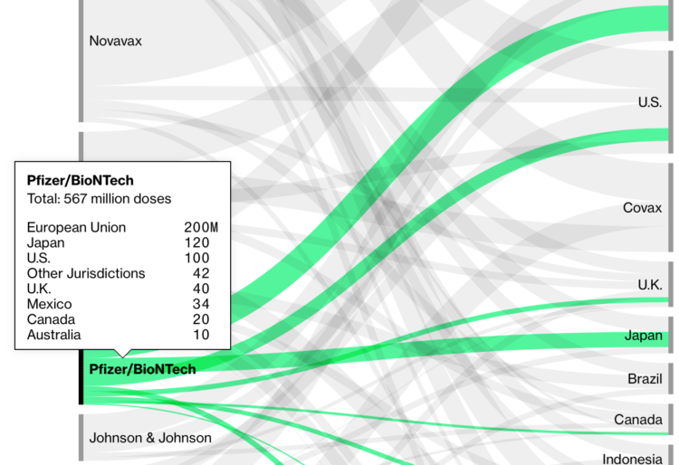
Bloomberg is tracking nine coronavirus vaccines around the world. In addition to the approval process, they’re also tracking the procurement and distribution from companies to countries. Billions.
Eugene Wei looks closer at the algorithms that drive TikTok and how its design provided an effective feedback loop:
But for TikTok (or Douyin, its Chinese clone), who needed an algorithm that would excel at recommending short videos to viewers, no such massive publicly available training dataset existed. Where could you find short videos of memes, kids dancing and lip synching, pets looking adorable, influencers pushing brands, soldiers running through obstacle courses, kids impersonating brands, and on and on? Even if you had such videos, where could you find comparable data on how the general population felt about such videos? Outside of Musical.ly’s dataset, which consisted mostly of teen girls in the U.S. lip synching to each other, such data didn’t exist.
In a unique sort of chicken and egg problem, the very types of video that TikTok’s algorithm needed to train on weren’t easy to create without the app’s camera tools and filters, licensed music clips, etc.
At first I was confused by TikTok. I’m still confused by TikTok. But one thing that is for sure is that the system knows how to serve up videos that one might find interesting. Whether that’s good in the long run is anyone’s guess.

It might be tricky. It might be tedious. But it’ll make your process more straightforward when it’s time to visualize.
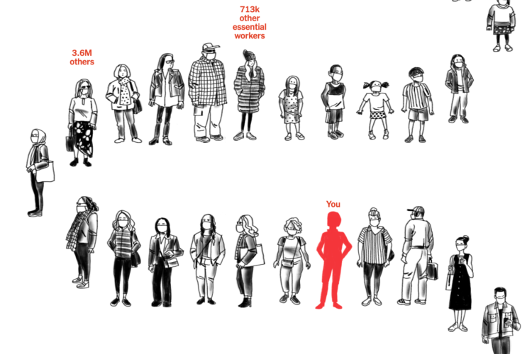
Using estimates from the Surgo Foundation and Ariadne Labs, Stuart A. Thompson for NYT Opinion shows how many people are in front of you to get the coronavirus vaccine. Just enter your age, if you’re an essential worker, and the county you live in for an idea of where you are.
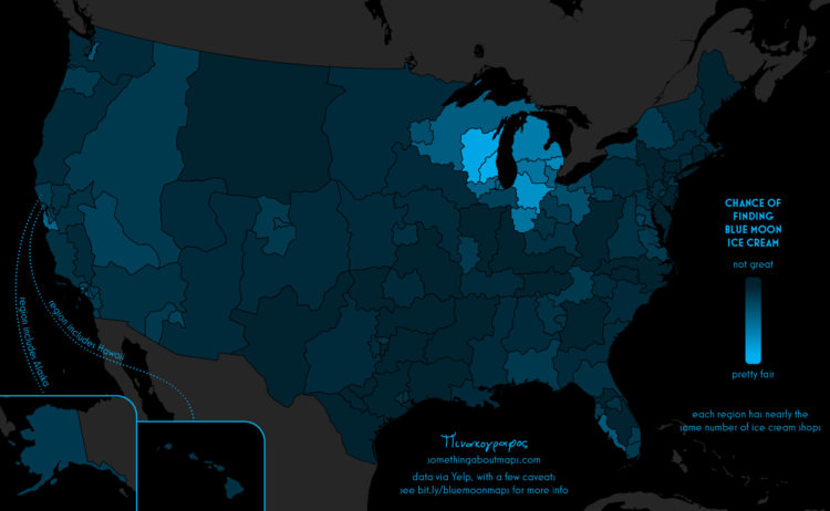
Daniel Huffman grew up with an ice cream flavor called Blue Moon. Where he’s from, it’s a common menu item, so he figured it was common nationally. Nope. So Huffman did some cartographic sleuthing:
In recent years, I have come to learn that it’s not widely available throughout the United States. It is, instead, a regional flavor, with various articles describing it as a “Midwestern favorite,” and an “iconic Midwestern frozen treat.” But nothing I read was able to give more detail about where blue moon was found — only anecdotal, unsatisfying generalizations about the Midwest. No one had hard data, and, most importantly, no one had maps. The true distribution of this flavor was a mystery that I needed to solve.
Now I want ice cream.
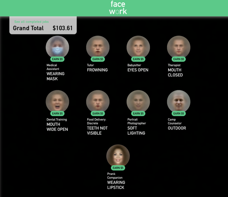
Kyle McDonald, in collaboration with Greg Borenstein, Evelyn Masso, and Fei Lui, made Facework. It’s a game that imagines a platform where people use their faces in a gig economy and you’re encouraged to trick the AI that you’re something you’re not — with your face.
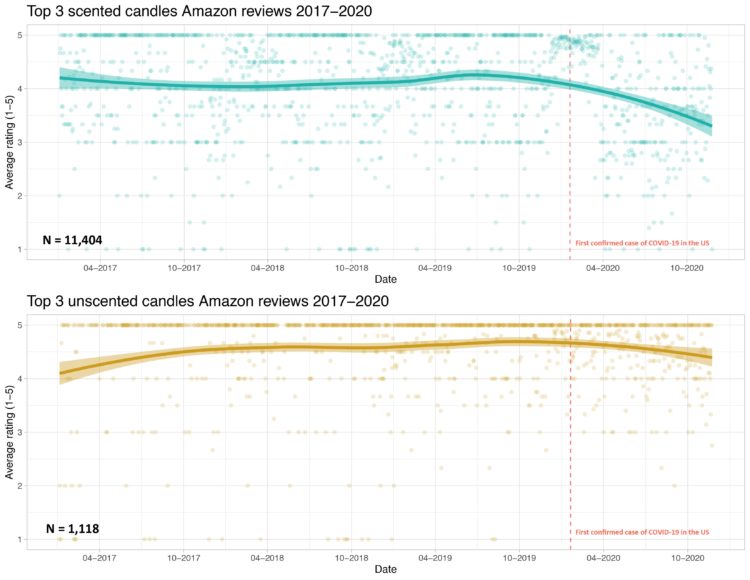
Prompted by a tweet about scented candles without smell and Covid-19, Kate Petrova plotted Amazon reviews for scented and unscented candles over time. Notice the downward trend for scented candles after the first confirmed case for Covid-19.
Interesting if true. I’m imagining a bunch of people opening their new scented candles, taking a big whiff, and not smelling anything.
But I wonder if there are outside forces (a.k.a. confounding factors) at work here. For example, Petrova only looked at reviews for the “top 3” scented candles. What do we see with other candles? Maybe a higher demand for scented candles from more people staying at home put a strain on the manufacturer. Maybe there was a shortage of some scented ingredient, which led to less potent candles. Maybe new scented candles customers have unrealistic expectations of what candles smell like.
I don’t know.
Maybe the decreasing average review really is related to Covid-19 symptoms.
Petrova put up the code and data, in case you want to dig into it.
Update: In my original post, I unknowingly used an offensive word unfit for usage. Thank you to those who pointed it out to me.
 Visualize This: The FlowingData Guide to Design, Visualization, and Statistics (2nd Edition)
New tools, refined process.


