• Membership
  • Newsletter
  • Projects
  • Learning
  • About
  • Member Login
  • Illustrations show how to reduce risk at small gatherings

    October 29, 2020

    Topic

    Infographics  /  coronavirus, El Pais, illlustration, mask, risk, ventilation

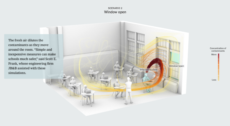
    Risk of coronavirus infection changes depending on the amount of contagious particles you breathe in. El Pais illustrated the differences when you take certain measures, namely wearing masks, ventilation, and decreased exposure time.

    The suggestions are based on statistical models, so there is more uncertainty than I think the explanations provide, but the sequence of illustrations provides a clear picture of what we can do — if you must do things indoors.

  • Political search interest in 2020

    October 29, 2020

    Topic

    Statistical Visualization  /  Google News Initiative, politics, search, Truth & Beauty

    In Waves of Interest, a collaboration between the Google News Initiative and Truth & Beauty, see the defining search trends of 2020. See trends over time. See trends over geography. See trends over past election seasons.

    See also how the work came together.

  • How your state makes electricity

    October 29, 2020

    Topic

    Statistical Visualization  /  electricity, New York Times

    The way we make electricity in America is changing. For The New York Times, Nadja Popovich and Brad Plumer used ribbon charts, which I think are a NYT staple now, to show the shift between 2001 to 2019.

    The width of each ribbon represents percentage of power produced by a source, and the vertical order shows highest percentage to lowest over time. Each state gets a chart and an explanation.

    Wind power in Iowa, shown above, is up at 42 percent. Impressive.

  • Maps of Home

    October 28, 2020

    Topic

    Maps  /  Dylan Moriarty, home, illustration, scrollytelling

    Dots on a map can feel like, well, just a bunch of dots. Dylan Moriarty zoomed in on the dot of his hometown, making the dot feel more real:

    The map concept at the top of this piece has been kicking in my head for a long while. Came from a dream: Meandering in a museum space, from far, far away you see a map introducing a new exhibit on New York City. Walking closer, the standard .NEW YORK CITY dot became more detailed until you’d get to up close and discovered that each inch had a drawing detailing that block’s history. A historical illustration with the energy and detail of a Where’s Waldo page. No doubt inspired by the wonderful 1981 illustrated map of Chicago gangs.

    This is very good.

  • Early voting volumes

    October 27, 2020

    Topic

    Statistical Visualization  /  election, New York Times, voting

    As you might expect, early voting volume is high across the country. In many states, one week until election day, the early voting count is already more than half of the total 2016 counts. For The New York Times, Denise Lu and Karen Yourish provide the breakdown with cumulative charts by state.

    See also how long it might take to count all the votes.

    And you can download the count data from the United States Election Project.

  • Money raised for the presidential election – by geography, time, and demographic

    October 27, 2020

    Topic

    Maps  /  election, fundraising, New York Times

    The New York Times analyzed campaign finance data from April to October, mapping and charting their results by different segments:

    The findings paint a portrait of two candidates who are, in many ways, financing their campaigns from two different Americas.

    It is not just that much of Mr. Biden’s strongest support comes overwhelmingly from the two coasts, which it does. Or that Mr. Trump’s financial base is in Texas, which it is. It is that across the country, down to the ZIP code level, some of the same cleavages that are driving the 2020 election — along class and education lines — are also fundamentally reshaping how the two parties pay for their campaigns.

  • Halloween logicals

    October 26, 2020

    Topic

    Infographics  /  Halloween, humor, logic

    From Kaz Miyamol, these Venn diagrams present very important information about Halloween.

  • Vintage relief maps

    October 23, 2020

    Topic

    Maps  /  3-d, Muir Way, vintage

    Muir Way updates vintage relief maps with a third dimension. Pretty. The above is a geologic map of the United States, based on a 1932 print.

    Scott Reinhard made similar maps last year, but Muir Way leaned a little more into it with more geographic areas and prints to buy.

  • Members Only

    The Process 112 – Statistics Without Awareness, Virtual Reality, and a Bar Chart Race

    October 22, 2020

    Topic

    The Process  /  context

    Look around. Take it in.

  • How to Make Symbol-based Glyph Charts, with R Examples

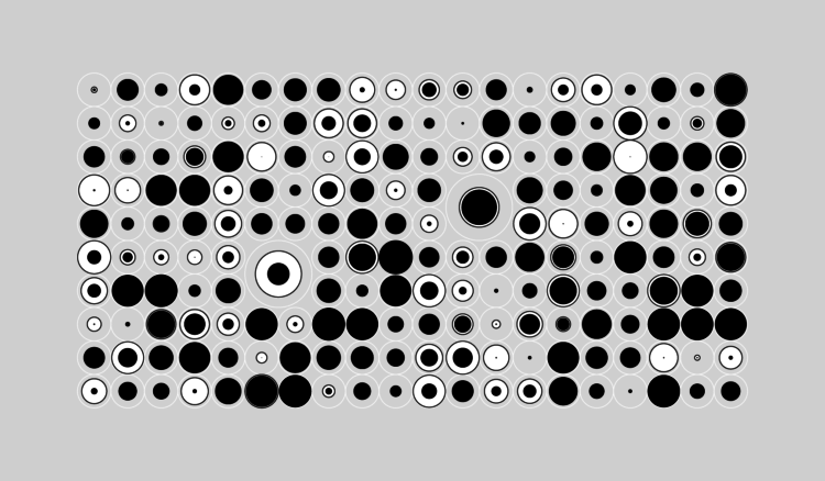
    Using geometric shapes as an encoding can provide another dimension to your charts.

  • Fires in the west and climate change

    October 22, 2020

    Topic

    Maps  /  climate change, scrollytelling, Washington Post, wildfire

    This is some advanced mapping and scrollytelling from the Washington Post. The piece examines climate change in the context of the fires in the western United States.

    Starting in the beginning of August, the piece takes you through the timeline of events as your scroll. Maps of temperature, wind, lightning, and fire serve as the backdrop. Berry Creek, California, a mountain town that burned to the ground, provides an anchor to show how large climate shifts can affect the individual.

    Well done.

  • Decision tree for the presidential election result

    October 21, 2020

    Topic

    Network Visualization  /  election, Kerry Rodden

    While we’re on the topic of election scenarios, Kerry Rodden provides a radial decision tree to show possible outcomes. Select paths or specify state wins to see what might happen.

    It’s based on the New York Times piece by Mike Bostock and Shan Carter from 2012(!).

  • Using the FiveThirtyEight model, see how the election odds shift with different scenarios

    October 21, 2020

    Topic

    Statistics  /  election, FiveThirtyEight, simulation

    With each model update, FiveThirtyEight runs 40,000 simulations, or what-ifs, to calculate the odds for who will win the election. Their new interactive lets you experiment with all of the what-ifs to see how the odds shift when a candidate wins a state.

    It answers the question, “If ______ wins in ______ and in ______, etc., what are the chances of him winning the whole thing?”

    So if Trump wins a very red state or Biden wins a very blue state, the overall odds don’t change that much. But if a very red goes blue, or a very blue goes red, then the odds swing dramatically.

    There’s a good lesson on conditional probability somewhere in there.

  • Making map art in R

    October 21, 2020

    Topic

    Coding  /  Esteban Moro, R

    If you can make maps in your software and customize the aesthetics, you can make map art. Esteban Moro outlined how he made a personalized map in R:

    For my map art, I wanted to create something more personal: a combination of those beautiful street maps with personal mobility. That is, the city and how we navigate it. In this tutorial, you’ll learn how to create those street maps for your city and your mobility. We will use data from Open Street Maps (OSM) and, of course, R. We will also use personal mobility data, which you can input manually. Still, we will learn too how to get it from Google Maps Timeline (if you have your location activated). Part of the material here is based on the tutorial by Christian Burkhart.

  • Tips for not letting polls and forecasts occupy your mind for two weeks

    October 20, 2020

    Topic

    Statistics  /  election, FiveThirtyEight, forecast

    For FiveThirtyEight, Nate Silver provides tips to stay less stressed staring into the darkness known at election forecasts:

    This is perhaps the single piece of advice we give most often at FiveThirtyEight, but it’s especially important in the final couple weeks of a campaign. After a lull this weekend, there are likely to be a lot of polls the rest of the way out. On any given day, it will be possible to take the two or three best polls for Biden and tell a story of his holding or expanding his lead, or the two or three best polls for Trump and make a claim that the race is tightening.

    Resist buying too much into those narratives.

    Good luck.

  • Interactive data essays on climate change

    October 20, 2020

    Topic

    Statistical Visualization  /  climate, Parametric Press

    In their second issue, Parametric Press focuses on climate change with a set of interactive data essays:

    The articles explore the gamut of our climate’s past, present, and future, exploring not only what has happened (and is happening) but also what should happen, and what we as citizens should do to realize that future. In this issue you will find a personalized history of Earth’s CO2 record, a close look at disturbances in the floodplains in the Mekong Delta, an analysis of how YouTube and other digital streaming services impact the environment, along with critiques on potential carbon sequestration methods and an exploration of the corporations that are most responsible for getting us to where we are today.

  • Data visualization in virtual reality

    October 19, 2020

    Topic

    Statistical Visualization  /  physical, VR

    [arve url=”https://www.youtube.com/watch?v=XmYNISBjL_Q” loop=”no” muted=”no” /]

    Virtual reality puts you in a digital world that can feel like a real world when it’s done right. Research from Benjamin Lee, et al. explored some of the possibilities in work they’re calling data visceralation.

    As a proof of concept, shown in the video above, the researchers recreated popular works for virtual reality. Watch Olympic runners sprint past you or look up at the comparison of the world’s tallest buildings.

    The goal is essentially to make the abstract shapes or data points feel more real. Looks promising.

    By the way, this work is going to be presented at VIS 2020, which will be virtual and free to attend this year. If you’re interested in poking your head in, but don’t know where to start, Robert Kosara wrote an outsider’s guide to the conference to point you in the right direction.

  • More fire weather days coming

    October 16, 2020

    Topic

    Maps  /  California, climate change, ProPublica, wildfire

    It’s been smoky this season. Based on research from Michael Goss et al., Al Shaw and Elizabeth Weil for ProPublica look at the current fire situation in California and what that might mean for the future and the rest of the country.

    In wildfires, as with flooding and heat, climate change doesn’t create novel problems; it exacerbates existing problems and compounds risks. So there is no precise way to measure how much of all this increased wildfire activity is due to climate change. An educated guess is about half, experts say. Its role, however, is growing fast. Within 20 years, climate change promises to be the dominant factor driving larger and more frequent megafires — not only in California, but across the country.

  • Lifelines

    October 16, 2020

    Topic

    Infographics  /  despair, mortality, Periscopic

    Using estimates from a report by the Well Being Trust and the Robert Graham Center, Periscopic shows projected deaths of despair in Lifelines.

    Lights, each representing a life, float above the water, and as you adjust levels of mental health care, employment, and social connection, the lives either sink to the bottom or stay above the water. How do we keep as many as we can above water?

  • Members Only

    The Process 111 – Excel Limit

    October 15, 2020

    Topic

    The Process  /  Excel, limitations

    A row limit in Microsoft Excel led to an undercount of Covid-19 cases in the thousands. The root of the problem goes past the software though.

  • Page 93 of 391
  • <
  • 1
  • ...
  • 90
  • 91
  • 92
  • 93
  • 94
  • 95
  • ...
  • 391
  • >

Analyze, visualize, and communicate data usefully, beyond the defaults.

Become a member →

Recently for Members

May 8, 2025
When the data is not what it seems

May 1, 2025
Finding the Right Charts

April 24, 2025
Visualization Tools, Datasets, and Resources – April 2025 Roundup

April 17, 2025
Breaking Out of Chart Software Defaults

April 15, 2025
Line Chart with Decorative Neon Accents

Browse by Chart Type See All →

Pictogram Surface Plot Variable Width Bar Chart Network Graph Frequency Trails Density Plot Organogram Grid Map Table Dot Map

Browse By Topic

  • Visualization

    Seeing data

  • Maps

    Seeing geographic data

  • Infographics

    Explaining data

  • Networks

    Connecting data

  • Statistics

    Analyzing data

  • Software

    Working with data

  • Sources

    Getting data

  • Design

    Making data readable

Get the Book

Visualize This: The FlowingData Guide to Design, Visualization, and Statistics

Available now.

Order: Amazon / Bookshop

Made by FlowingData

  • The Process

  • Data Underload

  • Chart Everything

  • Guides

  • Books

  • Shop

  • About
  • Contact
  • Newsletter
  • LinkedIn
  • Instagram
  • Bluesky
  • RSS
Copyright © 2007-Present FlowingData. All rights reserved.