As a lead-in and backdrop to a timeline of the past year by The Washington Post, an animated dot density map represents Covid-19 deaths. “Every point of light is a life lost to coronavirus.”
Pandemic timeline as animated dot density map
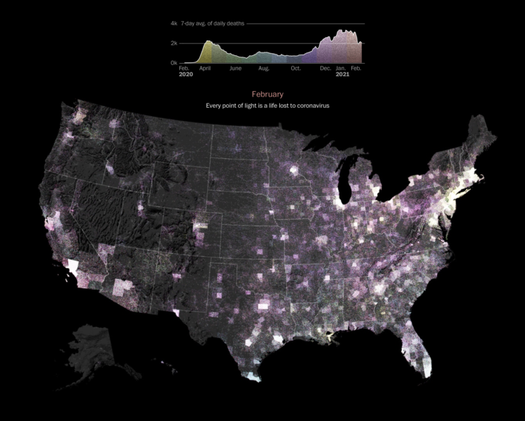
Chart Type Used

Second Edition
 Visualize This: The FlowingData Guide to Design, Visualization, and Statistics (2nd Edition)
 Visualize This: The FlowingData Guide to Design, Visualization, and Statistics (2nd Edition)
New tools, refined process.