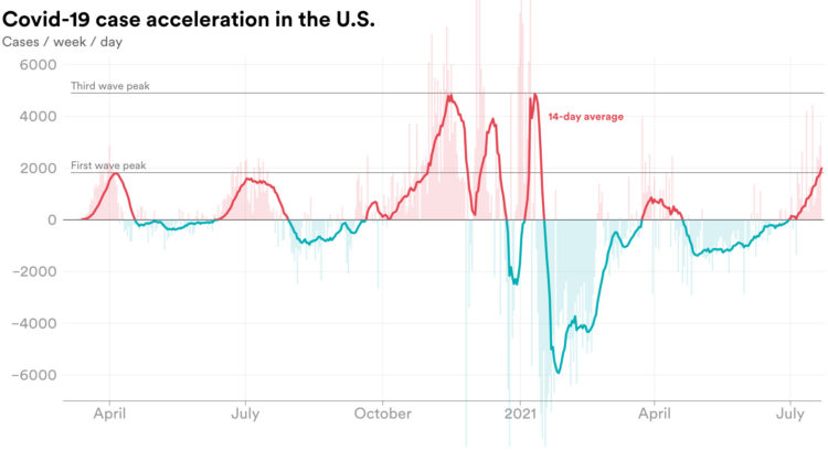
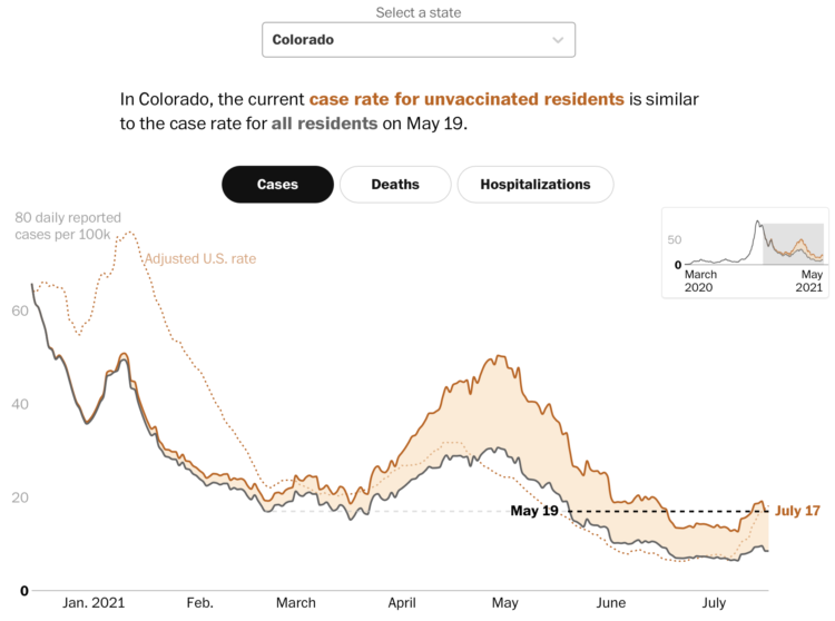
• Membership
  • Newsletter
  • Projects
  • Learning
  • About
  • Member Login
  • Members Only

    Visualization Tools and Learning Resources, March 2021 Roundup

    March 25, 2021

    Topic

    The Process  /  roundup

    Here’s the good stuff for March 2021.

  • Data Underload  /  income, work

    Income in Each State, Adjusted for Cost of Living

    A dollar might not buy you as much in one state as it does in the other.

    Read More
  • Which color scale to use for your charts

    March 24, 2021

    Topic

    Design  /  color, Datawrapper, Lisa Charlotte Rost

    On a superficial level, color scale selection seems like a straightforward task. Pick a sequence of colors that looks like it goes from light to dark. Done. But right when you get into it, you might find the process isn’t so straightforward. Different color scales can represent different aspects of your data, and poor selection can lead to poor communication. So, Lisa Charlotte Rost for Datawrapper wrote a four-part practical guide to help you figure it out.

    See also Rost’s equally useful guide on what colors to pick for your scales.

  • Teaching statistical models with wine tasting

    March 23, 2021

    Topic

    Statistics  /  modeling, Pudding, wine

    For The Pudding, Lars Verspohl provides an introduction to statistical models disguised as a lesson on finding good wine. Start with a definition of wine, which becomes a way to describe it with the numbers. Define what makes a wine good. Find the wines that look closer to that definition.

  • Statistical limits

    March 22, 2021

    Topic

    Statistics  /  Hannah Fry, limitations

    Reviewing Deborah Stone’s Counting and Tim Harford’s The Data Detective, Hannah Fry discusses the usefulness of data and its limitations for The New Yorker:

    Numbers are a poor substitute for the richness and color of the real world. It might seem odd that a professional mathematician (like me) or economist (like Harford) would work to convince you of this fact. But to recognize the limitations of a data-driven view of reality is not to downplay its might. It’s possible for two things to be true: for numbers to come up short before the nuances of reality, while also being the most powerful instrument we have when it comes to understanding that reality.

    This builds on Fry’s similarly themed article from a couple of years ago, as well as her book Hello World.

    Data is limited, and the better we understand those limitations, the better use we can get out of what’s there.

  • Inadequate hate crime statistics

    March 22, 2021

    Topic

    Statistics  /  crime, hate, police, ProPublica

    For ProPublica, Ken Schwencke reports on a poor data system that relies on local law enforcement to voluntarily enter data:

    Local law enforcement agencies reported a total of 6,121 hate crimes in 2016 to the FBI, but estimates from the National Crime Victimization Survey, conducted by the federal government, pin the number of potential hate crimes at almost 250,000 a year — one indication of the inadequacy of the FBI’s data.

    “The current statistics are a complete and utter joke,” said Roy Austin, former deputy assistant attorney general in the Department of Justice’s civil rights division. Austin also worked at the White House on data and civil rights and helped develop an open data plan for police data.

    Garbage in, garbage out.

  • Data Underload  /  basketball, trading

    Career Timelines for Every Basketball Player Who Has Played an NBA Game

    I was curious who played for a single team over their entire career, who skipped around, and how the patterns changed over the decades.

    Read More
  • Members Only

    Maybe All Charts are Bad – The Process 131

    March 18, 2021

    Topic

    The Process  /  bad chart, misleading

    But probably not.

  • Mapping all of the voters

    March 18, 2021

    Topic

    Maps  /  election, segregation, Upshot

    In what seems to have become a trend of making more and more detailed election maps, NYT’s The Upshot mapped results down to the addresses of 180 million voters:

    The maps above — and throughout this article — show their estimates of partisanship down to the individual voter, colored by the researchers’ best guess based on public data like demographic information, voter registration and whether voters participated in party primaries.

    We can’t know how any individual actually voted. But these maps show how Democrats and Republicans can live in very different places, even within the same city, in ways that go beyond the urban-suburban-rural patterns visible in aggregated election results.

    The estimates are based on research by Jacob Brown and Ryan Enos, recently published in Nature. You can also look at their data via the Harvard Dataverse.

  • Rising number of anti-Asian attacks

    March 18, 2021

    Topic

    Statistics  /  Asian, racism

    Russell Jeung, chair of the Asian American Studies Department at San Francisco State University, on NPR about the recent rise:

    What we’ve discovered isn’t that we’ve just had a spike, but we’ve had a surge over the entire year last year with COVID-19 and with the president’s political rhetoric in the last administration. We now have over 3,000 incidents and hate-filled incidents where people are tormenting Asian Americans. I can’t describe the actual amount of hate that Asian American community is experiencing now. We have over 11% of our cases where we’re getting pushed and shoved and actually physically assaulted.

    Ugh.

  • Evolution of Chinese names

    March 16, 2021

    Topic

    Infographics  /  Chinese, Isabella Chua, names

    For Kontinentalist, Isabella Chua took a dive into the evolution of Chinese names:

    Put simply, names encode the wishes parents have for their children.

    So, what were these wishes? For answers, I turned to the Chinese name database, which covers the surname and given-name characters for almost all 1.2 billion Han Chinese—the ethnic majority in China—individuals born between 1930 and 2008. I’ve focused only on given names here rather than surnames; given names are subject to parents’ discretion, whereas surnames are inherited.

    If you’re unfamiliar with Chinese names, Chua provides good explanations and audio pronunciations to make it easier to follow along.

  • Analysis of skin tones in beauty ads on Instagram

    March 16, 2021

    Topic

    Statistical Visualization  /  ads, diversity, fashion, Instagram, Quartz

    For Quartz, Amanda Shendruk and Marc Bain analyzed skin tones that appeared in beauty and fashion ads on Instagram. The graphics use Blackout Tuesday on June 2, 2020, when many brands vowed to improve diversity to better reflect the world, as a point of comparison. Using median skin color as the main metric, some companies shifted more than others.

  • Pandemic timeline as animated dot density map

    March 15, 2021

    Topic

    Maps  /  animation, coronavirus, pandemic, timeline, Washington Post

    As a lead-in and backdrop to a timeline of the past year by The Washington Post, an animated dot density map represents Covid-19 deaths. “Every point of light is a life lost to coronavirus.”

  • Facebook feed comparison between groups

    March 15, 2021

    Topic

    Infographics  /  comparison, facebook, feed, The Markup

    As part of their Citizen Browser project to inspect Facebook, The Markup shows a side-by-side comparison between Facebook feeds for different groups, based on the feeds of 1,000 paid participants.

    There are pretty big differences for news sources and group suggestions, but the news stories don’t seem as big as you might think with a median 3 percentage points difference between groups. Although, the distribution shows a wider spread.

  • Average stimulus aid, by household size and income

    March 12, 2021

    Topic

    Statistical Visualization  /  stimulus, Upshot

    Alicia Parlapiano and Josh Katz, reporting for NYT’s The Upshot, plotted the average aid for different groups, outlined by the March 2021 stimulus bill. The estimates come from a new analysis by the Tax Policy Center, which contrasts sharply with the 2017 Tax Cuts and Jobs Act.

    Check out the full Upshot chart, which shows single and married households up to three children or more. There are a few visual encodings going on here with the axes, bubble size, color, and income group labels.

  • Seeing CO2 is a playable data visualization

    March 11, 2021

    Topic

    Infographics  /  carbon, environment, Extraordinary Facility, game, scale

    Seeing CO2, by design studio Extraordinary Facility, is a playable data visualization that imagines if carbon dioxide were visible. You drive a car around collecting bits of information about carbon dioxide in our environment, and along the way, you’ll see volumes of CO2 compared against well-known structures. Pretty great.

  • Members Only

    Imagining the Path to a Bad Chart – The Process 130

    March 11, 2021

    Topic

    The Process  /  bad chart, imagine

    Bad charts get made. It’s inevitable. Sometimes I wonder how it happens though.

  • Bird migration forecast maps

    March 10, 2021

    Topic

    Maps  /  birds, forecasting, migration

    BirdCast, from Colorado State University and the Cornell Lab of Ornithology, shows current forecasts for where birds are headed over the United States:

    Bird migration forecasts show predicted nocturnal migration 3 hours after local sunset and are updated every 6 hours. These forecasts come from models trained on the last 23 years of bird movements in the atmosphere as detected by the US NEXRAD weather surveillance radar network. In these models we use the Global Forecasting System (GFS) to predict suitable conditions for migration occurring three hours after local sunset.

  • DeepTomCruise breakdown

    March 10, 2021

    Topic

    Statistics  /  AI, deepfake, TikTok, Tom Cruise

    Chris Ume, with the help of Tom Cruise impersonator Miles Fisher, created highly believable deepfakes of Tom Cruise and posted the videos to TikTok. Ume showed the breakdown of the arduous process of training the A.I. model and editing each frame.

    [arve url=”https://www.youtube.com/watch?v=wq-kmFCrF5Q” loop=”no” muted=”no” /]

    The Verge talked to Ume more about the process:

    “You can’t do it by just pressing a button,” says Ume. “That’s important, that’s a message I want to tell people.” Each clip took weeks of work, he says, using the open-source DeepFaceLab algorithm as well as established video editing tools. “By combining traditional CGI and VFX with deepfakes, it makes it better. I make sure you don’t see any of the glitches.”

    The results are both entertaining and worrisome.

  • Data Underload  /  living, minimum wage, work

    Minimum Wage and Cost of Living

    We already looked at minimum wage over time, but when it comes to geography and income, you also have to consider the cost of living for a fair comparison.

    Read More
  • Page 85 of 392
  • <
  • 1
  • ...
  • 82
  • 83
  • 84
  • 85
  • 86
  • 87
  • ...
  • 392
  • >

Analyze, visualize, and communicate data usefully, beyond the defaults.

Become a member →

Recently for Members

May 8, 2025
When the data is not what it seems

May 1, 2025
Finding the Right Charts

April 24, 2025
Visualization Tools, Datasets, and Resources – April 2025 Roundup

April 17, 2025
Breaking Out of Chart Software Defaults

April 15, 2025
Line Chart with Decorative Neon Accents

Browse by Chart Type See All →

Mosaic Plot Parallel Coordinates Packed Bubble Chart Histogram Pictogram Line Map Radar Chart Square Pie Chart Network Graph

Browse By Topic

  • Visualization

    Seeing data

  • Maps

    Seeing geographic data

  • Infographics

    Explaining data

  • Networks

    Connecting data

  • Statistics

    Analyzing data

  • Software

    Working with data

  • Sources

    Getting data

  • Design

    Making data readable

Get the Book

Visualize This: The FlowingData Guide to Design, Visualization, and Statistics

Available now.

Order: Amazon / Bookshop

Made by FlowingData

  • The Process

  • Data Underload

  • Chart Everything

  • Guides

  • Books

  • Shop

  • About
  • Contact
  • Newsletter
  • LinkedIn
  • Instagram
  • Bluesky
  • RSS
Copyright © 2007-Present FlowingData. All rights reserved.