Every decade the National Oceanic and Atmospheric Administration releases climate normals to provide a baseline to compare current weather against. NOAA just released the estimates for 1991 to 2020. As you might expect, and shown in the maps above, it’s getting hotter.
-
Members Only
-
It was only a matter of time before someone showed dots moving across a map to show migration during the pandemic. Again, using USPS change of address data, Yan Wu and Luis Melgar for the Wall Street Journal (paywalled) showed where people moved in the country.
As shown through other views, a lot of the movement wasn’t out of the ordinary, but in some areas — mainly San Francisco and New York — the pandemic appeared to motivate people a little more to move.
-
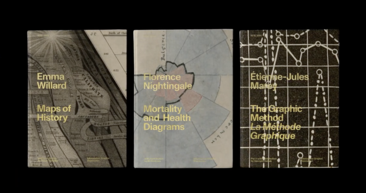
The Information Graphic Visionaries book series just launched on Kickstarter. Emma Willard, Florence Nightingale, and Étienne-Jules Marey are the subjects of three books, each including high-resolution images of the creators’ works and essays that provide historical context.
Whenever I’m feeling uninspired, I like to flip through old works. It always amazes me what past visualization practitioners were able to make without a computer. Oftentimes the detail and creativity surpass what we see these days. So Visionaries should be a fine addition to the library.
Just one day in and the Kickstarter is about halfway to the goal.
-
The CDC said that “less than 10 percent” of coronavirus cases were from outdoor transmissions. David Leonhardt for The New York Times argues why in all likelihood that number is way too high and leads to public confusion:
If you read the academic research that the C.D.C. has cited in defense of the 10 percent benchmark, you will notice something strange. A very large share of supposed cases of outdoor transmission have occurred in a single setting: construction sites in Singapore.
In one study, 95 of 10,926 worldwide instances of transmission are classified as outdoors; all 95 are from Singapore construction sites. In another study, four of 103 instances are classified as outdoors; again, all four are from Singapore construction sites.
This obviously doesn’t make much sense. It instead appears to be a misunderstanding that resembles the childhood game of telephone, in which a message gets garbled as it passes from one person to the next.
-
About 48% of the U.S. population aged 15 and older is married. I was curious if there were regional variations, so I mapped it.
-
If you’ve watched even just a few videos on YouTube, you probably noticed that many videos, especially those in the vlogging genre, start the same way: “Hey guys.” YouTube Culture & Trends confirms this. “What’s up” and “Good morning” currently take the second and third spots.
They also looked at how it ranks against other greetings and varies with different genres. Sports videos most commonly start with “What is going” (I assume followed by “on”) and tech starts with “Ladies and gentlemen.”
-
Øystein Moseng for Highcharts provides a brief guide on making your visualizations for accessible. Guideline #4 on not relying completely on color to show the data:
Relying on color as the only means of communicating information is a failure of one of the basic WCAG success criteria. This is because many users may not be able to distinguish between the different colors used.
Data labels, symbols, annotations and tooltips are some common ways to convey additional information in visualizations without relying on color. In addition, alternate presentations – such as an accessible data table – can be helpful. It is still encouraged to use color as a supplement to these techniques, this can make visualizations easier to understand, and in many cases more accessible.
-
We often hear about the Asian American community as one big group of people, but go one level down and you see a lot of variance within the group. Nicole Chavez and Priya Krishnakumar, reporting for CNN, provide several demographic breakdowns to show the differences.
-
The President of the United States chooses the art for the Oval Office, and the choices show who the president admires or the image they want to project. Larry Buchanan and Matt Stevens for The New York Times take you through all of the choices since the Kennedy administration.
About half way through the piece, an averaged image of the office through several presidencies shows what changes and what stays the same. Usually these averaged images feel gimmicky or don’t show you much, but as a lead in to separate pictures, the blurred image works.
-
Members Only
-
These sonographs of bird song, in contrast to the sounds from traditional instruments, show complex patterns on a base frequency.
-
Gus Wezerek, Ryan D. Enos, and Jacob Brown for NYT Opinion use neighborhood-level data to show how those around you voted in the 2020 election. They ask: do you live in a political bubble? Enter an address to see.
This is riffing off of NYT’s similarly-themed map from 2018, which asked the same question but answered more geographically. This newer version, as is the current way of doing things these days, is more bubbly and mobile-focused with the scroll format.
-
If you’re into the notebook workflow, Observable Plot is a JavaScript library built for you:
We created Plot to better support exploratory data analysis in reactive, JavaScript notebooks like Observable. We continue to support D3 for bespoke explanatory visualization and recommend Vega-Lite for imperative, polyglot environments such as Jupyter. Plot lets you see your ideas quickly, supports interaction with minimal fuss, is flexible with respect to data, and can be readily extended by the community. We believe people will be more successful finding and sharing insight if there’s less wrestling with the intricacies of programming and more “using vision to think.”
In case you’re curious how Plot compares to D3, which was used to build Plot, you can find that information here.
-
Divorce rates are tied to job security, age, and occupation, so it should make sense that we see a pattern when we plot divorce rates against income.
-
Steph Curry has been on a tear as of late. In April he made more threes than any NBA player ever has in a month. Ben Golliver and Artur Galocha for The Washington Post provide perspective on just how record-setting Curry’s current play is.
I’d be lying if I said it wasn’t satisfying to see half of the comparisons show how Curry has played better than James Harden.
-
[arve url=”https://youtu.be/R7FAAfK78_M” loop=”no” muted=”no” /]
In his new data-driven documentary, Neil Halloran digs into the uncertainty attached to estimates for climate change. Halloran’s argument is that we have to understand the limitations of forecasting the future before we can change it.
-
Members Only
-
Princeton University’s Net-Zero America project analyzes and models the infrastructure required to get to net-zero carbon emissions nationally. Dave Merrill for Bloomberg highlighted the group’s estimates for land usage to build things like wind and solar farms, which, as you might imagine, will require millions of acres.
-
Niko Kommenda for The Guardian used small multiples to show 90 of the largest glaciers in the world and how they have melted over many decades. The animation transitions between two time periods for each glacier, showing what was there earlier and what is left.