Where People are Married and Not
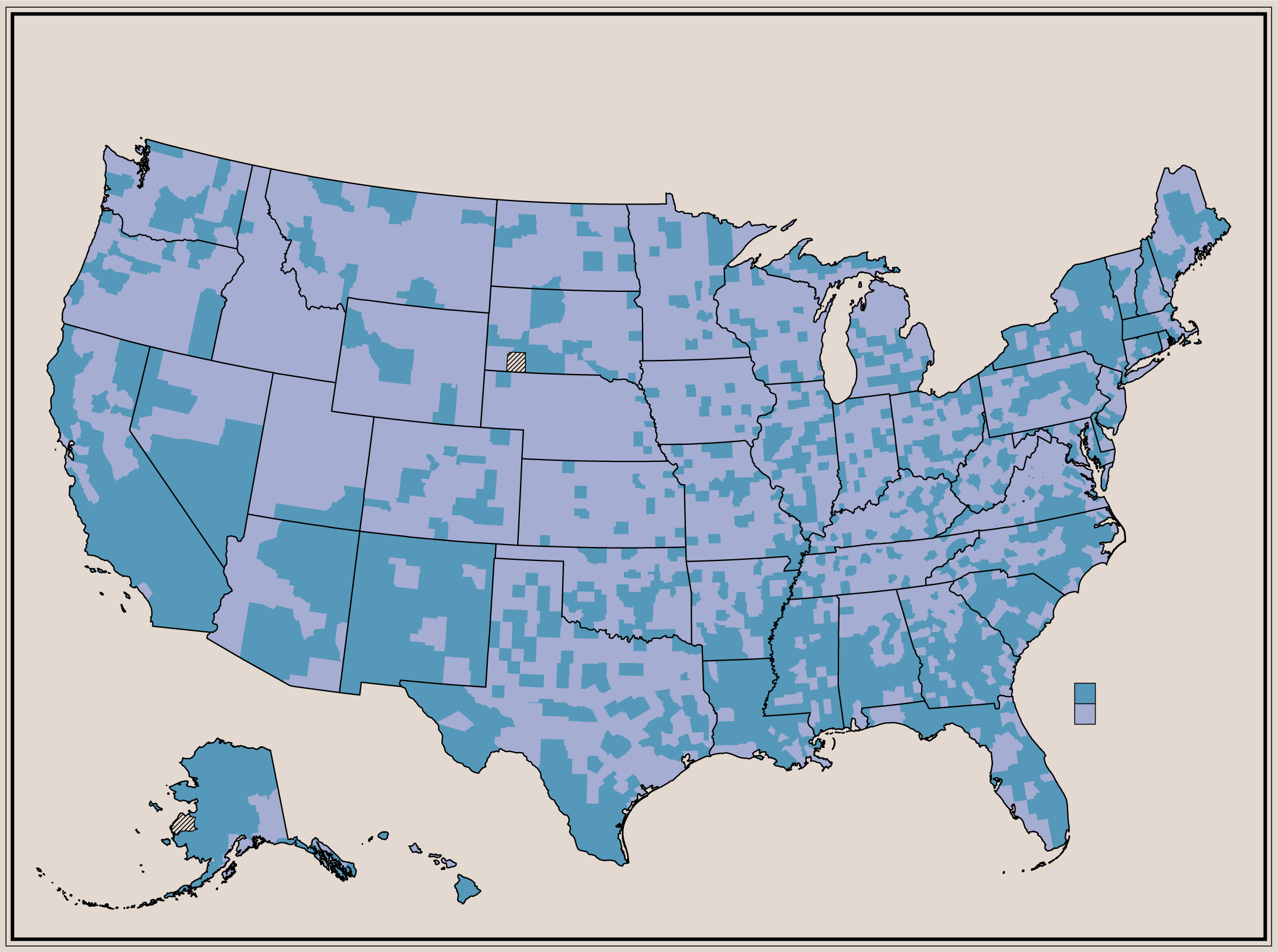
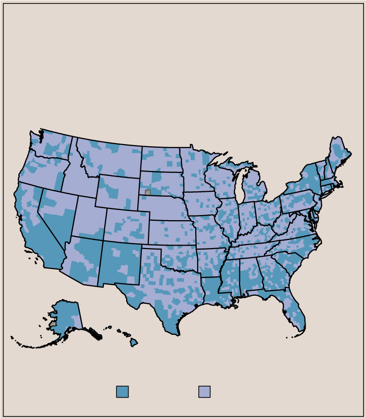
About 48% of the U.S. population aged 15 and older is married. I was curious if there were regional variations, so I mapped the percentage of married people versus not married people.
MAP
PREVALENT MARITAL STATUS
OUT OF POPULATION AGED 15 YEARS AND OLDER
Compiled from estimates from the 2019 Five-Year American Community Survey
PREVALENT MARITAL STATUS
Not married
Married
MAP
PREVALENT MARITAL STATUS
OUT OF POPULATION AGED 15 YEARS AND OLDER
Compiled from estimates from the 2019 Five-Year American Community Survey
PREVALENT MARITAL STATUS
Not married
Married
I was expecting to see mostly noise, so I was surprised to see the higher prevalence of non-married people in the bottom half of the United States. I have a feeling it’s age-related.
Chart Type Used
Become a member. Support an independent site. Get extra visualization goodness.
See What You Get