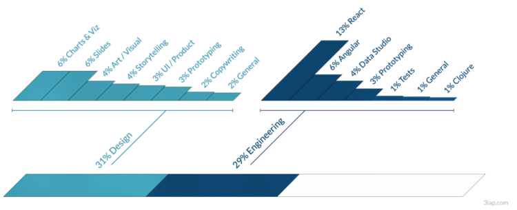
• Membership
  • Newsletter
  • Projects
  • Learning
  • About
  • Member Login
  • Weighted Olympic medal counts

    February 15, 2022

    Topic

    Statistical Visualization  /  Josh Katz, medal, Olympics, ranking, Upshot

    To decide who’s doing best at the Olympics you have to define what “best” means. Do you go by total medal count? Do you give more weight to gold medals over silver and bronze? Josh Katz, for NYT’s The Upshot, has been updating an interactive that ranks countries based on how you answer.

    Each heatmap represents a country. The horizontal axis represents how much more a silver is worth over a bronze, and the vertical axis is how much a gold is worth over a silver. So the bottom left corner is all medals equal. Color represents possible ranking. The list of countries on the right updates as you move the cursor over spots.

    Katz has been updating for each Olympics since PyeongChang 2018. It’s my favorite medal count tracker. I like the original best, which spaced countries in the list when there were ties.

  • Premier League territory control

    February 14, 2022

    Topic

    Statistical Visualization  /  Athletic, Premier League, soccer

    The Athletic charted territories on the field to show whether the team of interest or their opponents get more touches. I only understand about half of the words in this post, but I appreciate the chart.

  • Data Underload  /  age, birth, motherhood

    Age of Moms When Kids are Born

    People have kids at a wide range of ages, but the moments tend towards where we are in life. There are social norms and biological norms. Based on data from the National Center for Health Statistics, we can see how these ranges shift by child number.

    Read More
  • Members Only

    Good Redundant

    February 10, 2022

    Topic

    The Process  /  encoding, redundancy

    Think of the redundancies as reinforcement for a clearer signal.

  • Modernized version of a mid-19th century encylopedia

    February 10, 2022

    Topic

    Infographics  /  encyclopedia, J. G. Heck, Nicholas Rougeux, restoration

    Between 1849 and 1851, J.G. Heck published a 10-part encyclopedia called Iconographic Encyclopædia covering a wide range of topics in science and art. Nicholas Rougeux, who likes to web-ify old works, restored Heck’s 13,000-plus illustrations and restructured the encyclopedia for the browser. All it took was hours of manual labor spread out over 13 months.

    Read more about the process here.

  • Past redlining still seen in the present

    February 9, 2022

    Topic

    Maps  /  FiveThirtyEight, racism, redlining

    In the 1930s, a group called the Home Owners’ Loan Corporation went to cities classifying neighborhoods based on the “risk” of defaulting on loans. Areas deemed highest risk were marked with red ink on a map, and these areas tended to be non-white. The classification, redlining, was made illegal, but you can still see the effects today, as shown by Ryan Best and Elena Mejía with these interactive maps for FiveThirtyEight.

    The maps are based on U.S. Census estimates and data from the University of Richmond’s Mapping Inequality project.

  • Frequency trails in the snow

    February 9, 2022

    Topic

    Miscellaneous  /  humor, snow

    Same vibes pic.twitter.com/oXjhdwS3yW

    — Matt Blackwell (@matt_blackwell) February 7, 2022

    This is a good tweet.

  • How to Make a Line Chart with a Color Gradient in R

    Use color to reinforce or add another layer of meaning to a regular line chart.

  • Figure skating animated jumps

    February 8, 2022

    Topic

    Infographics  /  Nathan Chen, New York Times, Olympics, sports

    Figure skater Nathan Chen set a world record with his performance in the short program. The New York Times has these cute animations to show the completed jumps. Just spinning around four times in the air, no big deal.

  • Improving electric vehicle adoption rates

    February 8, 2022

    Topic

    Infographics  /  electric vehicle, Reuters

    Gas-powered vehicles contribute a big part of total carbon production, so to get to carbon neutral, it’s essential that electrical vehicles eventually replace what’s on the road now. For Reuters, Feilding Cage, with illustrations by Samuel Granados, explains the challenges for wide adoption to actually happen in the United States.

    The vehicles-on-the-road illustration to show percentages is a good mental link between data and reality. It reminds me of the vehicle recall visualization from NYT a while back.

  • Bubble tea combinations, a visual breakdown

    February 7, 2022

    Topic

    Network Visualization  /  boba, combinations, Daisy Chung, Julia Janicki

    Walk into a boba shop and usually you’ll see a large menu that lists the options for your tea, milk, toppings, ice, and sweetness. With all the variations, you get a lot of combinations. Julia Janicki and Daisy Chung broke it down with an interactive that takes you through the steps.

  • Accuracy of groundhog weather prediction

    February 4, 2022

    Topic

    Statistical Visualization  /  FiveThirtyEight, Groundhog Day, prediction

    For FiveThirtyEight, Simran Parwani and Kaleigh Rogers compared Groundhog Day predictions against actual weather data from the National Oceanic and Atmospheric Administration:

    After dozens of grueling hours of investigation, FiveThirtyEight can confirm that Punxsutawney Phil is a charlatan. A groundbreaking analysis has revealed the Pennsylvania-based groundhog who makes annual predictions about the arrival of spring is not nearly as reliable a prognosticator as those close to him claim. Phil, arguably the world’s most well-known rodent weather predictor, has been forecasting when spring will arrive annually on Groundhog Day since 1887. But when comparing his predictions to historical weather data, he’s only right about a third of the time.

    I am outraged.

  • Members Only

    Editing Carefully and That White House Bar Chart with the Weird y-axis – The Process 175

    February 3, 2022

    Topic

    The Process  /  editing, error

    The White House posted a chart with a messed up y-axis. Intentional or no?

  • Statistical Atlas  /  birth, mortality

    When There Were More Deaths Than Births in the U.S.

    The two counts have been getting closer to each other. The past couple of years accelerated the process.

    Read More
  • Charts showing Tom Brady’s standout career

    February 2, 2022

    Topic

    Statistical Visualization  /  football, Tom Brady, Upshot

    Tom Brady announced his retirement from the National Football League, which ends a long career that stands out from the rest. As required by law, when it comes to sports records over time, The Upshot made four line charts that show cumulative stats for Brady and his peers.

  • Crisis Text Line and data sharing

    February 2, 2022

    Topic

    Statistics  /  Crisis Text Line, ethics, privacy

    Crisis Text Line was sharing data with a for-profit business started by its founder. Given the sensitivity and nature of the data, this relationship understandably seemed questionable at best. Danah Boyd, who serves on the board for Crisis Text Line, provides a detailed view into what happened and why:

    The practice of non-profit governance requires collectively grappling with trade-off after trade-off. I have been a volunteer director of the board of Crisis Text Line for 8 years both because I believe in the mission and because I have been grateful to govern alongside amazing directors from whom I constantly learn. This doesn’t mean it’s been easy and it definitely doesn’t mean we always agree. But we do push each other and I learn a lot in the process. We strived to govern ethically, but that doesn’t mean others would see our decisions as such. We also make decisions that do not pan out as expected, requiring us to own our mistakes even as we change course. Sometimes, we can be fully transparent about our decisions; in other situations – especially when personnel matters are involved – we simply can’t. That is the hardest part of governance, both for our people and for myself personally.

  • Crypto volatility charts

    February 1, 2022

    Topic

    Statistical Visualization  /  cryptocurrency, New York Times

    One of the attractions of crypto is that values can swing into the positive over a short period of time. Of course, that means values can also suddenly dip. Emily Flitter and Karl Russell for The New York Times reported on this volatility through the lens of a handful of cryptocurrencies.

    The charts are straightforward but the layering and organization is soothing for me. This must be what people feel when they talk about ASMR.

  • Diversity of federal judge picks, compared by president

    February 1, 2022

    Topic

    Statistical Visualization  /  diversity, Joe Biden, judges

    Adrian Blanco for The Washington Post used squares connected at the corners to compare federal judge confirmations across presidencies. Each square represents a demographic, which is sized by number of confirmations. I like it.

  • A game to gerrymander your party to power

    January 31, 2022

    Topic

    Infographics  /  game, gerrymandering, New York Times

    Ella Koeze, Denise Lu, and Charlie Smart for The New York Times made a game to help you understand gerrymandering better. They created a fake territory called Hexapolis, and your mission, if you choose to accept it, is to gerrymander your party into power. Good luck.

    See also the miniature golf game from The Washington Post. We. Will. Understand. Gerrymandering.

  • Questioning Novak Djokovic’s Covid tests, based on data

    January 31, 2022

    Topic

    Statistical Visualization  /  BBC, coronavirus, Novak Djokovic, tennis

    Tennis player Novak Djokovic is not vaccinated against the coronavirus, and as a result, was not allowed to compete in the Australian Open. Data collated by the BBC suggests that Djokovic lied about his Covid-19 test results in an attempt to get around rules:

    The confirmation codes in all cases slotted into the same chronological timeline as our initial batch sent by BBC colleagues and showed that the earlier the test result date, the lower the confirmation code.

    The only outlier of all the confirmation codes we’ve plotted was Mr Djokovic’s positive test on 16 December.

    See also Zerforschung’s questioning from earlier this month.

  • Page 67 of 392
  • <
  • 1
  • ...
  • 64
  • 65
  • 66
  • 67
  • 68
  • 69
  • ...
  • 392
  • >

Analyze, visualize, and communicate data usefully, beyond the defaults.

Become a member →

Recently for Members

May 15, 2025
Step Chart, Enhanced

May 8, 2025
When the data is not what it seems

May 1, 2025
Finding the Right Charts

April 24, 2025
Visualization Tools, Datasets, and Resources – April 2025 Roundup

April 17, 2025
Breaking Out of Chart Software Defaults

Browse by Chart Type See All →

Grid Map Bump Chart Strip Plot Slope Chart Voronoi Diagram Dot Plot Parallel Coordinates Histogram Mosaic Plot Sankey Diagram

Browse By Topic

  • Visualization

    Seeing data

  • Maps

    Seeing geographic data

  • Infographics

    Explaining data

  • Networks

    Connecting data

  • Statistics

    Analyzing data

  • Software

    Working with data

  • Sources

    Getting data

  • Design

    Making data readable

Get the Book

Visualize This: The FlowingData Guide to Design, Visualization, and Statistics

Available now.

Order: Amazon / Bookshop

Made by FlowingData

  • The Process

  • Data Underload

  • Chart Everything

  • Guides

  • Books

  • Shop

  • About
  • Contact
  • Newsletter
  • LinkedIn
  • Instagram
  • Bluesky
  • RSS
Copyright © 2007-Present FlowingData. All rights reserved.