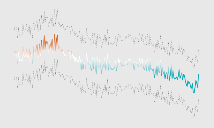
Sometimes being unprofessional works to your advantage when communicating data.
Baby names gain sudden popularity for various reasons. Maybe a celebrity with a unique name gains traction, or a character in a movie strikes a chord with audiences. Maybe an athlete reaches the peak of fame, and expecting parents have similar dreams.
I wondered how these trends changed over time. So using data from the Social Security Administration, I found the most trendy baby name every year since 1930. Here they are for female and male.
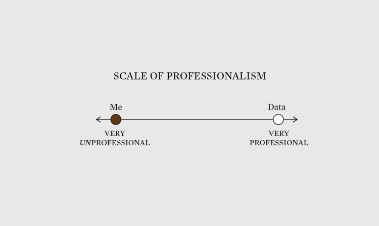
Sometimes being unprofessional works to your advantage when communicating data.
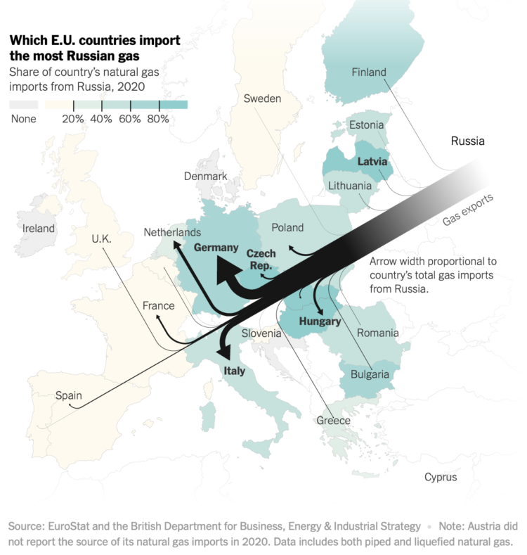
Speaking of Russian gas, Josh Holder, Karl Russell and Stanley Reed for The New York Times mapped gas exports from Russia to E.U. countries. NYT used Sankey flows where thicker lines mean more gas, which are paired with a choropleth map that represents share each country’s natural gas imports that are from Russia.
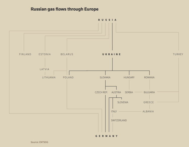
For Reuters, Prasanta Kumar Dutta, Samuel Granados and Michael Ovaska detail Europe’s dependence on Russia’s gas supplies and the crisis in Ukraine:
With its abundant gas reserves, the proximity of its oilfields and an extensive existing pipeline network, Russia dominates the EU’s gas market at about 38% of total supply. Norway, the bloc’s next largest source of natural gas, accounts for half that, just 19% of the market.
The interdependence between Europe and Russia is likely only to deepen with the new Nord Stream 2 pipeline set to double the direct supply of natural gas from Russia to Germany under the Baltic Sea. That is, of course, unless the crisis in Ukraine threatens Nord Stream 2’s regulatory approval process, a potent threat that could scrap the whole project, which the United States and Europe have wielded during negotiations.
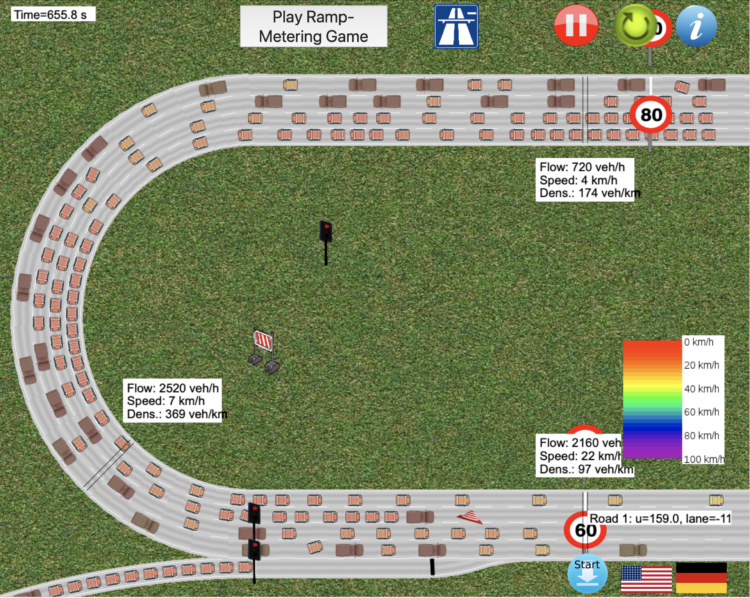
Traffic always seems so sensitive to the smallest disruptions. Someone pulls over to the side of the road? Traffic jam. Slight incline on the freeway? Traffic jam. One person weaving in and out of lanes? Traffic jam. With this traffic simulator by Martin Treiber, you can test out all the possible scenarios.
You can use different types of roads, place speed limits, start construction, increase or decrease the number of lanes, adjust the incline, and even define politeness among drivers. Experience the frustrations of driving, right from your computer. [via kottke]
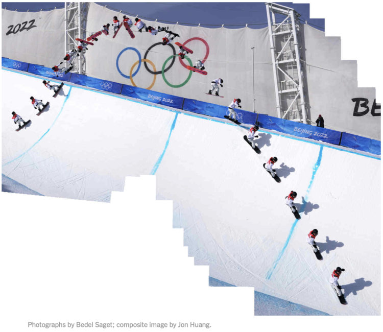
If you watched the men’s halfpipe in the Olympics, you were probably impressed by Ayumu Hirano’s tricks. But it can be hard to see what he actually does in real-time, other than flying high, spinning a lot, and landing cleanly. So The New York Times used composite photos to show Hirano’s trajectory. I especially like the zoom-in frame by frame composite showing a Cab Double Cork 1440.
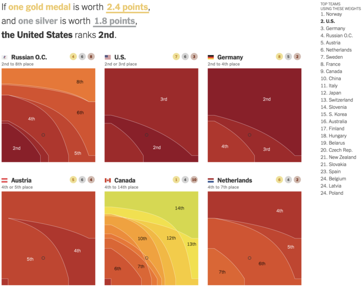
To decide who’s doing best at the Olympics you have to define what “best” means. Do you go by total medal count? Do you give more weight to gold medals over silver and bronze? Josh Katz, for NYT’s The Upshot, has been updating an interactive that ranks countries based on how you answer.
Each heatmap represents a country. The horizontal axis represents how much more a silver is worth over a bronze, and the vertical axis is how much a gold is worth over a silver. So the bottom left corner is all medals equal. Color represents possible ranking. The list of countries on the right updates as you move the cursor over spots.
Katz has been updating for each Olympics since PyeongChang 2018. It’s my favorite medal count tracker. I like the original best, which spaced countries in the list when there were ties.
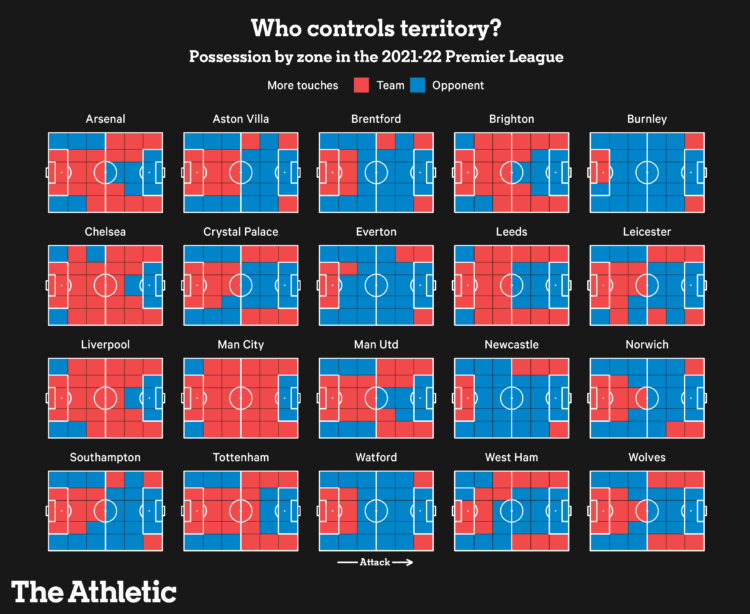
The Athletic charted territories on the field to show whether the team of interest or their opponents get more touches. I only understand about half of the words in this post, but I appreciate the chart.
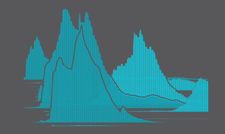
People have kids at a wide range of ages, but the moments tend towards where we are in life. There are social norms and biological norms. Based on data from the National Center for Health Statistics, we can see how these ranges shift by child number.
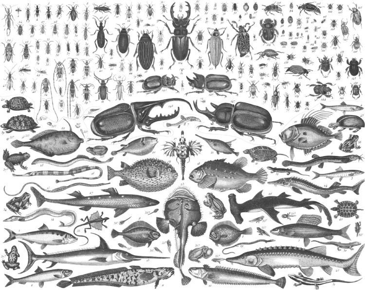
Between 1849 and 1851, J.G. Heck published a 10-part encyclopedia called Iconographic Encyclopædia covering a wide range of topics in science and art. Nicholas Rougeux, who likes to web-ify old works, restored Heck’s 13,000-plus illustrations and restructured the encyclopedia for the browser. All it took was hours of manual labor spread out over 13 months.
Read more about the process here.
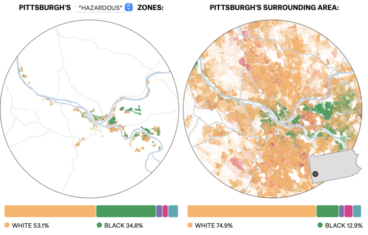
In the 1930s, a group called the Home Owners’ Loan Corporation went to cities classifying neighborhoods based on the “risk” of defaulting on loans. Areas deemed highest risk were marked with red ink on a map, and these areas tended to be non-white. The classification, redlining, was made illegal, but you can still see the effects today, as shown by Ryan Best and Elena Mejía with these interactive maps for FiveThirtyEight.
The maps are based on U.S. Census estimates and data from the University of Richmond’s Mapping Inequality project.
Same vibes pic.twitter.com/oXjhdwS3yW
— Matt Blackwell (@matt_blackwell) February 7, 2022
This is a good tweet.
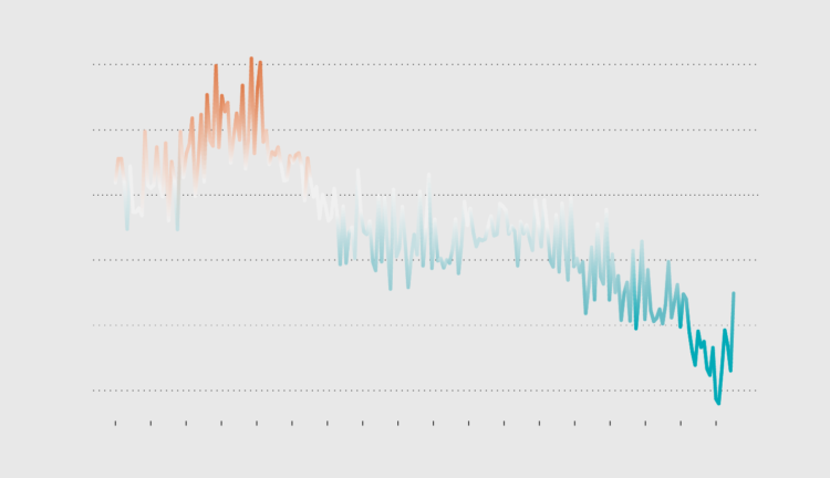
Use color to reinforce or add another layer of meaning to a regular line chart.
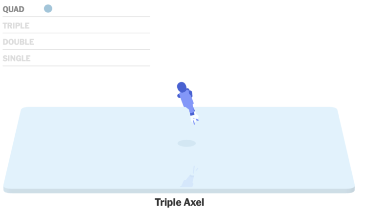
Figure skater Nathan Chen set a world record with his performance in the short program. The New York Times has these cute animations to show the completed jumps. Just spinning around four times in the air, no big deal.
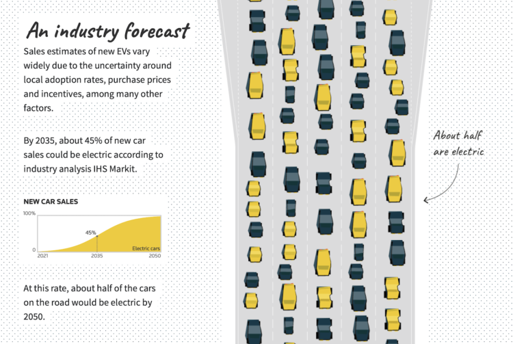
Gas-powered vehicles contribute a big part of total carbon production, so to get to carbon neutral, it’s essential that electrical vehicles eventually replace what’s on the road now. For Reuters, Feilding Cage, with illustrations by Samuel Granados, explains the challenges for wide adoption to actually happen in the United States.
The vehicles-on-the-road illustration to show percentages is a good mental link between data and reality. It reminds me of the vehicle recall visualization from NYT a while back.
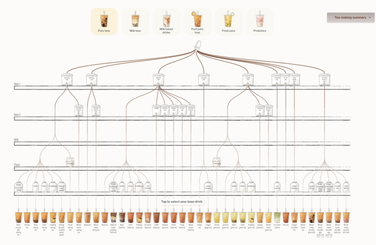
Walk into a boba shop and usually you’ll see a large menu that lists the options for your tea, milk, toppings, ice, and sweetness. With all the variations, you get a lot of combinations. Julia Janicki and Daisy Chung broke it down with an interactive that takes you through the steps.
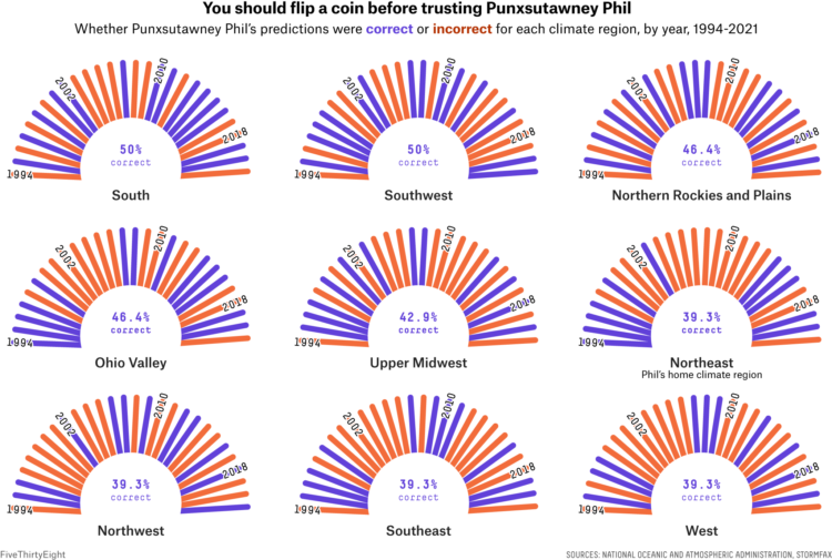
For FiveThirtyEight, Simran Parwani and Kaleigh Rogers compared Groundhog Day predictions against actual weather data from the National Oceanic and Atmospheric Administration:
After dozens of grueling hours of investigation, FiveThirtyEight can confirm that Punxsutawney Phil is a charlatan. A groundbreaking analysis has revealed the Pennsylvania-based groundhog who makes annual predictions about the arrival of spring is not nearly as reliable a prognosticator as those close to him claim. Phil, arguably the world’s most well-known rodent weather predictor, has been forecasting when spring will arrive annually on Groundhog Day since 1887. But when comparing his predictions to historical weather data, he’s only right about a third of the time.
I am outraged.
The White House posted a chart with a messed up y-axis. Intentional or no?
The two counts have been getting closer to each other. The past couple of years accelerated the process.


 Visualize This: The FlowingData Guide to Design, Visualization, and Statistics
Available now.