This is the good stuff for March.
This is the good stuff for March.
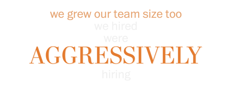
Tech layoffs continue, and as companies deliver more letters, there are some repeated topics. For The Washington Post, Hamza Shaban, Luis Melgar, and Leslie Shapiro parsed out the patterns:
The Post analyzed 48 publicly available memos from tech companies ranging from start-ups that have raised at least $50 million to trillion-dollar giants that have announced layoffs since last summer. Major themes and key words for each theme were determined after reviewing the memos. The Post programmatically split each memo into sentences and identified each sentence with a key word. Sentences were manually vetted to verify correct classification. A single sentence may be assigned multiple categories. Design elements are direct quotes from layoff memos with the exception of the first, where “Dear” was not necessarily used.

This is necessarily uncomfortable to go through, but for The Washington Post, N. Kirkpatrick, Atthar Mirza, and Manuel Canales show the bodily damage caused by an AR-15 bullet versus a 9mm round.
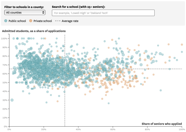
For the San Francisco Chronicle, Nami Sumida shows admission rates at University of California campuses, categorized by public and private high schools:
Admissions for UCLA and Berkeley, the most competitive of the nine undergraduate UCs, follow a similar trend. Private school seniors were 20 percentage points more likely to apply to the two campuses than their peers at public schools. But unlike systemwide admissions, UCLA and Berkeley admitted public and private school students at about equal rates.
You can download the full UC dataset, which dates back to the 1994 freshman college class. With time, and several categories, it seems like a fun dataset to poke at.
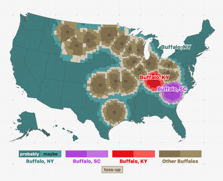
Throughout the United States, there are a surprising number of cities that have the same name. In fact, after playing with this interactive map by Russell Samora for The Pudding, it seems more likely that cities share a name with another than not. (Don’t quote me on that.)
The question is: When someone mentions a city, which one are they talking about? Samora calculated the likelihoods, given the county that person lives in. For example, when someone refers to Buffalo, most people are probably talking about Buffalo, New York. If you live in Buffalo, Kentucky, then probably not.
You can also mess around with your likelihood metric here.
See also: street names across the country.
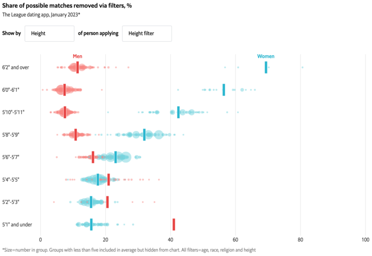
With online dating apps, you’re able to filter out potential matches based on characteristics like age and height. The Economist charted who’s filtering out what.
The chart took me a second to figure out, but I think I got it. Each bubble represents a demographic group. The x-axis represents the percentage of potential matches the group filters out, and the y-axis represents a characteristic of the searching group. For example, you can see in the above that taller women filter out more people with the height filter, whereas taller men don’t filter out as much.
After three years, The New York Times is switching away from local data collection to data from the Centers for Disease Control and Prevention:
As the virus began to spread rapidly in the United States in March 2020, it became clear that there was no single source that tracked infections at the local level. In the absence of comprehensive government data, The Times quickly built a custom system for gathering, vetting and publishing data from more than 100 state and local government sources.
By collecting the data continually, and from multiple levels of government, The Times was able to map the spread of the virus, with updated information published several times a day.
It’s sad that NYT had to collect data at all, but I’m glad they did. Those Covid pages were an invaluable resource those first two years.
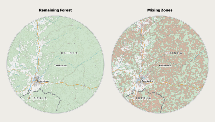
For ProPublica, Al Shaw, Irena Hwang, and Caroline Chen explain the increased risk of spreading disease when there are fewer trees and physical barriers in between people:
The implications of such a drastic increase in mixing zone area over a relatively small increase in deforestation are serious. In 2018, a team led by Christina Faust, a researcher at the University of Glasgow, Scotland, developed a peer-reviewed model that directly links changes in forest cover to the potential for spillover events. To understand how the potential for spillover had changed since the 2013 outbreak, we applied data from real-world satellite images to this theoretical model.
The dot plot and map combo at the end is a nice touch.

With fewer people in mind, you can visualize data with fewer trade-offs and greater focus.
In the 1950s, less than 10% of families with children were single-parent. In 2022, among families with children, 31% were single-parent — more than three times as common.

For The Washington Post, Anahad O’Connor, Aaron Steckelberg, and Laura Reiley visually describe the use of artificial sweeteners in so-called healthy foods. Like with their piece on coffee versus tea, anthropomorphized food items take you through, which I very much enjoy.
Continuing an analysis of IRS records, Robert Faturechi and Ellis Simani for ProPublica delve into the timing of executives trading stock in partners and competitors:
The Medpace executive is among dozens of top executives who have traded shares of either competitors or other companies with close connections to their own. A Gulf of Mexico oil executive invested in one partner company the day before it announced good news about some of its wells. A paper-industry executive made a 37% return in less than a week by buying shares of a competitor just before it was acquired by another company. And a toy magnate traded hundreds of millions of dollars in stock and options of his main rival, conducting transactions on at least 295 days. He made an 11% return over a recent five-year period, even as the rival’s shares fell by 57%.
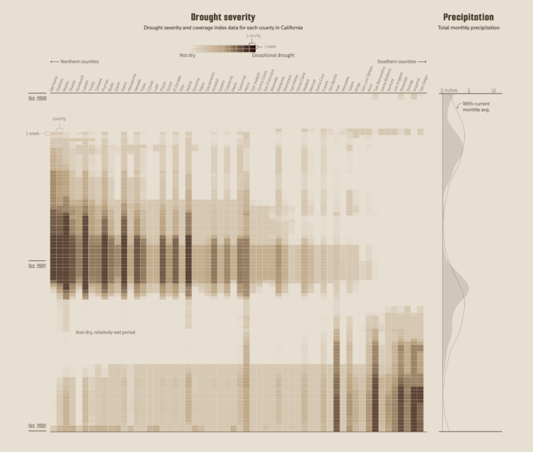
It’s been raining a lot here in California, which is helpful, because most of the state has been in severe drought for the past few years. However, the current aging systems can only capture so much of the rainwater, which means we’re still in a drought. For Reuters, Clare Trainor and Minami Funakoshi use a combo heatmap and area plot to show drought severity over the years.
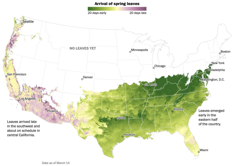
Going off the calendar, today is the first day of spring, but nature just goes off the weather. For The Washington Post, Harry Stevens mapped the early and late arrival of spring leaves across the country:
This year’s winter weather pattern cleaved the country in half. As a ridge of high atmospheric pressure warmed the east, a low pressure system kept conditions cooler and wetter than usual across the west, said Michael A. Crimmins, a climate science professor at the University of Arizona.
It’s like Punxsutawney Phil has no actual bearing on the arrival of spring.
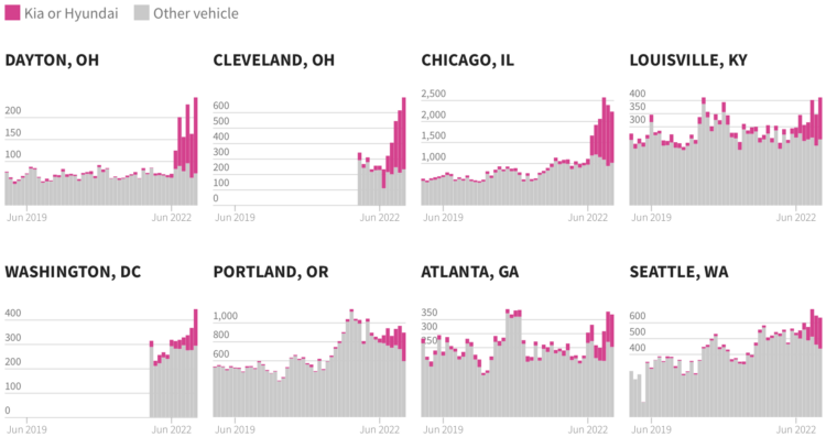
In the middle of 2022, a popular video on TikTok, since taken down, showed how to easily start a Kia or Hyundai with a USB connector. The trend started a year earlier in Milwaukee, Wisconsin, where hundreds of vehicles were stolen every month. USAFacts looked at how the trend spread to other cities.
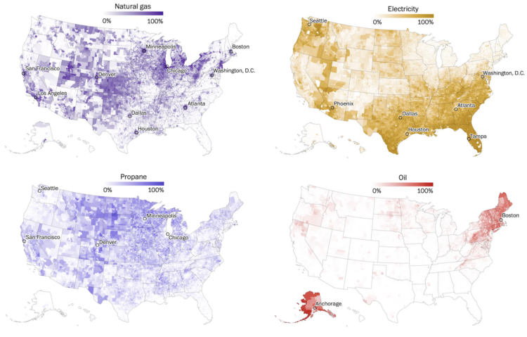
For The Washington Post, John Muyskens, Shannon Osaka, and Naema Ahmed mapped the main ways that Americans heat their homes:
Thanks to a combination of local climates, electricity prices and historical accident, America’s home heating system, like the country’s politics, is deeply divided. In the South, thanks to government funding from almost a century ago and mild climates, many rely on electricity to stay warm. The Midwest is dominated by natural gas and, in rural areas, propane. In the Northeast, despite high prices and inconvenience, fuel oil still heats many homes.
People are waiting longer to have kids or not having kids at all, which leads to more dual income households with no kids.
GeoGuessr player rainbolt is next-level good at reading Google Maps. Given a short Vine clip, he walks through his process of figuring out the exact location of the video in about 15 minutes:
It shows what you can do with publicly available bits of information to answer very specific questions. [via Waxy]

Silicon Valley Bank was unable to fill its responsibilities, so the Federal Deposit Insurance Corporation took over last week. With $209 billion in assets, the SVB failure was the biggest since Washington Mutual Bank’s in 2008. These are all the failures since 2001, scaled by amount of assets in 2023 dollars.
 Visualize This: The FlowingData Guide to Design, Visualization, and Statistics (2nd Edition)
New tools, refined process.