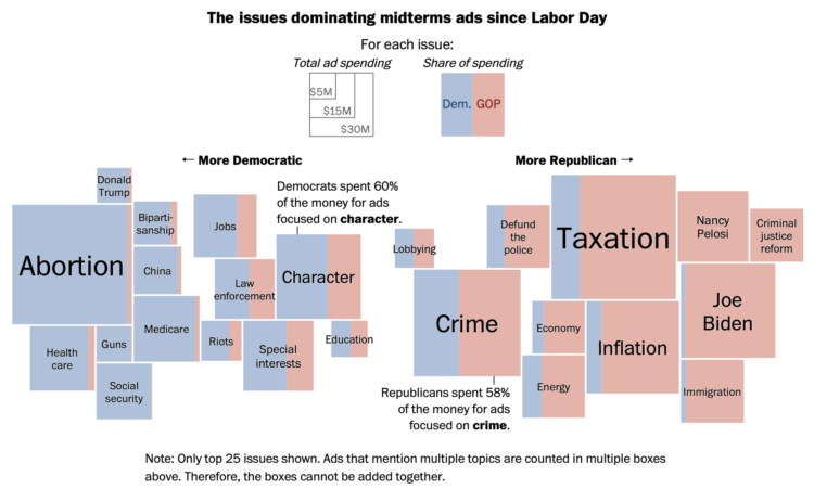
Midterm election day is just about here in the U.S., so the political ads are running. Harry Stevens and Colby Itkowitz, for The Washington Post, show the spending breakdown by political party and topic. Bigger squares mean more spending, and more blue or more red mean more Democrat or Republican, respectively, share of the spending.
The chart reminds of the Shan Carter classic from 2012, which visualized word usage at the National Convention. Same split and sort, but with circles.

 Visualize This: The FlowingData Guide to Design, Visualization, and Statistics (2nd Edition)