• Membership
  • Newsletter
  • Projects
  • Learning
  • About
  • Member Login
  • A moving drumbeat, explained visually

    June 6, 2023

    Topic

    Infographics  /  beats, Michelle McGhee, music, Pudding

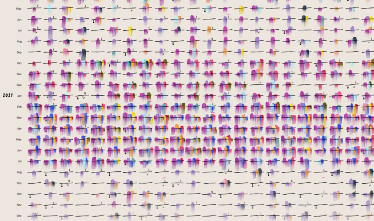
    When you first learn to play music, a lot of the instruction is about structure. Turn the metronome on and follow the beats straight up. James Dewitt Yancey, also known as J Dilla, shifted the beats for a different feel and sound. This piece, by Michelle McGhee for The Pudding, demonstrates this difference.

    Turn the sound on and press the buttons. It’s neat to hear the breakdown of the rhythm as you walk through the styles.

  • Map of donut federations

    June 5, 2023

    Topic

    Maps  /  donut, Washington Post

    In a fun one by Alyssa Fowers, for The Washington Post’s Department of Data, a map of the most common donut shops in the United States:

    We kicked off our investigation with our friends at Yelp, who shared all the doughnut shop listings on the review site. By grouping stores with the same name and calculating the most common doughnut shop in groups of census tracts around the country, we found that our reader’s observation was right on: The United States is a federation of at least nine distinct doughnut nations.

    All hail Small Brand Fiefdoms.

  • Changes to Blackjack payouts so that gamblers lose more to casinos

    June 5, 2023

    Topic

    Statistics  /  gambling, Las Vegas, probability

    Katherine Sayre, for The Wall Street Journal, on Las Vegas casinos squeezing out more juice:

    Gambling companies such as MGM Resorts and Caesars, the two biggest operators on the Strip, have reduced how much they will pay for winning hands at blackjack at many of their tables, data show.

    Blackjack, a fast-paced card game, historically paid out a ratio of 3:2 when a player hit 21 on the first two cards. That means a gambler wins $15 for every $10 bet. Now, many blackjack tables on the Strip pay out at 6:5, which means that same $10 yields only $12.

    During my very first advanced probability course in college, the professor went right into the math of “the house always wins.” It only takes a tiny house advantage to guarantee you lose all your money over a long enough period of time.

    For example, it would seem that if you play Blackjack following the same strategy as the dealer, the odds of you winning and losing would be even. But the dealer will always take your money if you bust, regardless of what hand they get. That’s enough advantage for the casino. Well, it was enough, until they started paying out less and increasing minimum bets.

  • Rights at risk at the U.S. Supreme Court level

    June 2, 2023

    Topic

    Infographics  /  ProPublica, rights, Supreme Court

    For ProPublica, Ian MacDougall and Sergio Hernandez evaluated records of sitting justices to gauge the rights at risk of being taken away. Each right gets a section with background, bills and court cases challenging the right, and the justices that have questioned the right through judicial opinions and public remarks.

  • An open-access journal for visualization research

    June 2, 2023

    Topic

    News  /  journal, open access, research

    In an effort to provide a more transparent process in visualization and interaction research, The Journal of Visualization and Interaction begins:

    The Journal of Visualization and Interaction (JoVI) is a venue for publishing scholarly work related to the fields of visualization and human-computer interaction. Contributions to the journal include research in:

    • how people understand and interact with information and technology,
    • innovations in interaction techniques, interactive systems, or tools,
    • systematic literature reviews,
    • replication studies or reinterpretations of existing work,
    • research software packages for HCI and visualization,
    • and commentary on existing publications.

    Cross-disciplinary work from other fields such as statistics or psychology, which is relevant to the fields of visualization or human-computer interaction is also welcome.

  • Members Only

    Chart Practice: Feature Focus

    June 1, 2023

    Topic

    The Process  /  practice

    Focus on the small visualization things you can improve while still getting your work done.

  • Scale model of the universe’s timeline

    June 1, 2023

    Topic

    Data Art  /  Alex Gorosh, scale, time, Wylie Overstreet

    [arve url=”https://www.youtube.com/watch?v=nOVvEbH2GC0″ /]

    To better understand the scale of time and feed your existential dread, Wylie Overstreet and Alex Gorosh used LED lights spread miles across a desert, proportional to milestones in the history of the universe. The model stretched 4.3 miles to represent 13.8 trillion years.

    See also the seven-mile scale model of the Solar System, which is another video in their To Scale series. [via kottke]

  • More hiring, because more quitting

    May 31, 2023

    Topic

    Statistical Visualization  /  hiring, Washington Post, work

    This is a good example of things are not quite what they seem until you look at more data. Andrew Van Dam, for Washington Post’s Department of Data, looks into why it appears red states hire more than blue states.

  • A guessing game for place and time

    May 30, 2023

    Topic

    Maps  /  game, guess

    Add another geolocation guessing game that I am terrible at. TimeGuessr shows you a photograph, and you guess when and where it was taken.

  • Shortening baseball games

    May 30, 2023

    Topic

    Statistical Visualization  /  baseball, time, Upshot

    Baseball games grew longer over the decades, with the average length well over three hours in recent years. Ben Blatt and Francesca Paris, for NYT’s The Upshot, show how a few rule changes this season keep the ball moving for shorter games.

  • How teenagers’ job ambitions have changed

    May 26, 2023

    Topic

    Infographics  /  teen, Vox, work

    [arve url=”https://www.youtube.com/watch?v=eMjqJKviDBo” /]

    The Programme for International Student Assessment (PISA), run by the OECD since 2000, surveys teenage students to estimate the quality of education around the world. One of the questions asked: “What kind of job do you expect to have when you are about 30 years old?” For Vox, Alvin Chang walks through how the responses changed over the past two decades, which appears to suggest that students are less certain about what the future holds.

    There are some tricky spots in explaining misalignment between ambition and preparation, but Chang does a good job of moving along step-by-step.

  • Members Only

    Visualization Tools and Learning Resources, May 2023 Roundup

    May 25, 2023

    Topic

    The Process  /  roundup

    Here’s the good stuff for May.

  • A geolocation game in the format of Wordle

    May 25, 2023

    Topic

    Maps  /  game, geolocation, Pudding, Russell Samora, Wordle

    With a cross between the games Wordle and GeoGuessr, Russell Samora for The Pudding made a daily game that challenges you to geolocate a place based on images of the place from Wikimedia Commons. You get five guesses to click on a map, and after each guess you get a new image and the number of miles you were off.

  • Data Underload  /  households

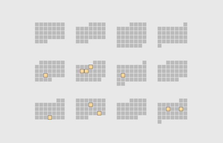
    All the Household Types in the U.S.

    When you think of household types in the United States, the most common ones probably come to mind: single, married couple, married couple with a kid, or married couple with two kids.

    But there are thousands of others. Let’s look at all of them.

    Read More
  • A portrait of your stolen identity in data breaches

    May 23, 2023

    Topic

    Infographics  /  ABC News, breaches, privacy

    You’ve probably heard about big data breaches over the years. They’re in the news or you get an email from a company that kindly reminds you to reset your password, because a few million accounts might have been exposed. Julian Fell, Ben Spraggon, and Matt Liddy for ABC News show how bits of information from all the known breaches can add up to form a complete profile of you.

    Enter an email address and see how many breaches it went through, plus what information was stolen. Yay, 14 breaches for me.

    Also check out Have I Been Pwned, where the data for the interactive comes from. It provides more background on individual breaches. [Thanks, Matt]

  • Spreadsheet esports

    May 22, 2023

    Topic

    Software  /  esports, Excel

    You’ve probably heard of esports, where people compete against each other in multiplayer video games. Financial Modeling World Cup runs esports for Microsoft Excel. Players get a fixed amount of time to accomplish complex spreadsheet tasks, and whoever figures out the correct answers in the least amount of time wins.

    The two-hour all-star battle last year even had running commentary and post-competition interviews. It is so gloriously nerdy. [via kottke]

  • Swipe left or right to cut the national debt

    May 19, 2023

    Topic

    Infographics  /  debt, game, Washington Post

    Cutting the national debt is a complex process that involves a lot more than personal preferences of an individual. But what if you simplified the task to a bunch of yes-no answers and made it into a Tinder-style swiping game? Szu Yu Chen, Chris Alcantara, and Jeff Stein for The Washington Post put you in charge of the choices.

  • Members Only

    Chart Practice: Switching the Datasets

    May 18, 2023

    Topic

    The Process  /  practice

    Same data brings out the same visual forms. So switch up the data that you look at.

  • How much AI will affect your job

    May 18, 2023

    Topic

    Statistical Visualization  /  AI, Washington Post, work

    Research by Edward W. Felten, Manav Raj, and Robert Seamans provides estimates for how occupations will be impacted by artificial intelligence, such as ChatGPT and Midjourney, based on AI exposure and demographics. Yan Wu and Sergio Peçanha, for The Washington Post, provide a rundown and searchable charts for the work so that you can check your own occupation.

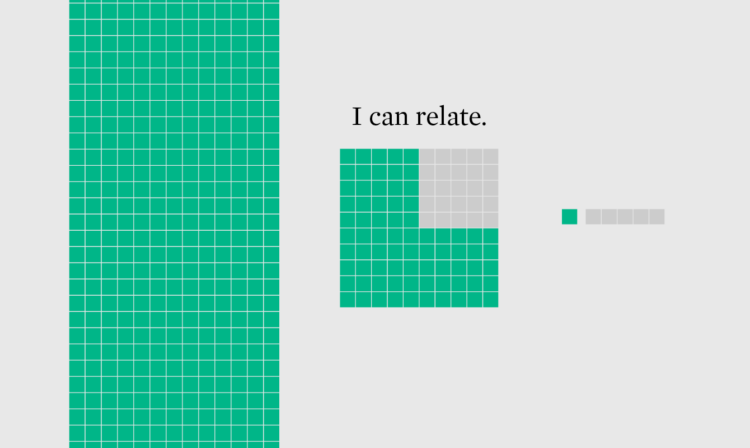
  • How to Make Unit-Based, Variable Width Bar Charts

    In a cross between unit charts and variable width bar charts, we can show total counts and relative proportions at the same time.

  • Page 41 of 391
  • <
  • 1
  • ...
  • 38
  • 39
  • 40
  • 41
  • 42
  • 43
  • ...
  • 391
  • >

Analyze, visualize, and communicate data usefully, beyond the defaults.

Become a member →

Recently for Members

May 8, 2025
When the data is not what it seems

May 1, 2025
Finding the Right Charts

April 24, 2025
Visualization Tools, Datasets, and Resources – April 2025 Roundup

April 17, 2025
Breaking Out of Chart Software Defaults

April 15, 2025
Line Chart with Decorative Neon Accents

Browse by Chart Type See All →

Sankey Diagram Grid Map Dot Plot Horizon Graph Area Chart Alluvial Diagram Ternary Plot Beeswarm Chord Diagram Bar Chart

Browse By Topic

  • Visualization

    Seeing data

  • Maps

    Seeing geographic data

  • Infographics

    Explaining data

  • Networks

    Connecting data

  • Statistics

    Analyzing data

  • Software

    Working with data

  • Sources

    Getting data

  • Design

    Making data readable

Get the Book

Visualize This: The FlowingData Guide to Design, Visualization, and Statistics

Available now.

Order: Amazon / Bookshop

Made by FlowingData

  • The Process

  • Data Underload

  • Chart Everything

  • Guides

  • Books

  • Shop

  • About
  • Contact
  • Newsletter
  • LinkedIn
  • Instagram
  • Bluesky
  • RSS
Copyright © 2007-Present FlowingData. All rights reserved.